
Matplotlib
Contents
Matplotlib#
Introduction#
Matplotlib is the most important plotting library in Python. There are many nice Python plotting libraries, each with their own strengths. (My personal favorites are Altair and Plotly.) But no other plotting library is as flexible or as widely used as Matplotlib.
Typically we do not import the entire Matplotlib library, but instead import its submodule pyplot. The standard abbreviation for pyplot is plt.
import numpy as np
import matplotlib.pyplot as plt
The following is an equivalent way to import pyplot. Here we’ve just commented it out.
# from matplotlib import pyplot as plt
There are a few different approaches to plotting in Matplotlib. (That can make Matplotlib harder to learn than for example NumPy. When I was first learning Matplotlib, I found it difficult to internalize its syntax, because the code examples I found online often used different but similar-looking approaches.) We are going to focus on what is called the object-oriented interface. We’ll see the main alternative, which is called the state-based interface, in the next section.
We will use plt.subplots() to create the figure in which we will do the plotting. In the following we define the output to be z, but using this variable z is not standard. We will see the standard approach a few cells below.
z = plt.subplots()

This variable z now represents a length-2 tuple.
type(z)
tuple
len(z)
2
What elements are in this length-2 tuple? The 0-th element in z is what is called a Figure object in Matplotlib.
z[0]

type(z[0])
matplotlib.figure.Figure
The element z[1] is an Axes object. (Aside: notice this word “axes” is spelled with an “e”, not with an “i”.)
z[1]
<AxesSubplot:>
type(z[1])
matplotlib.axes._subplots.AxesSubplot
Rather than assigning z = plt.subplots() as we did above, it is conventional to use what is called “tuple unpacking”, so that the resulting figure gets assigned to the variable fig and the resulting axes object gets assigned to the variable ax.
fig, ax = plt.subplots()
fig

type(fig)
matplotlib.figure.Figure
type(ax)
matplotlib.axes._subplots.AxesSubplot
It’s finally time to do some plotting. We plot by calling the plot method of the Axes object. (The fact that we’re calling a method of an object, as opposed to calling some independent function defined in Matplotlib, is why this approach is called the “object-oriented” interface.)
As far as what arguments are passed to plot, the syntax is extremely similar to Matlab. (In general, much of the syntax of Matplotlib is similar to, and inspired by, Matlab.) The first argument should specify the \(x\)-coordinates and the next argument should specify the \(y\)-coordinates.
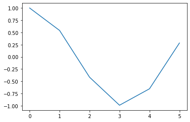
Here is an example. Let’s try to plot \(y = \cos(x)\) for \(x\) from 0 to 6. We will see how to make it look better in the following cells.
fig, ax = plt.subplots()
ax.plot(range(6), np.cos(range(6)))
[<matplotlib.lines.Line2D at 0x114f45ae0>]

One issue with the above (not a visual issue but a coding issue) is that the code is not DRY (which stands for “Don’t Repeat Yourself”). The fact that we’re repeating range(6) twice is a violation of the DRY principle. We fix that by setting x = range(6) and then using x instead of range(6). This variable name x is a natural choice, because in this case x represents the \(x\)-coordinates.
fig, ax = plt.subplots()
x = range(6)
ax.plot(x, np.cos(x))
[<matplotlib.lines.Line2D at 0x114fb96c0>]
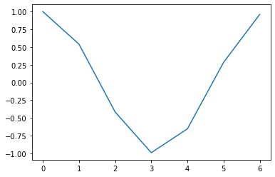
Another small issue with the above code is that we had wanted to plot the curve from 0 to 6, but since range(6) stops at 5, we should change range(6) to range(7). Now that our code is more DRY, making this change is less prone to mistakes, because we only have to change 6 to 7 in one place.
fig, ax = plt.subplots()
x = range(7)
ax.plot(x, np.cos(x))
[<matplotlib.lines.Line2D at 0x1150195a0>]

One more minor issue is the [<matplotlib.lines.Line2D at 0x1150195a0>] getting displayed at the top. We can get rid of that by using a semi-colon ; after the last line. (I think this is the only application of semi-colons I know in Python, unlike Matlab, where we used semi-colons all the time.)
fig, ax = plt.subplots()
x = range(7)
ax.plot(x, np.cos(x));
Let’s get to the real issue now, the fact that the graph doesn’t look good, because it is so jagged. The reason it looks so jagged is because it is plotting only 7 points and then connecting them with straight lines. (That’s the exact same as using plot in Matlab; the plotted points get connected by straight lines.) We could try to fix that by using a step size of 0.1, but we can’t use floats inside of range.
fig, ax = plt.subplots()
x = range(0,7,0.1)
ax.plot(x, np.cos(x));
---------------------------------------------------------------------------
TypeError                                 Traceback (most recent call last)
Input In [18], in <cell line: 2>()
      1 fig, ax = plt.subplots()
----> 2 x = range(0,7,0.1)
      3 ax.plot(x, np.cos(x))

TypeError: 'float' object cannot be interpreted as an integer

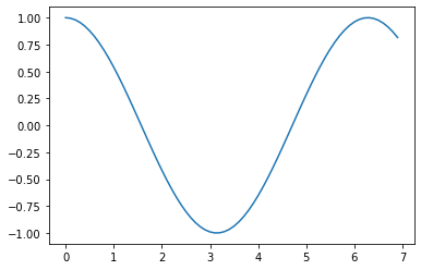
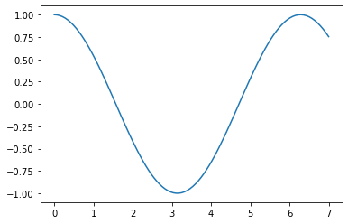
If we switch from range to NumPy’s arange, then we can use 0.1 as a step size, and the graph looks much more smooth. (Comment. I noticed after recording the video that we’re now going past x=6. I guess this version stops at 6.9. That wasn’t intentional.)
fig, ax = plt.subplots()
x = np.arange(0,7,0.1)
ax.plot(x, np.cos(x));
Another option, which looks pretty similar, is to use np.linspace to make x. In this case, we specify that there should be 100 (evenly spaced) sample points chosen. (Again, to match what I asked for above, it would be better to use np.linspace(0,6,100), so it stops at 6 rather than at 7.)
fig, ax = plt.subplots()
x = np.linspace(0,7,100)
ax.plot(x, np.cos(x));

The two Matplotlib interfaces#
For an overview of these two interfaces, it is worth reading from the Matlab documentation directly. Reference: Matplotlib User Guide: The Lifecycle of a Plot.
Matplotlib has two interfaces. The first is an object-oriented (OO) interface. In this case, we utilize an instance of
axes.Axesin order to render visualizations on an instance offigure.Figure. The second is based on MATLAB and uses a state-based interface. In general, try to use the object-oriented interface over the pyplot interface.
In Math 9, we ask that you use the object-oriented interface (as we did in the above section).
The object-oriented interface#
import numpy as np
import matplotlib.pyplot as plt
This is a recap of what we did above. Notice how we are using the plot method of ax, which is an Axes object.
fig, ax = plt.subplots()
x = np.linspace(0,7,100)
ax.plot(x, np.cos(x));
type(ax)
matplotlib.axes._subplots.AxesSubplot
The variable fig also represents an object. (The distinction between fig and ax might be more clear later, where we have a single Figure holding multiple Axes objects.)
type(fig)
matplotlib.figure.Figure
The state-based interface#
Here is the atlernative interface. I would say that in Matplotlib code I see on the internet, this state-based interface is used more often, probably because it is more concise. Nonetheless, it is recommended (in Math 9 and also in the official Matplotlib documentation) to use the object-oriented interface. The reason for this recommendation is that the object-oriented interface tends to be more natural as visualizations become more complex.
In the following state-based interface example, plt.plot is fairly different from ax.plot above. The expression plt.plot refers to the plot function in the pyplot module. The expression ax.plot refers to the plot method of the object ax. The arguments passed to plot are the same in both cases.
x = np.linspace(0,7,100)
plt.plot(x, np.cos(x));

Notice the first line in the documentation for plt.plot.
Help on function plot in module matplotlib.pyplot:
That line reinforces what we were saying above, that this plot should be thought of as a function defined in pyplot, not as a method associated with a particular object.
help(plt.plot)
Help on function plot in module matplotlib.pyplot:

plot(*args, scalex=True, scaley=True, data=None, **kwargs)
    Plot y versus x as lines and/or markers.

    Call signatures::

        plot([x], y, [fmt], *, data=None, **kwargs)
        plot([x], y, [fmt], [x2], y2, [fmt2], ..., **kwargs)

    The coordinates of the points or line nodes are given by *x*, *y*.

    The optional parameter *fmt* is a convenient way for defining basic
    formatting like color, marker and linestyle. It's a shortcut string
    notation described in the *Notes* section below.

    >>> plot(x, y)        # plot x and y using default line style and color
    >>> plot(x, y, 'bo')  # plot x and y using blue circle markers
    >>> plot(y)           # plot y using x as index array 0..N-1
    >>> plot(y, 'r+')     # ditto, but with red plusses

    You can use `.Line2D` properties as keyword arguments for more
    control on the appearance. Line properties and *fmt* can be mixed.
    The following two calls yield identical results:

    >>> plot(x, y, 'go--', linewidth=2, markersize=12)
    >>> plot(x, y, color='green', marker='o', linestyle='dashed',
    ...      linewidth=2, markersize=12)

    When conflicting with *fmt*, keyword arguments take precedence.


    **Plotting labelled data**

    There's a convenient way for plotting objects with labelled data (i.e.
    data that can be accessed by index ``obj['y']``). Instead of giving
    the data in *x* and *y*, you can provide the object in the *data*
    parameter and just give the labels for *x* and *y*::

    >>> plot('xlabel', 'ylabel', data=obj)

    All indexable objects are supported. This could e.g. be a `dict`, a
    `pandas.DataFrame` or a structured numpy array.


    **Plotting multiple sets of data**

    There are various ways to plot multiple sets of data.

    - The most straight forward way is just to call `plot` multiple times.
      Example:

      >>> plot(x1, y1, 'bo')
      >>> plot(x2, y2, 'go')

    - If *x* and/or *y* are 2D arrays a separate data set will be drawn
      for every column. If both *x* and *y* are 2D, they must have the
      same shape. If only one of them is 2D with shape (N, m) the other
      must have length N and will be used for every data set m.

      Example:

      >>> x = [1, 2, 3]
      >>> y = np.array([[1, 2], [3, 4], [5, 6]])
      >>> plot(x, y)

      is equivalent to:

      >>> for col in range(y.shape[1]):
      ...     plot(x, y[:, col])

    - The third way is to specify multiple sets of *[x]*, *y*, *[fmt]*
      groups::

      >>> plot(x1, y1, 'g^', x2, y2, 'g-')

      In this case, any additional keyword argument applies to all
      datasets. Also this syntax cannot be combined with the *data*
      parameter.

    By default, each line is assigned a different style specified by a
    'style cycle'. The *fmt* and line property parameters are only
    necessary if you want explicit deviations from these defaults.
    Alternatively, you can also change the style cycle using
    :rc:`axes.prop_cycle`.


    Parameters
    ----------
    x, y : array-like or scalar
        The horizontal / vertical coordinates of the data points.
        *x* values are optional and default to ``range(len(y))``.

        Commonly, these parameters are 1D arrays.

        They can also be scalars, or two-dimensional (in that case, the
        columns represent separate data sets).

        These arguments cannot be passed as keywords.

    fmt : str, optional
        A format string, e.g. 'ro' for red circles. See the *Notes*
        section for a full description of the format strings.

        Format strings are just an abbreviation for quickly setting
        basic line properties. All of these and more can also be
        controlled by keyword arguments.

        This argument cannot be passed as keyword.

    data : indexable object, optional
        An object with labelled data. If given, provide the label names to
        plot in *x* and *y*.

        .. note::
            Technically there's a slight ambiguity in calls where the
            second label is a valid *fmt*. ``plot('n', 'o', data=obj)``
            could be ``plt(x, y)`` or ``plt(y, fmt)``. In such cases,
            the former interpretation is chosen, but a warning is issued.
            You may suppress the warning by adding an empty format string
            ``plot('n', 'o', '', data=obj)``.

    Returns
    -------
    list of `.Line2D`
        A list of lines representing the plotted data.

    Other Parameters
    ----------------
    scalex, scaley : bool, default: True
        These parameters determine if the view limits are adapted to the
        data limits. The values are passed on to `autoscale_view`.

    **kwargs : `.Line2D` properties, optional
        *kwargs* are used to specify properties like a line label (for
        auto legends), linewidth, antialiasing, marker face color.
        Example::

        >>> plot([1, 2, 3], [1, 2, 3], 'go-', label='line 1', linewidth=2)
        >>> plot([1, 2, 3], [1, 4, 9], 'rs', label='line 2')

        If you specify multiple lines with one plot call, the kwargs apply
        to all those lines. In case the label object is iterable, each
        element is used as labels for each set of data.

        Here is a list of available `.Line2D` properties:

        Properties:
        agg_filter: a filter function, which takes a (m, n, 3) float array and a dpi value, and returns a (m, n, 3) array
        alpha: scalar or None
        animated: bool
        antialiased or aa: bool
        clip_box: `.Bbox`
        clip_on: bool
        clip_path: Patch or (Path, Transform) or None
        color or c: color
        dash_capstyle: `.CapStyle` or {'butt', 'projecting', 'round'}
        dash_joinstyle: `.JoinStyle` or {'miter', 'round', 'bevel'}
        dashes: sequence of floats (on/off ink in points) or (None, None)
        data: (2, N) array or two 1D arrays
        drawstyle or ds: {'default', 'steps', 'steps-pre', 'steps-mid', 'steps-post'}, default: 'default'
        figure: `.Figure`
        fillstyle: {'full', 'left', 'right', 'bottom', 'top', 'none'}
        gid: str
        in_layout: bool
        label: object
        linestyle or ls: {'-', '--', '-.', ':', '', (offset, on-off-seq), ...}
        linewidth or lw: float
        marker: marker style string, `~.path.Path` or `~.markers.MarkerStyle`
        markeredgecolor or mec: color
        markeredgewidth or mew: float
        markerfacecolor or mfc: color
        markerfacecoloralt or mfcalt: color
        markersize or ms: float
        markevery: None or int or (int, int) or slice or list[int] or float or (float, float) or list[bool]
        path_effects: `.AbstractPathEffect`
        picker: float or callable[[Artist, Event], tuple[bool, dict]]
        pickradius: float
        rasterized: bool
        sketch_params: (scale: float, length: float, randomness: float)
        snap: bool or None
        solid_capstyle: `.CapStyle` or {'butt', 'projecting', 'round'}
        solid_joinstyle: `.JoinStyle` or {'miter', 'round', 'bevel'}
        transform: unknown
        url: str
        visible: bool
        xdata: 1D array
        ydata: 1D array
        zorder: float

    See Also
    --------
    scatter : XY scatter plot with markers of varying size and/or color (
        sometimes also called bubble chart).

    Notes
    -----
    **Format Strings**

    A format string consists of a part for color, marker and line::

        fmt = '[marker][line][color]'

    Each of them is optional. If not provided, the value from the style
    cycle is used. Exception: If ``line`` is given, but no ``marker``,
    the data will be a line without markers.

    Other combinations such as ``[color][marker][line]`` are also
    supported, but note that their parsing may be ambiguous.

    **Markers**

    =============   ===============================
    character       description
    =============   ===============================
    ``'.'``         point marker
    ``','``         pixel marker
    ``'o'``         circle marker
    ``'v'``         triangle_down marker
    ``'^'``         triangle_up marker
    ``'<'``         triangle_left marker
    ``'>'``         triangle_right marker
    ``'1'``         tri_down marker
    ``'2'``         tri_up marker
    ``'3'``         tri_left marker
    ``'4'``         tri_right marker
    ``'8'``         octagon marker
    ``'s'``         square marker
    ``'p'``         pentagon marker
    ``'P'``         plus (filled) marker
    ``'*'``         star marker
    ``'h'``         hexagon1 marker
    ``'H'``         hexagon2 marker
    ``'+'``         plus marker
    ``'x'``         x marker
    ``'X'``         x (filled) marker
    ``'D'``         diamond marker
    ``'d'``         thin_diamond marker
    ``'|'``         vline marker
    ``'_'``         hline marker
    =============   ===============================

    **Line Styles**

    =============    ===============================
    character        description
    =============    ===============================
    ``'-'``          solid line style
    ``'--'``         dashed line style
    ``'-.'``         dash-dot line style
    ``':'``          dotted line style
    =============    ===============================

    Example format strings::

        'b'    # blue markers with default shape
        'or'   # red circles
        '-g'   # green solid line
        '--'   # dashed line with default color
        '^k:'  # black triangle_up markers connected by a dotted line

    **Colors**

    The supported color abbreviations are the single letter codes

    =============    ===============================
    character        color
    =============    ===============================
    ``'b'``          blue
    ``'g'``          green
    ``'r'``          red
    ``'c'``          cyan
    ``'m'``          magenta
    ``'y'``          yellow
    ``'k'``          black
    ``'w'``          white
    =============    ===============================

    and the ``'CN'`` colors that index into the default property cycle.

    If the color is the only part of the format string, you can
    additionally use any  `matplotlib.colors` spec, e.g. full names
    (``'green'``) or hex strings (``'#008000'``).
We won’t do anything more with this state-based approach, but it is good to know it exists so that you can recognize when it is being used.
Multiple plots#
We’ve seen an example of making a single plot. Here we’ll see two examples of making multiple plots. In the first example, we will make all the plots on a single axes object (I think it really is spelled “axes”, not “axis”, in Matplotlib), and in the second example we will make six different plots.
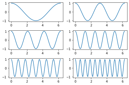
Plot \(y = \cos(kx)\) for \(k = 1, 2, 3, 5, 7, 10\) between \(x = 0\) and \(x = 2\pi\)
on a single axes;
on multiple axes.
Warning. The images we make in this section will not look very good. We’ll see a few ways to customize the style later.
import numpy as np
import matplotlib.pyplot as plt
𝑘_list = [1,2,3,5,7,10]
A common mistake is try typing pi on its own, but pi is not defined in Python. We will use np.pi to get access to \(\pi\).
x = np.linspace(0, 2*np.pi, 100)
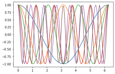
We’ve often tried to avoid using for loops in Math 9, but this is an example where I think using a for loop is the most natural approach. We have a single axes object, ax, and we call the plot method on it six times. We use lambda functions to quickly define the six functions we’re plotting. (Side comment: be sure to use k*x instead of kx. If you type kx, Python will look for a variable with the name kx. Another side comment: we defined x above and we use x as the variable in our lambda function. That is fine, they don’t conflict, but it is good to be concerned about that. The reason this works is because one of the two x variables is only defined inside a function.)
fig, ax = plt.subplots()

for k in k_list:
    f = lambda x: np.cos(k*x)
    y = f(x)
    ax.plot(x,y)
Now let’s see how to make these same six plots on different axes.
So far, we’ve been using plt.subplots(), with empty parentheses, but we can also pass some arguments to this subplots function. The name subplots, especially the “s” at the end of it, already hints that we can make multiple subplots in a single figure.
help(plt.subplots)
Help on function subplots in module matplotlib.pyplot:

subplots(nrows=1, ncols=1, *, sharex=False, sharey=False, squeeze=True, subplot_kw=None, gridspec_kw=None, **fig_kw)
    Create a figure and a set of subplots.

    This utility wrapper makes it convenient to create common layouts of
    subplots, including the enclosing figure object, in a single call.

    Parameters
    ----------
    nrows, ncols : int, default: 1
        Number of rows/columns of the subplot grid.

    sharex, sharey : bool or {'none', 'all', 'row', 'col'}, default: False
        Controls sharing of properties among x (*sharex*) or y (*sharey*)
        axes:

        - True or 'all': x- or y-axis will be shared among all subplots.
        - False or 'none': each subplot x- or y-axis will be independent.
        - 'row': each subplot row will share an x- or y-axis.
        - 'col': each subplot column will share an x- or y-axis.

        When subplots have a shared x-axis along a column, only the x tick
        labels of the bottom subplot are created. Similarly, when subplots
        have a shared y-axis along a row, only the y tick labels of the first
        column subplot are created. To later turn other subplots' ticklabels
        on, use `~matplotlib.axes.Axes.tick_params`.

        When subplots have a shared axis that has units, calling
        `~matplotlib.axis.Axis.set_units` will update each axis with the
        new units.

    squeeze : bool, default: True
        - If True, extra dimensions are squeezed out from the returned
          array of `~matplotlib.axes.Axes`:

          - if only one subplot is constructed (nrows=ncols=1), the
            resulting single Axes object is returned as a scalar.
          - for Nx1 or 1xM subplots, the returned object is a 1D numpy
            object array of Axes objects.
          - for NxM, subplots with N>1 and M>1 are returned as a 2D array.

        - If False, no squeezing at all is done: the returned Axes object is
          always a 2D array containing Axes instances, even if it ends up
          being 1x1.

    subplot_kw : dict, optional
        Dict with keywords passed to the
        `~matplotlib.figure.Figure.add_subplot` call used to create each
        subplot.

    gridspec_kw : dict, optional
        Dict with keywords passed to the `~matplotlib.gridspec.GridSpec`
        constructor used to create the grid the subplots are placed on.

    **fig_kw
        All additional keyword arguments are passed to the
        `.pyplot.figure` call.

    Returns
    -------
    fig : `~.figure.Figure`

    ax : `.axes.Axes` or array of Axes
        *ax* can be either a single `~matplotlib.axes.Axes` object or an
        array of Axes objects if more than one subplot was created.  The
        dimensions of the resulting array can be controlled with the squeeze
        keyword, see above.

        Typical idioms for handling the return value are::

            # using the variable ax for single a Axes
            fig, ax = plt.subplots()

            # using the variable axs for multiple Axes
            fig, axs = plt.subplots(2, 2)

            # using tuple unpacking for multiple Axes
            fig, (ax1, ax2) = plt.subplots(1, 2)
            fig, ((ax1, ax2), (ax3, ax4)) = plt.subplots(2, 2)

        The names ``ax`` and pluralized ``axs`` are preferred over ``axes``
        because for the latter it's not clear if it refers to a single
        `~.axes.Axes` instance or a collection of these.

    See Also
    --------
    .pyplot.figure
    .pyplot.subplot
    .pyplot.axes
    .Figure.subplots
    .Figure.add_subplot

    Examples
    --------
    ::

        # First create some toy data:
        x = np.linspace(0, 2*np.pi, 400)
        y = np.sin(x**2)

        # Create just a figure and only one subplot
        fig, ax = plt.subplots()
        ax.plot(x, y)
        ax.set_title('Simple plot')

        # Create two subplots and unpack the output array immediately
        f, (ax1, ax2) = plt.subplots(1, 2, sharey=True)
        ax1.plot(x, y)
        ax1.set_title('Sharing Y axis')
        ax2.scatter(x, y)

        # Create four polar axes and access them through the returned array
        fig, axs = plt.subplots(2, 2, subplot_kw=dict(projection="polar"))
        axs[0, 0].plot(x, y)
        axs[1, 1].scatter(x, y)

        # Share a X axis with each column of subplots
        plt.subplots(2, 2, sharex='col')

        # Share a Y axis with each row of subplots
        plt.subplots(2, 2, sharey='row')

        # Share both X and Y axes with all subplots
        plt.subplots(2, 2, sharex='all', sharey='all')

        # Note that this is the same as
        plt.subplots(2, 2, sharex=True, sharey=True)

        # Create figure number 10 with a single subplot
        # and clears it if it already exists.
        fig, ax = plt.subplots(num=10, clear=True)
In the following, plt.subplots(3,2), the 3 specifies that there should be three rows of axes and the 2 specifies that there should be two columns of axes.
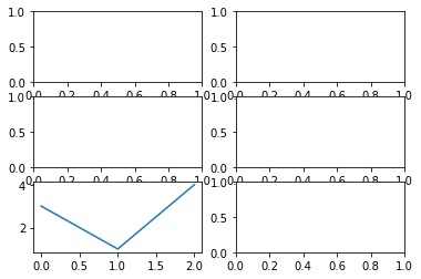
fig, axs = plt.subplots(3,2)

Previously, when we used fig, ax = plt.subplots(), the variable ax represented an Axes object. In this case, where we are using fig, axs = plt.subplots(3,2), the variable axs represents a NumPy array. (I found that quite surprising when I first learned it, since NumPy is an external library and not part of standard Python.)
type(axs)
numpy.ndarray
The shape of axs is (3,2), the same numbers as we passed to subplots. This corresponds to our figure holding a 3-by-2 grid of axes.
axs.shape
(3, 2)
The entries in axs are themselves Axes objects. For example, axs[1,1] will correspond to the Axes object in row 1, column 1 (where we start counting at 0). We would like to iterate through these six axes objects, and that will be easier to do if we have a “flattened” version of axs.
axs.reshape(-1)
array([<AxesSubplot:>, <AxesSubplot:>, <AxesSubplot:>, <AxesSubplot:>,
       <AxesSubplot:>, <AxesSubplot:>], dtype=object)
axs_flat = axs.reshape(-1)
We can use axs_flat to access all the subplots using a single index, with values 0 to 5. If we wanted to access for example axs_flat[4] using the original two-dimensional NumPy array axs, we would have to use two indices, axs[2,0].
axs_flat[4]
<AxesSubplot:>
We can call the plot method on these individual Axes objects, just like we did in the previous sections.
axs_flat[4].plot([3,1,4])
[<matplotlib.lines.Line2D at 0x115590c10>]
Notice how fig still holds six subplots, and one of these subplots now has a simple line plot drawn on it. (The [3,1,4] are viewed as the \(y\)-values, when only one input argument is given. Again, this convention is the same as in Matlab.)
fig
If we tried to access the 4-th element of the original two-dimensional NumPy array axs, an error would be raised. The following is trying to find the 4-th row of axs, but axs does not have a 4-th row.
axs[4]
---------------------------------------------------------------------------
IndexError                                Traceback (most recent call last)
Input In [15], in <cell line: 1>()
----> 1 axs[4]

IndexError: index 4 is out of bounds for axis 0 with size 3
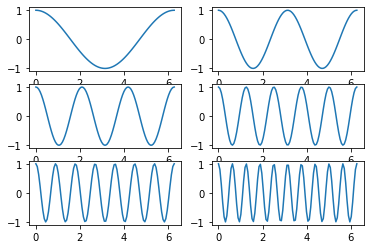
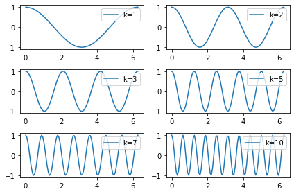
We need to pair the coefficient k_list[0] with the Axes object axs_flat[0], and to pair k_list[1] with axs_flat[1], and so on. The approach we use here is pretty un-Pythonic; we will see a better approach in the next section. We will also see later how to make the style look a little more modern.
fig, axs = plt.subplots(3,2)
axs_flat = axs.reshape(-1)

for i in range(len(k_list)):
    k = k_list[i]
    ax = axs_flat[i]
    f = lambda x: np.cos(k*x)
    y = f(x)
    ax.plot(x,y)

Replacing range(len(k_list))#
In the previous section, we used range(len(k_list)) to get the indices of elements in k_list. This was definitely more robust than just typing range(6), but it was not the Pythonic way to get these indices. We will see a better way to get those indices, using the function enumerate.
In our specific case, we never use the indices themselves; we only use them to access the corresponding elements in axs_flat. So for our particular use-case here, it is more Pythonic to skip the indices entirely and use zip.
We start by copy-pasting the final code form above.
import numpy as np
import matplotlib.pyplot as plt
𝑘_list = [1,2,3,5,7,10]
x = np.linspace(0, 2*np.pi, 100)
fig, axs = plt.subplots(3,2)
axs_flat = axs.reshape(-1)

for i in range(len(k_list)):
    k = k_list[i]
    ax = axs_flat[i]
    f = lambda x: np.cos(k*x)
    y = f(x)
    ax.plot(x,y)
Recall that k_list was our (somewhat random) list of coefficients.
k_list
[1, 2, 3, 5, 7, 10]
If we want both the index i and the corresponding entry k, the most Pythonic approach is to use the function enumerate. Here is an example, but do you see what mistake we have made?
for i,k in enumerate(k_list):
    print("The value of i is {i}")
    print("The value of k is {k}")
The value of i is {i}
The value of k is {k}
The value of i is {i}
The value of k is {k}
The value of i is {i}
The value of k is {k}
The value of i is {i}
The value of k is {k}
The value of i is {i}
The value of k is {k}
The value of i is {i}
The value of k is {k}
We were using f-string syntax, but we forgot to put the f before the quotation marks.
Notice how, for example, the index i = 4 corresponds to k = 7 inside of 𝑘_list = [1,2,3,5,7,10].
for i,k in enumerate(k_list):
    print(f"The value of i is {i}")
    print(f"The value of k is {k}")
The value of i is 0
The value of k is 1
The value of i is 1
The value of k is 2
The value of i is 2
The value of k is 3
The value of i is 3
The value of k is 5
The value of i is 4
The value of k is 7
The value of i is 5
The value of k is 10
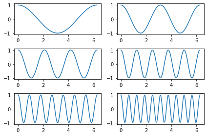
Now that the for loop gives us access to both the index i and the corresponding value of k, we can remove the k = k_list[i] portion of the above code. Maybe more importantly, we can replace the awkward-looking range(len(k_list)) portion with the more natural enumerate(k_list).
fig, axs = plt.subplots(3,2)
axs_flat = axs.reshape(-1)

for i,k in enumerate(k_list):
    ax = axs_flat[i]
    f = lambda x: np.cos(k*x)
    y = f(x)
    ax.plot(x,y)

Because we never actually used the i on its own (we only used it to find the corresponding element in axs_flat), it is even more Pythonic to use zip instead of enumerate.
Let’s introduce zip in an easier example. What zip will do is group the 0-th items together, the 1-st items together, and so on. For example, in the following, 10 and 4 get grouped together, because a_list[1] is 10 and b_list[1] is 4.
a_list = [7,10,2]
b_list = [3,4,5]

for a,b in zip(a_list, b_list):
    print(a,b)
7 3
10 4
2 5
The object actually produced by zip is a new type of object (a zip object!).
zip(a_list, b_list)
<zip at 0x1156b8ac0>
type(zip(a_list, b_list))
zip
But we can convert this zip object to for example a list, and then it is more clear how to think about zip(a_list, b_list). The list version is a list of length-2 tuples, where each tuple contains an element from a_list and the corresponding element from b_list.
list(zip(a_list, b_list))
[(7, 3), (10, 4), (2, 5)]
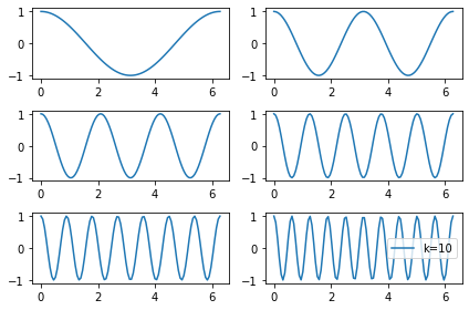
It’s now pretty much effortless to make our six plots using zip. Notice how we are able to remove the line ax = axs_flat[i] from the for loop, since ax is getting automatically assigned by the for loop statement for k,ax in zip(k_list, axs_flat):.
fig, axs = plt.subplots(3,2)
axs_flat = axs.reshape(-1)

for k,ax in zip(k_list, axs_flat):
    f = lambda x: np.cos(k*x)
    y = f(x)
    ax.plot(x,y)

We’ve now seen three different approaches of making these six plots, one approach using range, one approach using enumerate, and one approach using zip. All three are important to know, but in this particular example, the zip approach is the most Pythonic.
Adjusting the appearance#
The plots we’ve made so far look pretty old-fashioned in comparison to modern plotting libraries. This section will be a quick introduction to some of the ways we can adjust the style of our Matplotlib plots. (The plots still will not look great after making these changes. I recommend browsing the Matplotlib example gallery to see some beautiful visualizations that can be made using Matplotlib.)
import numpy as np
import matplotlib.pyplot as plt
Here is our starting code. The code itself I think is good; it is the final visualization that I want us to improve.
𝑘_list = [1,2,3,5,7,10]
x = np.linspace(0, 2*np.pi, 100)

fig, axs = plt.subplots(3,2)
axs_flat = axs.reshape(-1)

for k,ax in zip(k_list, axs_flat):
    f = lambda x: np.cos(k*x)
    y = f(x)
    ax.plot(x,y)

The first improvement we are going to make is to call the tight_layout method on the Figure object. I’ve never understood why it is called tight_layout, but this will spread out the subplots, so that the axis numbers are not getting cut off by the adjacent plots.
Don’t worry about memorizing any of the styling code from this section. The important thing is to be aware these stylizations exist, and to understand what they are doing when you see the code.
The following code works, but there is something a little strange about it. Do you see what is strange?
𝑘_list = [1,2,3,5,7,10]
x = np.linspace(0, 2*np.pi, 100)

fig, axs = plt.subplots(3,2)
axs_flat = axs.reshape(-1)

for k,ax in zip(k_list, axs_flat):
    f = lambda x: np.cos(k*x)
    y = f(x)
    ax.plot(x,y)
    fig.tight_layout()
Since there is only one Figure object in this chart, it is a little strange that we are calling fig.tight_layout() inside the for loop, so it is getting called six times. It makes more sense to call it outside of the for loop. We add a line break and we remove the indentation. The line break is just for readability; removing the indentation is what takes fig.tight_layout() out of the for loop.
𝑘_list = [1,2,3,5,7,10]
x = np.linspace(0, 2*np.pi, 100)

fig, axs = plt.subplots(3,2)
axs_flat = axs.reshape(-1)

for k,ax in zip(k_list, axs_flat):
    f = lambda x: np.cos(k*x)
    y = f(x)
    ax.plot(x,y)

fig.tight_layout()
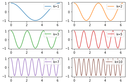
Next we add a legend to the chart. We do this in two stages. In stage one, we add a label to each of the subplots, using an f-string. In stage two, we tell Matplotlib to display the label in a legend, using the legend method of the Axes object.
(For many of these customizations, I expect there are many different ways to create the same effect, and I don’t necessarily claim the way introduced here is best. One overall complaint I have about Matplotlib is that there are often many different ways to do the same thing. That may sound like a good thing, but I find it makes the methods harder to learn.)
Here only one legend gets displayed. Do you see what we did wrong?
𝑘_list = [1,2,3,5,7,10]
x = np.linspace(0, 2*np.pi, 100)

fig, axs = plt.subplots(3,2)
axs_flat = axs.reshape(-1)

for k,ax in zip(k_list, axs_flat):
    f = lambda x: np.cos(k*x)
    y = f(x)
    ax.plot(x,y, label=f"k={k}")

ax.legend()
fig.tight_layout()
The mistake above was the opposite of the mistake we made with fig.tight_layout(). Above we were calling ax.legend() outside of the for loop, but there are six different Axes objects, each represented by the variable name ax, so we need to call this legend method within the for loop.
The following works, but the image looks pretty strange, because the Matplotlib is choosing different default locations for the legend for each of the six subplots.
𝑘_list = [1,2,3,5,7,10]
x = np.linspace(0, 2*np.pi, 100)

fig, axs = plt.subplots(3,2)
axs_flat = axs.reshape(-1)

for k,ax in zip(k_list, axs_flat):
    f = lambda x: np.cos(k*x)
    y = f(x)
    ax.plot(x,y, label=f"k={k}")
    ax.legend()

fig.tight_layout()
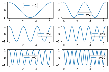
Let’s specify that the legend should always be in the upper-right by passing loc="upper right" as an argument to the legend method. (Definitely do not bother memorizing for example that it needs to be "upper right" with a space between the words.)
𝑘_list = [1,2,3,5,7,10]
x = np.linspace(0, 2*np.pi, 100)

fig, axs = plt.subplots(3,2)
axs_flat = axs.reshape(-1)

for k,ax in zip(k_list, axs_flat):
    f = lambda x: np.cos(k*x)
    y = f(x)
    ax.plot(x,y, label=f"k={k}")
    ax.legend(loc="upper right")

fig.tight_layout()
The next portion is about some options for changing colors. Usually we work with matplotlib.pyplot, but here we are working with a different submodule, the colors submodule. For now we will just import a single dictionary from matplotlib.colors. I knew this variable name with “TA”, but I didn’t exactly remember the name, so I typed from matplotlib.colors import TA and hit the tab key, and it autocompleted for me. The name of TABLEAU_COLORS is not very easy to type, so we will give it the abbreviation tcolors. (Most abbreviations we use in Math 9 are standard, and it would be a mistake to use anything else. This tcolors is an exception; we just made up that abbreviation, and it would be fine to use a different one.)
from matplotlib.colors import TABLEAU_COLORS as tcolors
tcolors
{'tab:blue': '#1f77b4',
 'tab:orange': '#ff7f0e',
 'tab:green': '#2ca02c',
 'tab:red': '#d62728',
 'tab:purple': '#9467bd',
 'tab:brown': '#8c564b',
 'tab:pink': '#e377c2',
 'tab:gray': '#7f7f7f',
 'tab:olive': '#bcbd22',
 'tab:cyan': '#17becf'}
The colors here are the colors used by default in Matplotlib. For example, if we make two plots on the same axes, the first plot will be in the color “tab:blue” and the second plot will be in the color “tab:orange”.
We will just use the keys from this dictionary. We can access those keys by using the keys method of a dictionary object. This method returns something similar to a list, but notice that the object returned is not a list.
tcolors.keys()
dict_keys(['tab:blue', 'tab:orange', 'tab:green', 'tab:red', 'tab:purple', 'tab:brown', 'tab:pink', 'tab:gray', 'tab:olive', 'tab:cyan'])
Not surprisingly, there is also a corresponding values method.
tcolors.values()
dict_values(['#1f77b4', '#ff7f0e', '#2ca02c', '#d62728', '#9467bd', '#8c564b', '#e377c2', '#7f7f7f', '#bcbd22', '#17becf'])
Let’s try to get access to these colors. Read the following error message (especially the last line of the error message and maybe the arrow showing where the error occurred). Do you see what we did wrong?
𝑘_list = [1,2,3,5,7,10]
x = np.linspace(0, 2*np.pi, 100)

fig, axs = plt.subplots(3,2)
axs_flat = axs.reshape(-1)

for k,ax in zip(k_list, axs_flat, tcolors.keys()):
    f = lambda x: np.cos(k*x)
    y = f(x)
    ax.plot(x,y, label=f"k={k}")
    ax.legend(loc="upper right")

fig.tight_layout()
---------------------------------------------------------------------------
ValueError                                Traceback (most recent call last)
Input In [12], in <cell line: 7>()
      4 fig, axs = plt.subplots(3,2)
      5 axs_flat = axs.reshape(-1)
----> 7 for k,ax in zip(k_list, axs_flat, tcolors.keys()):
      8     f = lambda x: np.cos(k*x)
      9     y = f(x)

ValueError: too many values to unpack (expected 2)
Do you understand what the error message is telling us? I had originally thought that zip needed to be applied to things of all the same length, but I was wrong, and in this case having tcolors.keys() be length longer than length 6 is no problem.
The problem is that when we do tuple unpacking using for example k,ax in ..., there needs to be two values in each tuple, one which will get assigned to k and one which will get assigned to ax. When we zip together three different objects, as in zip(k_list, axs_flat, tcolors.keys()), then we need to provide three variable names. The keyword name for color is c.
If you go through these colors and compare them to the (messy) chart above where we made all of the plots on a single Axes object, the colors should be the same, because these colors should be the same as the default colors used by Matplotlib, and in the same order.
𝑘_list = [1,2,3,5,7,10]
x = np.linspace(0, 2*np.pi, 100)

fig, axs = plt.subplots(3,2)
axs_flat = axs.reshape(-1)

for k,ax,color in zip(k_list, axs_flat, tcolors.keys()):
    f = lambda x: np.cos(k*x)
    y = f(x)
    ax.plot(x,y, label=f"k={k}", c=color)
    ax.legend(loc="upper right")

fig.tight_layout()
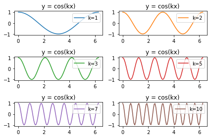
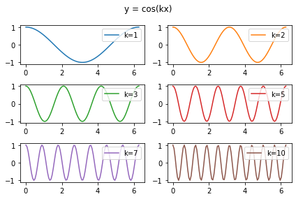
Next let’s see how to add a title. There are a few different approaches. Here we add a title to each subplot.
𝑘_list = [1,2,3,5,7,10]
x = np.linspace(0, 2*np.pi, 100)

fig, axs = plt.subplots(3,2)
axs_flat = axs.reshape(-1)

for k,ax,color in zip(k_list, axs_flat, tcolors.keys()):
    f = lambda x: np.cos(k*x)
    y = f(x)
    ax.plot(x,y, label=f"k={k}", c=color)
    ax.legend(loc="upper right")
    ax.set(title="y = cos(kx)")

fig.tight_layout()
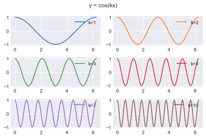
Here we add a title to the entire figure.
𝑘_list = [1,2,3,5,7,10]
x = np.linspace(0, 2*np.pi, 100)

fig, axs = plt.subplots(3,2)
axs_flat = axs.reshape(-1)

for k,ax,color in zip(k_list, axs_flat, tcolors.keys()):
    f = lambda x: np.cos(k*x)
    y = f(x)
    ax.plot(x,y, label=f"k={k}", c=color)
    ax.legend(loc="upper right")

fig.suptitle("y = cos(kx)")
fig.tight_layout()
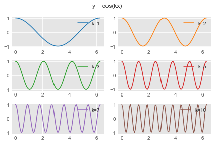
The default styling in Matplotlib can be replaced with a variety of different pre-defined options. I think big improvements can be made by setting different styles. The following line will change all future Matplotlib calls until you restart the kernel. The style option I use most often is “seaborn-darkgrid”. (Seaborn itself is a very nice plotting library; Seaborn is built on Matplotlib.)
plt.style.use('seaborn-darkgrid')
The following code is verbatim the same as the code above. I think the resulting figure looks a lot nicer with the Seaborn styling.
𝑘_list = [1,2,3,5,7,10]
x = np.linspace(0, 2*np.pi, 100)

fig, axs = plt.subplots(3,2)
axs_flat = axs.reshape(-1)

for k,ax,color in zip(k_list, axs_flat, tcolors.keys()):
    f = lambda x: np.cos(k*x)
    y = f(x)
    ax.plot(x,y, label=f"k={k}", c=color)
    ax.legend(loc="upper right")

fig.suptitle("y = cos(kx)")
fig.tight_layout()
Here is a list of all the available plotting styles. (Challenge. Can you use a for loop to display the above figure in each of these different styles? My attempt to do that failed.)
plt.style.available
['Solarize_Light2',
 '_classic_test_patch',
 '_mpl-gallery',
 '_mpl-gallery-nogrid',
 'bmh',
 'classic',
 'dark_background',
 'fast',
 'fivethirtyeight',
 'ggplot',
 'grayscale',
 'seaborn',
 'seaborn-bright',
 'seaborn-colorblind',
 'seaborn-dark',
 'seaborn-dark-palette',
 'seaborn-darkgrid',
 'seaborn-deep',
 'seaborn-muted',
 'seaborn-notebook',
 'seaborn-paper',
 'seaborn-pastel',
 'seaborn-poster',
 'seaborn-talk',
 'seaborn-ticks',
 'seaborn-white',
 'seaborn-whitegrid',
 'tableau-colorblind10']
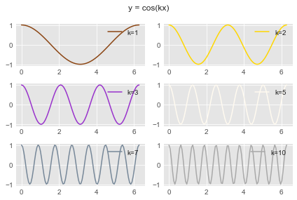
Here is another pre-defined style I like, called “ggplot”. (The “gg” in “ggplot” stands for “grammar of graphics”, which is an approach towards plotting used by many of my favorite Python plotting libraries, such as Altair, Plotly, and Seaborn. The original ggplot plotting library was I believe for the R programming language.)
plt.style.use('ggplot')
𝑘_list = [1,2,3,5,7,10]
x = np.linspace(0, 2*np.pi, 100)

fig, axs = plt.subplots(3,2)
axs_flat = axs.reshape(-1)

for k,ax,color in zip(k_list, axs_flat, tcolors.keys()):
    f = lambda x: np.cos(k*x)
    y = f(x)
    ax.plot(x,y, label=f"k={k}", c=color)
    ax.legend(loc="upper right")

fig.suptitle("y = cos(kx)")
fig.tight_layout()
As one last example, let’s choose random colors. There are only 10 colors that are part of the TABLEAU_COLORS dictionary, but there are many more that are part of the CSS4_COLORS dictionary.
from matplotlib.colors import TABLEAU_COLORS as tcolors
len(tcolors)
10
from matplotlib.colors import TABLEAU_COLORS as tcolors, CSS4_COLORS as ccolors
len(ccolors)
148
These CSS4_COLORS include color names that are recognized in html, for example.
ccolors
{'aliceblue': '#F0F8FF',
 'antiquewhite': '#FAEBD7',
 'aqua': '#00FFFF',
 'aquamarine': '#7FFFD4',
 'azure': '#F0FFFF',
 'beige': '#F5F5DC',
 'bisque': '#FFE4C4',
 'black': '#000000',
 'blanchedalmond': '#FFEBCD',
 'blue': '#0000FF',
 'blueviolet': '#8A2BE2',
 'brown': '#A52A2A',
 'burlywood': '#DEB887',
 'cadetblue': '#5F9EA0',
 'chartreuse': '#7FFF00',
 'chocolate': '#D2691E',
 'coral': '#FF7F50',
 'cornflowerblue': '#6495ED',
 'cornsilk': '#FFF8DC',
 'crimson': '#DC143C',
 'cyan': '#00FFFF',
 'darkblue': '#00008B',
 'darkcyan': '#008B8B',
 'darkgoldenrod': '#B8860B',
 'darkgray': '#A9A9A9',
 'darkgreen': '#006400',
 'darkgrey': '#A9A9A9',
 'darkkhaki': '#BDB76B',
 'darkmagenta': '#8B008B',
 'darkolivegreen': '#556B2F',
 'darkorange': '#FF8C00',
 'darkorchid': '#9932CC',
 'darkred': '#8B0000',
 'darksalmon': '#E9967A',
 'darkseagreen': '#8FBC8F',
 'darkslateblue': '#483D8B',
 'darkslategray': '#2F4F4F',
 'darkslategrey': '#2F4F4F',
 'darkturquoise': '#00CED1',
 'darkviolet': '#9400D3',
 'deeppink': '#FF1493',
 'deepskyblue': '#00BFFF',
 'dimgray': '#696969',
 'dimgrey': '#696969',
 'dodgerblue': '#1E90FF',
 'firebrick': '#B22222',
 'floralwhite': '#FFFAF0',
 'forestgreen': '#228B22',
 'fuchsia': '#FF00FF',
 'gainsboro': '#DCDCDC',
 'ghostwhite': '#F8F8FF',
 'gold': '#FFD700',
 'goldenrod': '#DAA520',
 'gray': '#808080',
 'green': '#008000',
 'greenyellow': '#ADFF2F',
 'grey': '#808080',
 'honeydew': '#F0FFF0',
 'hotpink': '#FF69B4',
 'indianred': '#CD5C5C',
 'indigo': '#4B0082',
 'ivory': '#FFFFF0',
 'khaki': '#F0E68C',
 'lavender': '#E6E6FA',
 'lavenderblush': '#FFF0F5',
 'lawngreen': '#7CFC00',
 'lemonchiffon': '#FFFACD',
 'lightblue': '#ADD8E6',
 'lightcoral': '#F08080',
 'lightcyan': '#E0FFFF',
 'lightgoldenrodyellow': '#FAFAD2',
 'lightgray': '#D3D3D3',
 'lightgreen': '#90EE90',
 'lightgrey': '#D3D3D3',
 'lightpink': '#FFB6C1',
 'lightsalmon': '#FFA07A',
 'lightseagreen': '#20B2AA',
 'lightskyblue': '#87CEFA',
 'lightslategray': '#778899',
 'lightslategrey': '#778899',
 'lightsteelblue': '#B0C4DE',
 'lightyellow': '#FFFFE0',
 'lime': '#00FF00',
 'limegreen': '#32CD32',
 'linen': '#FAF0E6',
 'magenta': '#FF00FF',
 'maroon': '#800000',
 'mediumaquamarine': '#66CDAA',
 'mediumblue': '#0000CD',
 'mediumorchid': '#BA55D3',
 'mediumpurple': '#9370DB',
 'mediumseagreen': '#3CB371',
 'mediumslateblue': '#7B68EE',
 'mediumspringgreen': '#00FA9A',
 'mediumturquoise': '#48D1CC',
 'mediumvioletred': '#C71585',
 'midnightblue': '#191970',
 'mintcream': '#F5FFFA',
 'mistyrose': '#FFE4E1',
 'moccasin': '#FFE4B5',
 'navajowhite': '#FFDEAD',
 'navy': '#000080',
 'oldlace': '#FDF5E6',
 'olive': '#808000',
 'olivedrab': '#6B8E23',
 'orange': '#FFA500',
 'orangered': '#FF4500',
 'orchid': '#DA70D6',
 'palegoldenrod': '#EEE8AA',
 'palegreen': '#98FB98',
 'paleturquoise': '#AFEEEE',
 'palevioletred': '#DB7093',
 'papayawhip': '#FFEFD5',
 'peachpuff': '#FFDAB9',
 'peru': '#CD853F',
 'pink': '#FFC0CB',
 'plum': '#DDA0DD',
 'powderblue': '#B0E0E6',
 'purple': '#800080',
 'rebeccapurple': '#663399',
 'red': '#FF0000',
 'rosybrown': '#BC8F8F',
 'royalblue': '#4169E1',
 'saddlebrown': '#8B4513',
 'salmon': '#FA8072',
 'sandybrown': '#F4A460',
 'seagreen': '#2E8B57',
 'seashell': '#FFF5EE',
 'sienna': '#A0522D',
 'silver': '#C0C0C0',
 'skyblue': '#87CEEB',
 'slateblue': '#6A5ACD',
 'slategray': '#708090',
 'slategrey': '#708090',
 'snow': '#FFFAFA',
 'springgreen': '#00FF7F',
 'steelblue': '#4682B4',
 'tan': '#D2B48C',
 'teal': '#008080',
 'thistle': '#D8BFD8',
 'tomato': '#FF6347',
 'turquoise': '#40E0D0',
 'violet': '#EE82EE',
 'wheat': '#F5DEB3',
 'white': '#FFFFFF',
 'whitesmoke': '#F5F5F5',
 'yellow': '#FFFF00',
 'yellowgreen': '#9ACD32'}
Let’s see how we can choose six random colors from this CSS4_COLORS dictionary.
rng = np.random.default_rng()
We will use the choice method of rng to choose six of these random colors. It is not obvious to me why the following does not work.
colors = rng.choice(ccolors.keys(), size=len(k_list))
---------------------------------------------------------------------------
TypeError                                 Traceback (most recent call last)
File _generator.pyx:712, in numpy.random._generator.Generator.choice()

TypeError: 'dict_keys' object cannot be interpreted as an integer

The above exception was the direct cause of the following exception:

ValueError                                Traceback (most recent call last)
Input In [29], in <cell line: 1>()
----> 1 colors = rng.choice(ccolors.keys(), size=len(k_list))

File _generator.pyx:714, in numpy.random._generator.Generator.choice()

ValueError: a must be a sequence or an integer, not <class 'dict_keys'>
To fix the error, we convert ccolors.keys() to a list.
colors = rng.choice(list(ccolors.keys()), size=len(k_list))
Here are the six colors chosen in this case. (If you run the code, you’ll get different colors, because we haven’t specified a seed when we instantiated the random number generator.)
colors
array(['saddlebrown', 'gold', 'darkorchid', 'floralwhite',
       'lightslategrey', 'darkgrey'], dtype='<U20')
Here we are using the randomly chosen colors. We replace the tcolors.keys() in the zip with our colors NumPy array we just created.
𝑘_list = [1,2,3,5,7,10]
x = np.linspace(0, 2*np.pi, 100)

fig, axs = plt.subplots(3,2)
axs_flat = axs.reshape(-1)

for k,ax,color in zip(k_list, axs_flat, colors):
    f = lambda x: np.cos(k*x)
    y = f(x)
    ax.plot(x,y, label=f"k={k}", c=color)
    ax.legend(loc="upper right")

fig.suptitle("y = cos(kx)")
fig.tight_layout()
There is certainly much more we could do involving customizations of Matplotlib plots, but we are going to go on to a new topic, Newton’s Method.