Worksheet Week 4 & Homework 4
The Worksheet and Homework are the same this week. For the Worksheet assignment, just turn in your progress as of Tuesday. The Worksheet assignment is graded on effort.
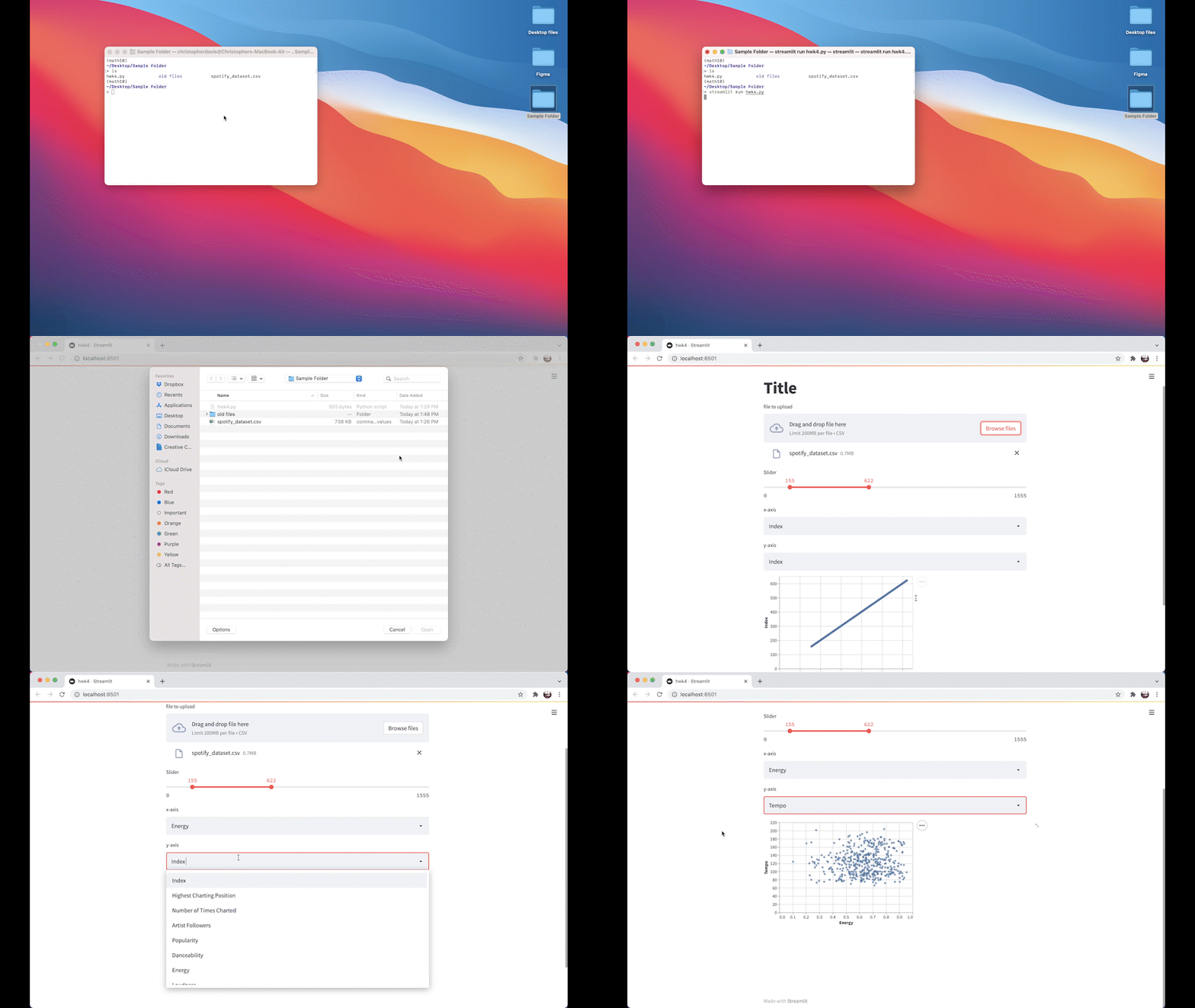
In this assignment we will make a Streamlit app (Video: Intro to Streamlit, 5:25). When run, this app lets the user upload a csv file, and then choose which columns to plot in an Altair chart. Here is a short preview (but your app will have more features).

Work in a group of 1-3 students. Streamlit apps are written as .py files, not as Jupyter notebooks. The suggested text editor to use is Spyder from within Anaconda Navigator, but there are many other good (also free) choices, such as Visual Studio Code.
Your app should have the following features.
Give your app a title.
List the names of everyone in your group. Have each individual name hyperlinked to their GitHub repository. One way to do this could be using
st.markdown. (When you’re not sure how to use one of these commands, try looking at the Streamlit documentation. For example, here is the documentation for st.markdown. Try scrolling down in the documentation to the example to get a sense for basic usage ofst.markdown.)Include a file uploader widget using
st.file_uploader. Force the file to have extension csv, using thetypekeyword argument.Make a pandas DataFrame from the file. (For my way of doing this, I got an error until the file was actually uploaded. So put this in an if statement or in a try-except block.)
Using
applymapand a lambda function, replace all string entries consisting of a single blank space" "in the DataFrame with NumPy’s not-a-number. (The point of this is just to improve our ability to test on the Spotify dataset, and to practice with lambda functions.)Using list comprehension, make a list containing the names of all the columns of the DataFrame which can be made numeric. (See the material from the Friday, Week 3 lecture, for one method for doing this and the next part.)
Replace the DataFrame with another version, where all those columns are made numeric.
Use
st.selectboxto let the user choose any numeric column for the \(x\)-axis. Use another selectbox for the \(y\)-axis.Use the range slider version of
st.sliderto allow the user to select the rows they want plotted. Have the minimum be 0 and the maximum be the number of rows in the file.Use an f-string and
st.writeto display some information about the chosen data.Use
st.altair_chartto display the chart with the chosen \(x\)-axis, \(y\)-axis, and rows.Include at least one extra element in the app, beyond what is specified above. Your choice.
Optional, but recommended
Test your app using our usual Udemy dataset or Spotify dataset. The Spotify dataset especially is a good test dataset, because most of those columns do not start out being numeric.
Optional, for 5 homework extra credit points
Make your app public using the free Streamlit Cloud, Community Tier (instructions). Put a link to your app in the comments section on Canvas for this homework. If there are multiple group members, only the members who share the app on their own Streamlit Cloud account will get the bonus points. (Sharing an app this way will be required later in the class, so this is a chance to learn the procedure early.)
