Visualization in Python
Contents
Visualization in Python
Recording of lecture from 1/19/2022
The most important visualization library in Math 10 is Altair. Today I want to introduce Altair and two other similar libraries, Seaborn and Plotly Express. All three of these are based on a concept called the Grammar of Graphics, which I believe was invented in this book, The Grammar of Graphics, which is free to download from on campus or using VPN.
The most famous visualization library in Python is Matplotlib. We won’t talk about Matplotlib today. It is quite different from the libraries we will discuss today (Seaborn is built on top of Matplotlib).
import numpy as np
import pandas as pd
import altair as alt
import seaborn as sns
import plotly.express as px
np.arange(0,1.1,0.25)
array([0. , 0.25, 0.5 , 0.75, 1. ])
Here is the “by hand” way to make a pandas DataFrame.
Using np.arange is a little difficult in this context because we need to make sure its length is the same as the length of the other columns.
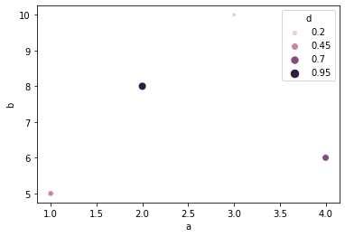
df = pd.DataFrame({"a":[3,1,4,2],"b":[10,5,6,8],"c":["first","second","third","fourth"],
    "d":np.arange(0.2,1.1,0.25)})
df
| a | b | c | d | |
|---|---|---|---|---|
| 0 | 3 | 10 | first | 0.20 |
| 1 | 1 | 5 | second | 0.45 |
| 2 | 4 | 6 | third | 0.70 |
| 3 | 2 | 8 | fourth | 0.95 |
Put your mouse over one of the points to see the effect of the tooltip.
alt.Chart(df).mark_circle().encode(
    x = "a",
    y = "b",
    color = "d",
    size = "d",
    tooltip = ["a","c"]
)
alt.Chart(df).mark_bar().encode(
    x = "a",
    y = "b"
)
alt.Chart(df).mark_bar(width=30).encode(
    x = "a",
    y = "b"
)
To make a scatter plot in Altair, you use mark_circle. In Seaborn, you use scatterplot. The syntax is very similar.
sns.scatterplot(
    data = df,
    x = "a",
    y = "b",
    hue = "d",
    size = "d",
)
<AxesSubplot:xlabel='a', ylabel='b'>
The same thing for Plotly Express.
px.scatter(
    data_frame=df,
    x = "a",
    y = "b",
    color = "d",
    size = "d",
)
Penguins dataset from Seaborn
df = sns.load_dataset("penguins")
df.head()
| species | island | bill_length_mm | bill_depth_mm | flipper_length_mm | body_mass_g | sex | |
|---|---|---|---|---|---|---|---|
| 0 | Adelie | Torgersen | 39.1 | 18.7 | 181.0 | 3750.0 | Male |
| 1 | Adelie | Torgersen | 39.5 | 17.4 | 186.0 | 3800.0 | Female |
| 2 | Adelie | Torgersen | 40.3 | 18.0 | 195.0 | 3250.0 | Female |
| 3 | Adelie | Torgersen | NaN | NaN | NaN | NaN | NaN |
| 4 | Adelie | Torgersen | 36.7 | 19.3 | 193.0 | 3450.0 | Female |
df.shape
(344, 7)
df.dtypes
species               object
island                object
bill_length_mm       float64
bill_depth_mm        float64
flipper_length_mm    float64
body_mass_g          float64
sex                   object
dtype: object
alt.Chart(df).mark_circle().encode(
    x = "bill_length_mm",
    y = "bill_depth_mm",
    color = "species"
)
px.scatter(
    data_frame=df,
    x = "bill_length_mm",
    y = "bill_depth_mm",
    color = "species"
)
sns.scatterplot(
    data = df,
    x = "bill_length_mm",
    y = "bill_depth_mm",
    hue = "species"
)
<AxesSubplot:xlabel='bill_length_mm', ylabel='bill_depth_mm'>
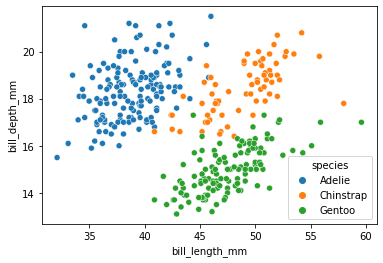
By default, the Altair axes will include 0. If you want to remove them, the code gets a little longer.
alt.Chart(df).mark_circle().encode(
    x = alt.X("bill_length_mm",scale = alt.Scale(zero=False)),
    y = alt.Y("bill_depth_mm", scale = alt.Scale(zero=False)),
    color = "species"
)
Adding a tooltip that includes all the data.
alt.Chart(df).mark_circle().encode(
    x = alt.X("bill_length_mm",scale = alt.Scale(zero=False)),
    y = alt.Y("bill_depth_mm", scale = alt.Scale(zero=False)),
    color = "species",
    size = "body_mass_g",
    opacity = "body_mass_g",
    tooltip = list(df.columns)
)
Plotting just the data from rows 200 to 300.
alt.Chart(df[200:300]).mark_circle().encode(
    x = alt.X("bill_length_mm",scale = alt.Scale(zero=False)),
    y = alt.Y("bill_depth_mm", scale = alt.Scale(zero=False)),
    color = "species",
    size = "body_mass_g",
    opacity = "body_mass_g",
    tooltip = list(df.columns)
)
df[200:300] and df.iloc[200:300] mean the same thing; the one is just an abbreviation for the other.
Can you find the point on the above plot that corresponds to row 200?
df.iloc[200:300]
| species | island | bill_length_mm | bill_depth_mm | flipper_length_mm | body_mass_g | sex | |
|---|---|---|---|---|---|---|---|
| 200 | Chinstrap | Dream | 51.5 | 18.7 | 187.0 | 3250.0 | Male |
| 201 | Chinstrap | Dream | 49.8 | 17.3 | 198.0 | 3675.0 | Female |
| 202 | Chinstrap | Dream | 48.1 | 16.4 | 199.0 | 3325.0 | Female |
| 203 | Chinstrap | Dream | 51.4 | 19.0 | 201.0 | 3950.0 | Male |
| 204 | Chinstrap | Dream | 45.7 | 17.3 | 193.0 | 3600.0 | Female |
| ... | ... | ... | ... | ... | ... | ... | ... |
| 295 | Gentoo | Biscoe | 48.6 | 16.0 | 230.0 | 5800.0 | Male |
| 296 | Gentoo | Biscoe | 47.5 | 14.2 | 209.0 | 4600.0 | Female |
| 297 | Gentoo | Biscoe | 51.1 | 16.3 | 220.0 | 6000.0 | Male |
| 298 | Gentoo | Biscoe | 45.2 | 13.8 | 215.0 | 4750.0 | Female |
| 299 | Gentoo | Biscoe | 45.2 | 16.4 | 223.0 | 5950.0 | Male |
100 rows × 7 columns
df.columns
Index(['species', 'island', 'bill_length_mm', 'bill_depth_mm',
       'flipper_length_mm', 'body_mass_g', 'sex'],
      dtype='object')
type(df.columns)
pandas.core.indexes.base.Index
list(df.columns)
['species',
 'island',
 'bill_length_mm',
 'bill_depth_mm',
 'flipper_length_mm',
 'body_mass_g',
 'sex']
The best way to convert df.columns from a pandas Index into a list is to use list(df.columns). Just for practice, we also convert it into a list using list comprehension.
[c for c in df.columns]
['species',
 'island',
 'bill_length_mm',
 'bill_depth_mm',
 'flipper_length_mm',
 'body_mass_g',
 'sex']
Instead of the penguins dataset, there are others we could have imported also.
sns.get_dataset_names()
['anagrams',
 'anscombe',
 'attention',
 'brain_networks',
 'car_crashes',
 'diamonds',
 'dots',
 'exercise',
 'flights',
 'fmri',
 'gammas',
 'geyser',
 'iris',
 'mpg',
 'penguins',
 'planets',
 'taxis',
 'tips',
 'titanic']
df_tips = sns.load_dataset("tips")
df_tips
| total_bill | tip | sex | smoker | day | time | size | |
|---|---|---|---|---|---|---|---|
| 0 | 16.99 | 1.01 | Female | No | Sun | Dinner | 2 |
| 1 | 10.34 | 1.66 | Male | No | Sun | Dinner | 3 |
| 2 | 21.01 | 3.50 | Male | No | Sun | Dinner | 3 |
| 3 | 23.68 | 3.31 | Male | No | Sun | Dinner | 2 |
| 4 | 24.59 | 3.61 | Female | No | Sun | Dinner | 4 |
| ... | ... | ... | ... | ... | ... | ... | ... |
| 239 | 29.03 | 5.92 | Male | No | Sat | Dinner | 3 |
| 240 | 27.18 | 2.00 | Female | Yes | Sat | Dinner | 2 |
| 241 | 22.67 | 2.00 | Male | Yes | Sat | Dinner | 2 |
| 242 | 17.82 | 1.75 | Male | No | Sat | Dinner | 2 |
| 243 | 18.78 | 3.00 | Female | No | Thur | Dinner | 2 |
244 rows × 7 columns
We can save this using the to_csv method. If you don’t want the row names included (the “index”), then set index = false.
df_tips.to_csv("tips.csv", index=False)
In Deepnote, if you click on the corresponding csv file in the files section, it will automatically sort the rows. Here is how you do that same thing using pandas.
df_tips.sort_values("total_bill",ascending=False)
| total_bill | tip | sex | smoker | day | time | size | |
|---|---|---|---|---|---|---|---|
| 170 | 50.81 | 10.00 | Male | Yes | Sat | Dinner | 3 |
| 212 | 48.33 | 9.00 | Male | No | Sat | Dinner | 4 |
| 59 | 48.27 | 6.73 | Male | No | Sat | Dinner | 4 |
| 156 | 48.17 | 5.00 | Male | No | Sun | Dinner | 6 |
| 182 | 45.35 | 3.50 | Male | Yes | Sun | Dinner | 3 |
| ... | ... | ... | ... | ... | ... | ... | ... |
| 149 | 7.51 | 2.00 | Male | No | Thur | Lunch | 2 |
| 111 | 7.25 | 1.00 | Female | No | Sat | Dinner | 1 |
| 172 | 7.25 | 5.15 | Male | Yes | Sun | Dinner | 2 |
| 92 | 5.75 | 1.00 | Female | Yes | Fri | Dinner | 2 |
| 67 | 3.07 | 1.00 | Female | Yes | Sat | Dinner | 1 |
244 rows × 7 columns