
Analysis and predictions based on data from Premier League#
Author: Ruizhe Cheng
Course Project, UC Irvine, Math 10, S23
Introduction#
Introduce your project here. Maybe 3 sentences.
As a soccer fan, I want to choose some dataset related to soccer. I choose the dataset of Premier League, which has most detailed data. In my project, I take the data of season 2020-21, and seperate the data into two splits: Home Team and Away Team. I first visualize those data and tried to find the estimated goals and match results. I hope I can show the charm of soccerthrough my project.
Importing and setting up the data#
import pandas as pd
import altair as alt
import numpy as np
import matplotlib.pyplot as plt
from sklearn.ensemble import RandomForestRegressor
from sklearn.tree import DecisionTreeClassifier, plot_tree
from sklearn.model_selection import train_test_split
from sklearn.linear_model import LogisticRegression
from sklearn.metrics import mean_squared_error, classification_report
from sklearn.preprocessing import StandardScaler
from sklearn.neighbors import KNeighborsClassifier
from sklearn.cluster import KMeans
df_pre = pd.read_csv("results.csv")
df_pre.sample(10)
| Season | DateTime | HomeTeam | AwayTeam | FTHG | FTAG | FTR | HTHG | HTAG | HTR | ... | HST | AST | HC | AC | HF | AF | HY | AY | HR | AR | |
|---|---|---|---|---|---|---|---|---|---|---|---|---|---|---|---|---|---|---|---|---|---|
| 6473 | 2009-10 | 2010-02-01T00:00:00Z | Sunderland | Stoke | 0 | 0 | D | 0.0 | 0.0 | D | ... | 5.0 | 3.0 | 7.0 | 3.0 | 7.0 | 16.0 | 2.0 | 3.0 | 0.0 | 0.0 |
| 287 | 1993-94 | 1994-02-05T00:00:00Z | Blackburn | Wimbledon | 3 | 0 | H | NaN | NaN | NaN | ... | NaN | NaN | NaN | NaN | NaN | NaN | NaN | NaN | NaN | NaN |
| 7580 | 2012-13 | 2012-12-30T00:00:00Z | Everton | Chelsea | 1 | 2 | A | 1.0 | 1.0 | D | ... | 6.0 | 10.0 | 7.0 | 7.0 | 14.0 | 12.0 | 2.0 | 3.0 | 0.0 | 0.0 |
| 6741 | 2010-11 | 2010-11-10T00:00:00Z | West Ham | West Brom | 2 | 2 | D | 1.0 | 1.0 | D | ... | 5.0 | 6.0 | 6.0 | 7.0 | 13.0 | 5.0 | 3.0 | 0.0 | 0.0 | 0.0 |
| 5332 | 2006-07 | 2007-01-20T00:00:00Z | Aston Villa | Watford | 2 | 0 | H | 0.0 | 0.0 | D | ... | 6.0 | 6.0 | 7.0 | 6.0 | 11.0 | 20.0 | 2.0 | 0.0 | 0.0 | 0.0 |
| 6835 | 2010-11 | 2011-01-15T00:00:00Z | Chelsea | Blackburn | 2 | 0 | H | 0.0 | 0.0 | D | ... | 11.0 | 2.0 | 14.0 | 1.0 | 10.0 | 6.0 | 1.0 | 0.0 | 0.0 | 0.0 |
| 7014 | 2011-12 | 2011-08-20T00:00:00Z | Aston Villa | Blackburn | 3 | 1 | H | 2.0 | 0.0 | H | ... | 6.0 | 6.0 | 5.0 | 4.0 | 9.0 | 13.0 | 3.0 | 0.0 | 0.0 | 0.0 |
| 10065 | 2019-20 | 2019-08-24T12:30:00Z | Norwich | Chelsea | 2 | 3 | A | 2.0 | 2.0 | D | ... | 5.0 | 8.0 | 1.0 | 8.0 | 9.0 | 9.0 | 1.0 | 1.0 | 0.0 | 0.0 |
| 2424 | 1998-99 | 1999-05-08T00:00:00Z | Blackburn | Nott'm Forest | 1 | 2 | A | 1.0 | 1.0 | D | ... | NaN | NaN | NaN | NaN | NaN | NaN | NaN | NaN | NaN | NaN |
| 4615 | 2004-05 | 2005-02-26T00:00:00Z | Southampton | Arsenal | 1 | 1 | D | 0.0 | 1.0 | A | ... | 3.0 | 12.0 | 3.0 | 5.0 | 9.0 | 13.0 | 1.0 | 1.0 | 1.0 | 1.0 |
10 rows × 23 columns
There are too many seasons here, so I want to focus on one recent season. I tried to use the data of 2021-22, which is the most recent data; however, there are only 309 results. A complete season should have 380 matches. Here I choose the season 2020-21. I also dropped some columns that will not be used in my project, and reset the index of the rows.
df_pre.drop(['HTHG', 'HTAG', 'HTR', 'Referee'], axis=1, inplace=True)
df = df_pre[df_pre["Season"] == "2020-21"]
df.reset_index(drop=True, inplace=True)
df.head()
| Season | DateTime | HomeTeam | AwayTeam | FTHG | FTAG | FTR | HS | AS | HST | AST | HC | AC | HF | AF | HY | AY | HR | AR | |
|---|---|---|---|---|---|---|---|---|---|---|---|---|---|---|---|---|---|---|---|
| 0 | 2020-21 | 2020-09-12T12:30:00Z | Fulham | Arsenal | 0 | 3 | A | 5.0 | 13.0 | 2.0 | 6.0 | 2.0 | 3.0 | 12.0 | 12.0 | 2.0 | 2.0 | 0.0 | 0.0 |
| 1 | 2020-21 | 2020-09-12T15:00:00Z | Crystal Palace | Southampton | 1 | 0 | H | 5.0 | 9.0 | 3.0 | 5.0 | 7.0 | 3.0 | 14.0 | 11.0 | 2.0 | 1.0 | 0.0 | 0.0 |
| 2 | 2020-21 | 2020-09-12T17:30:00Z | Liverpool | Leeds | 4 | 3 | H | 22.0 | 6.0 | 6.0 | 3.0 | 9.0 | 0.0 | 9.0 | 6.0 | 1.0 | 0.0 | 0.0 | 0.0 |
| 3 | 2020-21 | 2020-09-12T20:00:00Z | West Ham | Newcastle | 0 | 2 | A | 15.0 | 15.0 | 3.0 | 2.0 | 8.0 | 7.0 | 13.0 | 7.0 | 2.0 | 2.0 | 0.0 | 0.0 |
| 4 | 2020-21 | 2020-09-13T14:00:00Z | West Brom | Leicester | 0 | 3 | A | 7.0 | 13.0 | 1.0 | 7.0 | 2.0 | 5.0 | 12.0 | 9.0 | 1.0 | 1.0 | 0.0 | 0.0 |
df.shape
(380, 19)
explanations about the colomns of the DataFrame: FTHG Full Time Home Team Goals FTAG Full Time Away Team Goals FTR Full Time Result (H=Home Win, D=Draw, A=Away Win) HS Home Team Shots AS Away Team Shots HST Home Team Shots on Target AST Away Team Shots on Target HC Home Team Corners AC Away Team Corners HF Home Team Fouls Committed AF Away Team Fouls Committed HY Home Team Yellow Cards AY Away Team Yellow Cards HR Home Team Red Cards AR Away Team Red Cards
df.describe()
| FTHG | FTAG | HS | AS | HST | AST | HC | AC | HF | AF | HY | AY | HR | AR | |
|---|---|---|---|---|---|---|---|---|---|---|---|---|---|---|
| count | 380.000000 | 380.000000 | 380.000000 | 380.000000 | 380.000000 | 380.000000 | 380.000000 | 380.000000 | 380.000000 | 380.000000 | 380.000000 | 380.000000 | 380.000000 | 380.000000 |
| mean | 1.352632 | 1.342105 | 12.815789 | 11.363158 | 4.544737 | 4.084211 | 5.557895 | 4.631579 | 11.223684 | 10.550000 | 1.423684 | 1.447368 | 0.050000 | 0.071053 |
| std | 1.320378 | 1.257722 | 5.490482 | 4.880602 | 2.594005 | 2.258555 | 3.039635 | 2.667315 | 3.438102 | 3.474768 | 1.107407 | 1.159960 | 0.218232 | 0.286373 |
| min | 0.000000 | 0.000000 | 1.000000 | 1.000000 | 0.000000 | 0.000000 | 0.000000 | 0.000000 | 3.000000 | 1.000000 | 0.000000 | 0.000000 | 0.000000 | 0.000000 |
| 25% | 0.000000 | 0.000000 | 9.000000 | 8.000000 | 3.000000 | 3.000000 | 3.000000 | 3.000000 | 9.000000 | 8.000000 | 1.000000 | 1.000000 | 0.000000 | 0.000000 |
| 50% | 1.000000 | 1.000000 | 12.000000 | 11.000000 | 4.000000 | 4.000000 | 5.000000 | 4.000000 | 11.000000 | 10.000000 | 1.000000 | 1.000000 | 0.000000 | 0.000000 |
| 75% | 2.000000 | 2.000000 | 16.000000 | 14.250000 | 6.000000 | 5.250000 | 7.000000 | 6.000000 | 13.000000 | 13.000000 | 2.000000 | 2.000000 | 0.000000 | 0.000000 |
| max | 9.000000 | 7.000000 | 29.000000 | 28.000000 | 14.000000 | 14.000000 | 16.000000 | 13.000000 | 23.000000 | 21.000000 | 6.000000 | 5.000000 | 1.000000 | 2.000000 |
Here we can take a quick look at the data. The average goal for each team per match is only about 1.35, and the median for the goals are 1. However, the maximun goals for home team are 9, and that for away team are 7, which are really high.
Basic Analysis and Visualization#
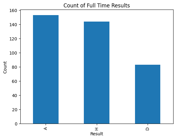
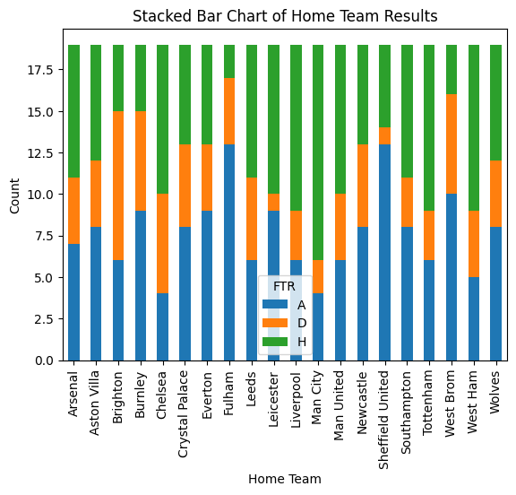
First, I am curious about the performance of being Home team and Away team. So I use pyplot to draw two bar charts, showing the data of home team and away team. The first chart shows that there are more away wins than home wins, which is against the common sense that a team is more likely to win at its home field. I will continue this problem in the Machine Learning part. Then, from the second plot, we can see the results at the home fields of different teams. The winning rate of Man City at its home field is signifficantly high, while the rate of Fullham and Sheffield United at their home fields is pretty low.
df['FTR'].value_counts().plot(kind='bar')
plt.title('Count of Full Time Results')
plt.xlabel('Result')
plt.ylabel('Count')
plt.show()
home_results = df.groupby(['HomeTeam','FTR']).size().unstack()
home_results.plot(kind='bar', stacked=True)
plt.title('Stacked Bar Chart of Home Team Results')
plt.xlabel('Home Team')
plt.ylabel('Count')
plt.xticks(rotation=90)
plt.show()
Moreover, based on these data, I want to know the final result (i.e. the champion and the rank of the clubs) of the Premier League of season 2020-21. Here I first made two DataFrame: df_home and df_away, and then calculate the points of every match. Then I combine the two datasets and sort the value by DateTime, which is helpful when plotting the points trend for the whole season. Finally, inspired by ChatGPT, I group by team, and calculate the cumulative sum using cumsum.
In soccer, for a H, which stands for home win, the home team get 3 points. For a D, which stands for draw, both teams get 1 points. For an A, which stands for away win, the away team get three points.
df_home = df[['DateTime', 'HomeTeam', 'FTR']].copy()
df_home['Points'] = df_home['FTR'].apply(lambda x: 3 if x == 'H' else 1 if x == 'D' else 0)
df_home.rename(columns={'HomeTeam': 'Team'}, inplace=True)

df_away = df[['DateTime', 'AwayTeam', 'FTR']].copy()
df_away['Points'] = df_away['FTR'].apply(lambda x: 3 if x == 'A' else 1 if x == 'D' else 0)
df_away.rename(columns={'AwayTeam': 'Team'}, inplace=True)

df_points = pd.concat([df_home, df_away])

df_points = df_points.sort_values('DateTime')

df_points['Points'] = df_points.groupby('Team')['Points'].cumsum()

df_points.sample(10)
| DateTime | Team | FTR | Points | |
|---|---|---|---|---|
| 196 | 2021-01-30T15:00:00Z | Wolves | H | 23 |
| 137 | 2020-12-26T12:30:00Z | Man United | D | 27 |
| 141 | 2020-12-26T20:00:00Z | Newcastle | H | 18 |
| 168 | 2021-01-13T20:15:00Z | Fulham | D | 12 |
| 87 | 2020-11-23T20:00:00Z | Wolves | D | 14 |
| 260 | 2021-03-03T18:00:00Z | Aston Villa | H | 39 |
| 116 | 2020-12-13T19:15:00Z | Brighton | H | 10 |
| 125 | 2020-12-17T18:00:00Z | Aston Villa | D | 19 |
| 222 | 2021-02-07T16:30:00Z | Liverpool | A | 40 |
| 268 | 2021-03-06T20:00:00Z | Leicester | A | 53 |
Then I used Altair to plot the overall points trend. Here we can simply figure out that the champion is Man City with 86 points. We can also know the rank based on the right colomn of color. The rank of the teams is related to the win rate at home field in some way. The advanced sort method and tooptip method, and the properties comes from ChatGPT.
alt.Chart(df_points).mark_line().encode(
    x='DateTime:T',
    y='Points:Q',
    color=alt.Color('Team:N',
                    sort=alt.EncodingSortField(field='Points', op='max', order='descending')),
    tooltip=[
        alt.Tooltip('DateTime:T', title='Date'),
        alt.Tooltip('Team:N', title='Team'),
        alt.Tooltip('Points:Q', title='Cumulative Points')
    ]
).properties(title='Team Points Over Time')
Machine Learning#
Predicting Goals#
Here I want to predict the goals based on the shots, shots on target, and corners. Some people may think that I should use classification instead of regression for the goals, because they are not continuous. Actually, I am computing the goals anticipation, which in real life, is in decimals. Any shots or shots on target is likely to increase the value. I setup another DataFrame to avoid potential warning by changing the original df.
df_pred_goal = df[['FTHG','FTAG']].copy()
rfr = RandomForestRegressor(n_estimators=190, max_leaf_nodes=10)
rfr.fit(df[['HS', 'HST', "HC"]], df['FTHG'])
df_pred_goal["PHG"] = rfr.predict(df[['HS', 'HST', "HC"]])
rfr.feature_importances_
array([0.09000766, 0.82174293, 0.08824941])
rfr.fit(df[['AS', 'AST', "AC"]], df['FTAG'])
df_pred_goal["PAG"] = rfr.predict(df[['AS', 'AST', "AC"]])
rfr.feature_importances_
array([0.11625363, 0.76128146, 0.1224649 ])
Here we can see the most important factor of goals is the shot on target. That somehow explain why a team may not win the game even it they almost control the game but does not have many shots on target.
df_pred_goal
| FTHG | FTAG | PHG | PAG | |
|---|---|---|---|---|
| 0 | 0 | 3 | 0.569868 | 2.297147 |
| 1 | 1 | 0 | 0.782878 | 1.492062 |
| 2 | 4 | 3 | 1.964029 | 1.509897 |
| 3 | 0 | 2 | 0.655987 | 0.506398 |
| 4 | 0 | 3 | 0.491501 | 2.358774 |
| ... | ... | ... | ... | ... |
| 375 | 2 | 0 | 1.188610 | 1.326949 |
| 376 | 5 | 0 | 3.569571 | 1.043606 |
| 377 | 1 | 0 | 0.677667 | 1.057127 |
| 378 | 3 | 0 | 2.212689 | 1.381954 |
| 379 | 1 | 2 | 0.912075 | 1.108708 |
380 rows × 4 columns
Now lets evaluate the accuracy of the predicted results. We can see that the mean_squared_error of the predicted is actually not very close, though the number seems small. It is because the goals are limited in a small range, mostly 0 and 1, so it is not possible to get a large mean_squared_error.
mean_squared_error(df_pred_goal["FTHG"], df_pred_goal["PHG"])
0.7865889056930663
mean_squared_error(df_pred_goal["FTAG"], df_pred_goal["PAG"])
0.8744102904871957
Looking at the charts below, we can clearly see the randomness of soccer. The ideal values should lie on the diagonal, but there is few points there. I add the scale to make two chats looks similar. The axis will change without the scale for the second chart.
alt.Chart(df_pred_goal).mark_circle().encode(
    x = alt.X("FTHG", scale=alt.Scale(domain=(0, 9))),
    y = alt.Y("PHG", scale=alt.Scale(domain=(0, 7)))
)
alt.Chart(df_pred_goal).mark_circle().encode(
    x = alt.X("FTAG", scale=alt.Scale(domain=(0, 9))),
    y = alt.Y("PAG", scale=alt.Scale(domain=(0, 7)))
)
Predicting Results#
Logistic Regression#
Here I want to do a real classification problem. I want to based on all these factors except goals (the determinat factor of the result of a game) to predict the result of a game. First I tried to use LogisticRegression.
clf = LogisticRegression(max_iter=380)
df_pred_result = df[["FTR"]].copy()
X = df.iloc[:, 7:]
y = df["FTR"]
clf.fit(X, y)
df_pred_result["PR"] = clf.predict(X)
df_pred_result.sample(5)
| FTR | PR | |
|---|---|---|
| 258 | H | H |
| 316 | D | H |
| 319 | H | H |
| 345 | H | H |
| 337 | A | H |
Lets take a look at the accuracy of the prediction. The accuracy is 66.8%, which is not really high. This indicates that the result of a soccer game is not easy to predict.
clf.score(X, y)
0.6684210526315789
From the coefficients, we can see that the shots on target, and the red cards can influence the result of the match significantly, and the yellow cards can influence in some way. Other facters only have little effect on the predicted result.
clf.coef_
array([[ 0.0642815 ,  0.01327618, -0.38079673,  0.28938495,  0.05029139,
        -0.06537861, -0.02596862, -0.02400606,  0.09491813,  0.11982299,
         0.39861416, -0.74050633],
       [ 0.02872287,  0.02037167, -0.05808584, -0.05515698, -0.02210147,
        -0.02951509,  0.01382746,  0.01788863,  0.08039077, -0.16365382,
        -0.13769126,  0.25417646],
       [-0.09300437, -0.03364786,  0.43888258, -0.23422797, -0.02818992,
         0.0948937 ,  0.01214116,  0.00611743, -0.1753089 ,  0.04383083,
        -0.2609229 ,  0.48632987]])
clf.classes_
array(['A', 'D', 'H'], dtype=object)
Now lets make a chart to see the area of decision. Fist I make a artificial DataFrame with range of each colomns from the original DataFrame. Then I predict the match results based on these data.
ranges = [(0, 30), (0, 30), (0, 15), (0, 15), (0, 18),
          (0, 18), (0, 24), (0, 24), (0, 6), (0, 6),
          (0, 2), (0, 2)]

arr = np.empty((5000, 12), dtype=int)

for i, (low, high) in enumerate(ranges):
    arr[:, i] = np.random.randint(low, high, 5000)

df_art = pd.DataFrame(arr, columns=["HS", "AS", "HST", "AST", "HC", "AC", "HF", "AF", "HY", "AY", "HR", "AR"])
df_art.head()
| HS | AS | HST | AST | HC | AC | HF | AF | HY | AY | HR | AR | |
|---|---|---|---|---|---|---|---|---|---|---|---|---|
| 0 | 13 | 9 | 0 | 0 | 11 | 4 | 22 | 23 | 3 | 4 | 0 | 1 |
| 1 | 21 | 28 | 10 | 14 | 17 | 3 | 15 | 14 | 3 | 2 | 1 | 1 |
| 2 | 19 | 2 | 6 | 2 | 2 | 13 | 8 | 3 | 1 | 4 | 0 | 0 |
| 3 | 26 | 28 | 6 | 10 | 16 | 4 | 5 | 11 | 5 | 3 | 0 | 1 |
| 4 | 15 | 27 | 4 | 8 | 3 | 8 | 1 | 19 | 1 | 4 | 1 | 0 |
df_art["PR"] = clf.predict(df_art)
df_art.head()
| HS | AS | HST | AST | HC | AC | HF | AF | HY | AY | HR | AR | PR | |
|---|---|---|---|---|---|---|---|---|---|---|---|---|---|
| 0 | 13 | 9 | 0 | 0 | 11 | 4 | 22 | 23 | 3 | 4 | 0 | 1 | D |
| 1 | 21 | 28 | 10 | 14 | 17 | 3 | 15 | 14 | 3 | 2 | 1 | 1 | A |
| 2 | 19 | 2 | 6 | 2 | 2 | 13 | 8 | 3 | 1 | 4 | 0 | 0 | H |
| 3 | 26 | 28 | 6 | 10 | 16 | 4 | 5 | 11 | 5 | 3 | 0 | 1 | A |
| 4 | 15 | 27 | 4 | 8 | 3 | 8 | 1 | 19 | 1 | 4 | 1 | 0 | A |
Consider that there are too many colomns in the DataFrame, here I just choose a important feature: shots on target to be the x, y axis.
alt.Chart(df_art).mark_circle().encode(
    x = "HST",
    y = "AST",
    color = "PR"
)
This chart is quite unclear. I realized that although the real life data are all integers, here if we put all integers in the chart, we cannot clearly figure out the decision boundary. So I change it into random numbers and make another chart.
arr1 = np.empty((5000, 12))

for i, (low, high) in enumerate(ranges):
    arr1[:, i] = np.random.uniform(low, high, 5000)

df_art1 = pd.DataFrame(arr1, columns=["HS", "AS", "HST", "AST", "HC", "AC", "HF", "AF", "HY", "AY", "HR", "AR"])

df_art1["PR"] = clf.predict(df_art1)

alt.Chart(df_art1).mark_circle().encode(
    x = "HST",
    y = "AST",
    color = "PR"
)
Now we can see that there is not a clear decision boundary. The result near the top left and bottom right corners are quite clear. However, the three color dots are mixed near the diagonal. This probably means that it was a tight game, and two teams have similar shots on targets, so we cannot tell the winner from the shots on target alone. Moreover, the number of predicted draws is quite small, which may not reflect the fact.
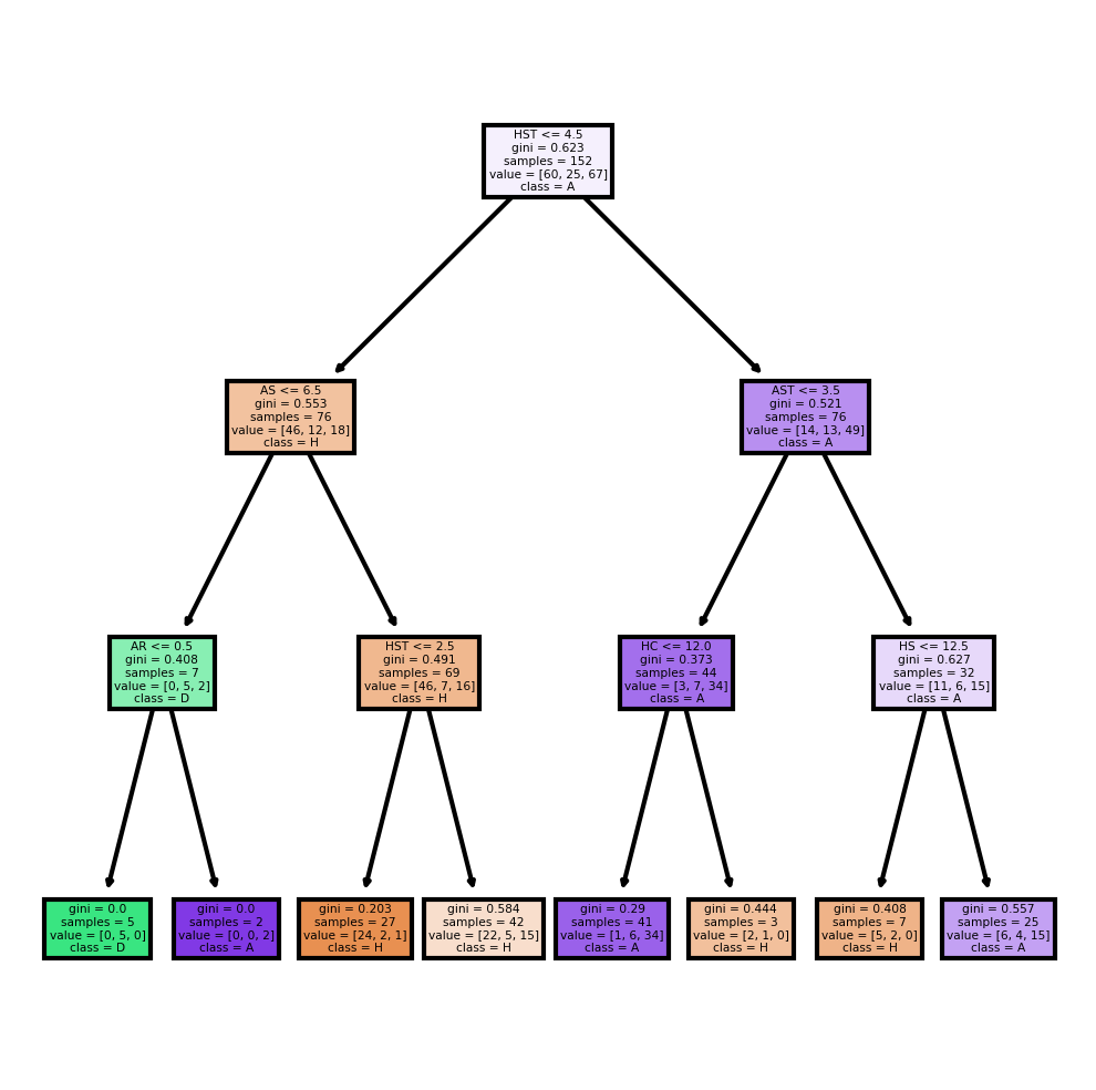
DecisionTreeClassifier#
Moreover, the data is complex, so there is a potential possibility that overfitting occurs when using a DecisionTreeClassifier. Lets check it in this section. Here I set the max_depth = 6 becuase I have 6 types of data: shots, shots on target, corners, fouls committed, yellow card, and red card.
dtc = DecisionTreeClassifier(max_depth=6)
X_train, X_test, y_train, y_test = train_test_split(X, y, train_size=0.4, random_state=10)
dtc.fit(X_train, y_train)
DecisionTreeClassifier(max_depth=6)
dtc.score(X_train, y_train)
0.9144736842105263
dtc.score(X_test, y_test)
0.5
As I predicted, overfitting does appear. The soccer data is actually quite random, but the train class accuracy is over 90%, which is really high for classification. When I test with test class, the accracy is only about half of the train class.
One way to try to fix this problem is giving a smaller max_depth. Here I change it to 3, half of 6, and lets see the result.
dtc2 = DecisionTreeClassifier(max_depth=3)
dtc2.fit(X_train, y_train)
DecisionTreeClassifier(max_depth=3)
dtc2.score(X_train, y_train)
0.7171052631578947
dtc2.score(X_test, y_test)
0.5307017543859649
Here the accuracy of train class is still higher than the test class, but there is no such obvious overfitting. Lets see the tree plot based on this DecisionTreeClassifier.
fig, axes = plt.subplots(nrows = 1,ncols = 1, figsize = (4,4), dpi=300)
plot_tree(dtc2,
               feature_names = X.columns,
               class_names=["H", "D", "A"],
               filled = True);
plt.show()
More Scikit-learn Methods#
K-Nearest Neighbors#
I get this idea totally from ChatGPT. The idea is to predict the Full Time Result (FTR) based on the match statistics. The StandardScaler is used to standardize the features to have a mean of 0 and a variance of 1. This is necessary because the kNN algorithm calculates the distance between different data points, and features on larger scales can unduly influence this calculation. The kNN model is initialized with n_neighbors=5, which means that the algorithm considers the 5 nearest neighbors when making a prediction. Finally, the classification_report function is then used to print a report showing the main classification metrics.
# Select features and target
features = df.iloc[:, 4:].drop("FTR", axis=1)
target = df['FTR']

# Preprocess the data (scale the features)
scaler = StandardScaler()
features = scaler.fit_transform(features)

# Split the data into train and test sets
features_train, features_test, target_train, target_test = train_test_split(features, target, test_size=0.2, random_state=10)

# Create and train the kNN classifier
knn = KNeighborsClassifier(n_neighbors=5)
knn.fit(features_train, target_train)

# Test the classifier
target_pred = knn.predict(features_test)

# Print a classification report
print(classification_report(target_test, target_pred))
              precision    recall  f1-score   support

           A       0.61      1.00      0.76        30
           D       0.75      0.15      0.25        20
           H       0.96      0.85      0.90        26

    accuracy                           0.72        76
   macro avg       0.77      0.67      0.64        76
weighted avg       0.77      0.72      0.67        76
K-Means#
I also get this idea from ChatGPT.The idea is to cluster teams based on their performance statistics (average Full Time Home and Away Goals). The groupby function is used to group the data by the HomeTeam column, and then the agg function is used to compute the mean Full Time Home Goals (FTHG) and Full Time Away Goals (FTAG) for each team. The K-Means model is initialized with n_clusters=3, which means that the algorithm tries to divide the teams into 3 clusters. Then I add the cluster labels to the DataFrame and plot the clusters with team name.
# Compute the average Full Time Home and Away Goals for each team
avg_goals = df.groupby('HomeTeam').agg({'FTHG':'mean', 'FTAG':'mean'}).reset_index()

# Run K-Means clustering
kmeans = KMeans(n_clusters=3)
kmeans.fit(avg_goals[['FTHG', 'FTAG']])

# Add the cluster labels to the DataFrame
avg_goals['Cluster'] = kmeans.labels_

# Plot the clusters with team annotations
plt.figure(figsize=(15, 10))  # increase plot size
plt.scatter(avg_goals['FTHG'], avg_goals['FTAG'], c=avg_goals['Cluster'])

for i, team in enumerate(avg_goals['HomeTeam']):
    plt.annotate(team, (avg_goals['FTHG'].iloc[i], avg_goals['FTAG'].iloc[i]))

plt.xlabel('Average Full Time Home Goals')
plt.ylabel('Average Full Time Away Goals')
plt.title('K-Means Clustering of Teams based on Performance')
plt.show()
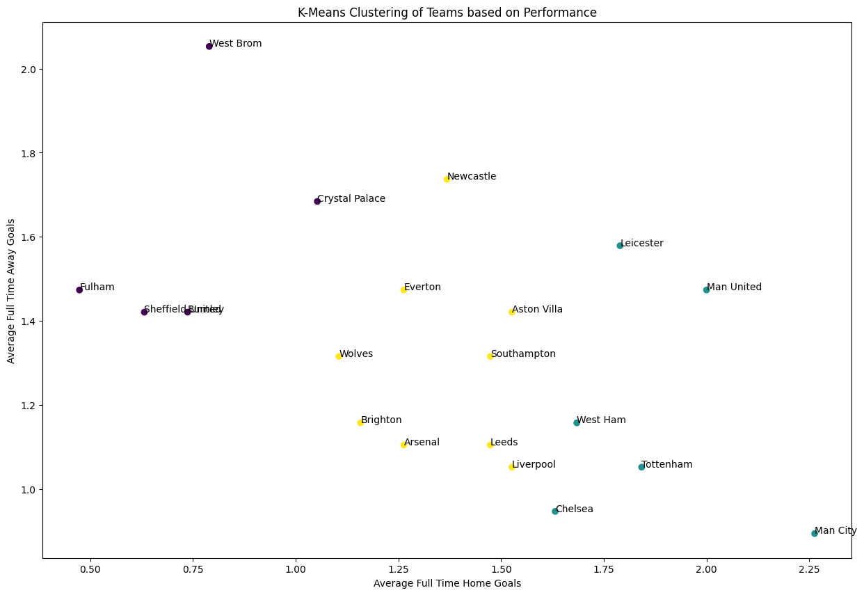
From the plot, we cans ee that some team have huge differece at home field and at away field. For example, the champion Man City, have an average home goals more than 2.25, but an average away goals less than 0.5. In contrast, West Brom score an average more than 2 away goals, but have only about 0.75 average home goal.
Summary#
Either summarize what you did, or summarize the results. Maybe 3 sentences.
In this project, I visualize the data of 380 matches in an entire season 2020-21 in Premier League, showing home and away winning data, and plotting the points trend. I also predict the expected goals and compare them with actual goals. Moreover, I used different methods to predict the match results based on the dataset, and I tried to plot the decision boundary and discover potential overfitting. Finally, I tried K-Neareat Neighbor and K-mean to provide further analysis of the dataset.
References#
Your code above should include references. Here is some additional space for references.
What is the source of your dataset(s)?
https://www.kaggle.com/datasets/irkaal/english-premier-league-results
List any other references that you found helpful.
ChatGPT 4.0 version
Submission#
Using the Share button at the top right, enable Comment privileges for anyone with a link to the project. Then submit that link on Canvas.
 Created in Deepnote