Worksheet 12#
You are encouraged to work in groups of up to 3 total students, but each student should make their own submission on Canvas. (It’s fine for everyone in the group to have the same upload.)
Preliminary part#
Load the attached “sim_data.csv” file as a DataFrame and save the result with the variable name
df.
Plot the data in a scatter plot using Altair. Name the resulting chart
c. Use
y=alt.Y("y", scale=alt.Scale(domain=(-150,200)))
for the y-axis encoding. This will help keep the chart looking consistent below. (We will be plotting some high-degree polynomials, which can completely change the plot range because they have such big y-values.)
Main part#
Write a function poly_fit(df, d, n, rs, color) which takes as input our DataFrame df, a degree d, a number of samples n, a random state value rs, and a color color, and returns an Altair chart created as follows.
Make a copy of
dfusing thecopymethod and name itdf_copy.Using the
samplemethod of a pandas DataFrame, create a pandas DataFramedf_subcontainingnrandom rows fromdf_copyand usingrsfor the random state.Using
PolynomialFeaturesandPipelineas in lecture on Wednesday, perform degreedpolynomial regression on the data indf_sub. (Important: be sure you are not using the full DataFramedf_copy.)Add a new column to
df_copy(not todf_sub) containing the predicted values corresponding todf_copy[["x"]]. (In other words, call thepredictmethod of thePipelineobject. We fit the regression using onlynsample values, but we are calling predict on all the values fromdf_copy. In Machine Learning, it is common to callfitandpredicton two different datasets.)Using an f-string, name this new column
"predRS", whereRSgets replaced by the random state value. (For example, ifrs=10, then the column should be named"pred10".)Make a line chart in Altair from
df_copyusing the colorcolor, the"x"column for the x-axis, and this"predRS"column you just made for the y-axis (you will need to use f-strings again… or maybe it would be nicer to store this string as a variable and then refer to that variable).When calling
mark_line, pass the keyword argumentclip=True. (This will keep extreme values from being plotted.)Your function should return that line chart.
Comments:
Be sure you are calling
fitondf_suband callingpredictondf_copy.I believe it is better style to have your imports, like
from sklearn.preprocessing ..., happen outside of the function, in a separate cell.You might be able to accomplish this without using
Pipeline,PolynomialFeatures, etc., but you should be able to use these on a quiz or exam.
Applications#
Find a few outputs of your function that look quite different, using our DataFrame
df, using degree 12 polynomial regression, 50 sample points. (In other words, try different values ofrsand look for examples where the outputs look different.) Also give the charts different colors.Layer these Altair charts on top of each other, using for example
c + c1 + c2.
Random comment (most should ignore this):
If you’re feeling pretty comfortable with Python, and want to try some material we haven’t discussed, try to make the layer charts using something like the following:
state_colors = [(state1, color1), (state2, color2), ...]
chart_list = [??? for rs, color in state_colors]
alt.layer(c, *chart_list)
If you want to be even more fancy, you can make the suggested
state_colorslist in some automatic way. You should be able to use any valid html color name, like these.
Sample quiz and midterm questions#
(You will not be turning these in as part of this worksheet.)
What if you try the same thing (still degree 12) with 400 sample points instead of 50 sample points, how do things change? What if you use 20 sample points?
What if you use degree 2 and 50 sample points, how do things change?
Do the polynomials seem to look more consistent as we use more sample points? What about as we use higher degrees?
Submission#
Save the resulting Altair layer chart as a png file (click the three dots at the upper right of the Altair chart) and submit that png file on Canvas.
Double-check that you are submitting your own png file, not the sample png file I attached.
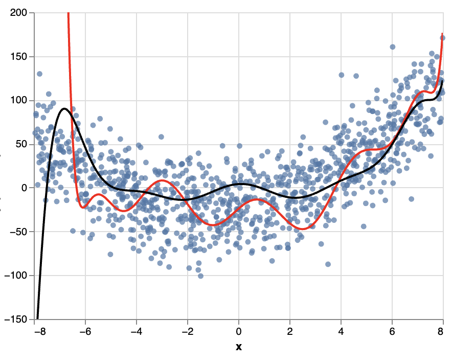
Your submission should look something like the following, but you are encouraged to use more than just two line charts. I have cut off the y-axis label from the png, but yours should show something like
y, pred??, pred??.