
Week 3 Monday#
Worksheet 5 is posted.
Like last week, I am going to be working in a “Private” Deepnote notebook and will upload it after class. The Deepnote support group is investigating why the hardware keeps resetting on me and that will hopefully be resolved this week.
Unlike NumPy and pandas, the data visualization library we use (Altair) would need to be installed on the lab computers. (That’s not difficult, but it would need to be done on each machine.) So we will benefit from using Deepnote for this portion.
Hanson is here to help.
Plotting based on the Grammar of Graphics#
If you’ve already seen one plotting library in Python, it was probably Matplotlib. Matplotlib is the most flexible and most widely used Python plotting library. In Math 10, our main interest is in using Python for Data Science, and for that, there are some specialty plotting libraries that will get us nice results much faster than Matplotlib.
Here we will introduce the plotting library we will use most often in Math 10, Altair, along with two more plotting libraries, Seaborn and Plotly. (Of these, Seaborn is probably the most famous.)
These three libraries are very similar to each other (not so similar to Matplotlib, although Seaborn is built on top of Matplotlib), and I believe all three are based on a notion called the Grammar of Graphics. (Here is the book The Grammar of Graphics, which is freely available to download from on campus or using VPN. There is also a widely used, and I think older, plotting library for the R statistical software that uses the same conventions, ggplot2.)
Here is the basic setup for Altair, Seaborn, and Plotly:
We have a pandas DataFrame, and each row in the DataFrame corresponds to one observation (i.e., to one instance, to one data point).
Each column in the DataFrame corresponds to a variable (also called a dimension, or a field).
To produce the visualizations, we encode different columns from the DataFrame into visual properties of the chart (like the x-coordinate, or the color).
Altair tries to choose default values that produce high-quality visualizations; this greatly reduces the need for fine-tuning. But there is also a huge amount of customization possible. As one example, here are the named color schemes available in Altair.
Warm-up: first look at the mpg dataset#
Load the
mpgdataset from the Seaborn library.
import seaborn as sns
Here is a list of all the datasets included with Seaborn.
sns.get_dataset_names()
['anagrams',
 'anscombe',
 'attention',
 'brain_networks',
 'car_crashes',
 'diamonds',
 'dots',
 'dowjones',
 'exercise',
 'flights',
 'fmri',
 'geyser',
 'glue',
 'healthexp',
 'iris',
 'mpg',
 'penguins',
 'planets',
 'seaice',
 'taxis',
 'tips',
 'titanic']
df = sns.load_dataset("mpg")
df.shape
(398, 9)
df.sample(3)
| mpg | cylinders | displacement | horsepower | weight | acceleration | model_year | origin | name | |
|---|---|---|---|---|---|---|---|---|---|
| 190 | 14.5 | 8 | 351.0 | 152.0 | 4215 | 12.8 | 76 | usa | ford gran torino |
| 179 | 22.0 | 4 | 121.0 | 98.0 | 2945 | 14.5 | 75 | europe | volvo 244dl |
| 1 | 15.0 | 8 | 350.0 | 165.0 | 3693 | 11.5 | 70 | usa | buick skylark 320 |
How many “origin” values are there in this dataset?
df.columns
Index(['mpg', 'cylinders', 'displacement', 'horsepower', 'weight',
       'acceleration', 'model_year', 'origin', 'name'],
      dtype='object')
len(df["origin"])
398
The unique method is defined for pandas Series but not for the whole DataFrame.
df.unique()
---------------------------------------------------------------------------
AttributeError                            Traceback (most recent call last)
Cell In[8], line 1
----> 1 df.unique()

File ~/mambaforge/envs/math10s23/lib/python3.9/site-packages/pandas/core/generic.py:5902, in NDFrame.__getattr__(self, name)
   5895 if (
   5896     name not in self._internal_names_set
   5897     and name not in self._metadata
   5898     and name not in self._accessors
   5899     and self._info_axis._can_hold_identifiers_and_holds_name(name)
   5900 ):
   5901     return self[name]
-> 5902 return object.__getattribute__(self, name)

AttributeError: 'DataFrame' object has no attribute 'unique'
df["origin"].unique()
array(['usa', 'japan', 'europe'], dtype=object)
len(df["origin"].unique())
3
df["origin"].value_counts()
usa       249
japan      79
europe     70
Name: origin, dtype: int64
len(df["origin"].value_counts())
3
How does the average weight of a car differ across these origins? Use the DataFrame method
groupby(which we have not seen yet).
Here is an example of the “object-oriented programming” approach of having special-purpose objects. Here we have a DataFrameGroupBy object that is probably not used anywhere else.
df.groupby("origin")
<pandas.core.groupby.generic.DataFrameGroupBy object at 0x13e2df940>
This special object has a mean method, which will report the average values for the various columns when split by their “origin” value. Here we have a whole DataFrame.
df.groupby("origin").mean()
/var/folders/8j/gshrlmtn7dg4qtztj4d4t_w40000gn/T/ipykernel_15816/2762219267.py:1: FutureWarning: The default value of numeric_only in DataFrameGroupBy.mean is deprecated. In a future version, numeric_only will default to False. Either specify numeric_only or select only columns which should be valid for the function.
  df.groupby("origin").mean()
| mpg | cylinders | displacement | horsepower | weight | acceleration | model_year | |
|---|---|---|---|---|---|---|---|
| origin | |||||||
| europe | 27.891429 | 4.157143 | 109.142857 | 80.558824 | 2423.300000 | 16.787143 | 75.814286 |
| japan | 30.450633 | 4.101266 | 102.708861 | 79.835443 | 2221.227848 | 16.172152 | 77.443038 |
| usa | 20.083534 | 6.248996 | 245.901606 | 119.048980 | 3361.931727 | 15.033735 | 75.610442 |
Here we get a single column from that DataFrame.
df.groupby("origin").mean()["weight"]
/var/folders/8j/gshrlmtn7dg4qtztj4d4t_w40000gn/T/ipykernel_15816/3362074246.py:1: FutureWarning: The default value of numeric_only in DataFrameGroupBy.mean is deprecated. In a future version, numeric_only will default to False. Either specify numeric_only or select only columns which should be valid for the function.
  df.groupby("origin").mean()["weight"]
origin
europe    2423.300000
japan     2221.227848
usa       3361.931727
Name: weight, dtype: float64
Can you calculate that same average weight for “europe” using Boolean indexing?
Here we get the sub-DataFrame containing only cars with origin equal to “europe”.
df_sub = df[df["origin"] == "europe"]
df_sub
| mpg | cylinders | displacement | horsepower | weight | acceleration | model_year | origin | name | |
|---|---|---|---|---|---|---|---|---|---|
| 19 | 26.0 | 4 | 97.0 | 46.0 | 1835 | 20.5 | 70 | europe | volkswagen 1131 deluxe sedan |
| 20 | 25.0 | 4 | 110.0 | 87.0 | 2672 | 17.5 | 70 | europe | peugeot 504 |
| 21 | 24.0 | 4 | 107.0 | 90.0 | 2430 | 14.5 | 70 | europe | audi 100 ls |
| 22 | 25.0 | 4 | 104.0 | 95.0 | 2375 | 17.5 | 70 | europe | saab 99e |
| 23 | 26.0 | 4 | 121.0 | 113.0 | 2234 | 12.5 | 70 | europe | bmw 2002 |
| ... | ... | ... | ... | ... | ... | ... | ... | ... | ... |
| 354 | 34.5 | 4 | 100.0 | NaN | 2320 | 15.8 | 81 | europe | renault 18i |
| 359 | 28.1 | 4 | 141.0 | 80.0 | 3230 | 20.4 | 81 | europe | peugeot 505s turbo diesel |
| 360 | 30.7 | 6 | 145.0 | 76.0 | 3160 | 19.6 | 81 | europe | volvo diesel |
| 375 | 36.0 | 4 | 105.0 | 74.0 | 1980 | 15.3 | 82 | europe | volkswagen rabbit l |
| 394 | 44.0 | 4 | 97.0 | 52.0 | 2130 | 24.6 | 82 | europe | vw pickup |
70 rows × 9 columns
Now we get the “weight” column from that sub-DataFrame.
df_sub["weight"]
19     1835
20     2672
21     2430
22     2375
23     2234
       ...
354    2320
359    3230
360    3160
375    1980
394    2130
Name: weight, Length: 70, dtype: int64
Now we call the mean method of this pandas Series.
df_sub["weight"].mean()
2423.3
Something to think about: how does the miles-per-gallon change based on the weight? I don’t think we know yet how to answer that in a concise way using pandas.
Visualizing the data using Altair#
To make visualizations in all of these libraries, we encode columns in the dataset to various visual channels in the chart.
import altair as alt
Plot this data using a scatter plot (denoted by
mark_circle()in Altair). Encode the “weight” column in the x-coordinate, the “mpg” column in the y-coordinate.
Here we get just a single point. We haven’t told Altair how to relate the data to the visualization. All Altair knows at this point is that we are using the DataFrame df and that we are drawing marks with circles (filled-in circles).
alt.Chart(df).mark_circle()
Here is a reminder of what columns we have to work with. If the capitalization or spelling is wrong, the plotting will not work.
df.columns
Index(['mpg', 'cylinders', 'displacement', 'horsepower', 'weight',
       'acceleration', 'model_year', 'origin', 'name'],
      dtype='object')
Here we allow the points to have different x-coordinates, corresponding to the weight.
alt.Chart(df).mark_circle().encode(
    x = "weight"
)
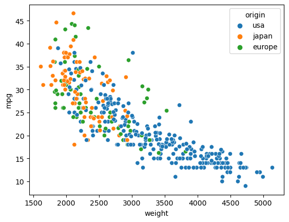
Now we allow also y-coordinates. From this vantage point, it’s clear (and it’s also intuitively clear) that as the weight increases, the miles-per-gallon decreases.
alt.Chart(df).mark_circle().encode(
    x = "weight",
    y = "mpg"
)
Add a color channel to the chart, encoding the “origin” value.
alt.Chart(df).mark_circle().encode(
    x = "weight",
    y = "mpg",
    color = "origin"
)
Add a tooltip to the chart, including the weight, mpg, origin, model year, and the name of the car.
Notice how if you move your mouse over a point in the chart, you will see all the requested information. Each drawn point should be thought of as corresponding to one row in the original DataFrame.
alt.Chart(df).mark_circle().encode(
    x = "weight",
    y = "mpg",
    color = "origin",
    tooltip = ["weight", "mpg", "origin", "model_year", "name"]
)
Visualizing the data using Seaborn#
We won’t use Seaborn or Plotly Express much if at all in Math 10 after Worksheet 5, but I want you to see how similar they are to Altair. If you like Seaborn or Plotly Express, think about using it extensively as an “extra” component in the course project at the end of the class.
Make a similar chart (using the xy-axes and color but not the tooltip) using Seaborn.
import seaborn as sns
The syntax is a little different (for example, here we use the keyword argument hue rather than color), but the approach is exactly the same: we specify how to encode columns in our DataFrame as visual channels in the plot.
sns.scatterplot(
    data=df,
    x="weight",
    y="mpg",
    hue="origin"
)
<Axes: xlabel='weight', ylabel='mpg'>
Visualizing the data using Plotly Express#
Make a similar chart using Plotly Express.
import plotly.express as px
Again, the syntax is a little different, but the idea is exactly the same.
px.scatter(
    data_frame=df,
    x="weight",
    y="mpg",
    color="origin"
)
Time to work on worksheets#
Worksheet 5 is posted. Time to work on that or Worksheets 3-4 from last week.
Hanson and I are here to help.