
Apple Stock
Contents
Apple Stock
Author: Mia [Nguyen Thao My] Ta
Course Project, UC Irvine, Math 10, S22
Introduction
The purpose of the project is to estimate Apple’s future stock price using historical data and linear regression. Analyzing stock data to predict the expected value of a company’s stock and displaying stock movement over time.
Section 1: Clean up Dataset
import pandas as pd
import numpy as np
import altair as alt
from altair import Chart, X, Y
import matplotlib.pyplot as plt
import seaborn as sns
df = pd.read_csv("AAPL.csv")
df = df.dropna()
df
| Unnamed: 0 | symbol | date | close | high | low | open | volume | adjClose | adjHigh | adjLow | adjOpen | adjVolume | divCash | splitFactor | |
|---|---|---|---|---|---|---|---|---|---|---|---|---|---|---|---|
| 0 | 0 | AAPL | 2015-05-27 00:00:00+00:00 | 132.045 | 132.260 | 130.0500 | 130.34 | 45833246 | 121.682558 | 121.880685 | 119.844118 | 120.111360 | 45833246 | 0.0 | 1.0 |
| 1 | 1 | AAPL | 2015-05-28 00:00:00+00:00 | 131.780 | 131.950 | 131.1000 | 131.86 | 30733309 | 121.438354 | 121.595013 | 120.811718 | 121.512076 | 30733309 | 0.0 | 1.0 |
| 2 | 2 | AAPL | 2015-05-29 00:00:00+00:00 | 130.280 | 131.450 | 129.9000 | 131.23 | 50884452 | 120.056069 | 121.134251 | 119.705890 | 120.931516 | 50884452 | 0.0 | 1.0 |
| 3 | 3 | AAPL | 2015-06-01 00:00:00+00:00 | 130.535 | 131.390 | 130.0500 | 131.20 | 32112797 | 120.291057 | 121.078960 | 119.844118 | 120.903870 | 32112797 | 0.0 | 1.0 |
| 4 | 4 | AAPL | 2015-06-02 00:00:00+00:00 | 129.960 | 130.655 | 129.3200 | 129.86 | 33667627 | 119.761181 | 120.401640 | 119.171406 | 119.669029 | 33667627 | 0.0 | 1.0 |
| ... | ... | ... | ... | ... | ... | ... | ... | ... | ... | ... | ... | ... | ... | ... | ... |
| 1253 | 1253 | AAPL | 2020-05-18 00:00:00+00:00 | 314.960 | 316.500 | 310.3241 | 313.17 | 33843125 | 314.960000 | 316.500000 | 310.324100 | 313.170000 | 33843125 | 0.0 | 1.0 |
| 1254 | 1254 | AAPL | 2020-05-19 00:00:00+00:00 | 313.140 | 318.520 | 313.0100 | 315.03 | 25432385 | 313.140000 | 318.520000 | 313.010000 | 315.030000 | 25432385 | 0.0 | 1.0 |
| 1255 | 1255 | AAPL | 2020-05-20 00:00:00+00:00 | 319.230 | 319.520 | 316.2000 | 316.68 | 27876215 | 319.230000 | 319.520000 | 316.200000 | 316.680000 | 27876215 | 0.0 | 1.0 |
| 1256 | 1256 | AAPL | 2020-05-21 00:00:00+00:00 | 316.850 | 320.890 | 315.8700 | 318.66 | 25672211 | 316.850000 | 320.890000 | 315.870000 | 318.660000 | 25672211 | 0.0 | 1.0 |
| 1257 | 1257 | AAPL | 2020-05-22 00:00:00+00:00 | 318.890 | 319.230 | 315.3500 | 315.77 | 20450754 | 318.890000 | 319.230000 | 315.350000 | 315.770000 | 20450754 | 0.0 | 1.0 |
1258 rows × 15 columns
Define DataFrame and getting exact weekday and month.
df = df.iloc[:,1:15]
df["date"] = pd.to_datetime(df["date"])
df = df.sort_values(by="date")
df["weekday"] = df["date"].dt.day_name()
df["month"] = df["date"].dt.month
df
| symbol | date | close | high | low | open | volume | adjClose | adjHigh | adjLow | adjOpen | adjVolume | divCash | splitFactor | weekday | month | |
|---|---|---|---|---|---|---|---|---|---|---|---|---|---|---|---|---|
| 0 | AAPL | 2015-05-27 00:00:00+00:00 | 132.045 | 132.260 | 130.0500 | 130.34 | 45833246 | 121.682558 | 121.880685 | 119.844118 | 120.111360 | 45833246 | 0.0 | 1.0 | Wednesday | 5 |
| 1 | AAPL | 2015-05-28 00:00:00+00:00 | 131.780 | 131.950 | 131.1000 | 131.86 | 30733309 | 121.438354 | 121.595013 | 120.811718 | 121.512076 | 30733309 | 0.0 | 1.0 | Thursday | 5 |
| 2 | AAPL | 2015-05-29 00:00:00+00:00 | 130.280 | 131.450 | 129.9000 | 131.23 | 50884452 | 120.056069 | 121.134251 | 119.705890 | 120.931516 | 50884452 | 0.0 | 1.0 | Friday | 5 |
| 3 | AAPL | 2015-06-01 00:00:00+00:00 | 130.535 | 131.390 | 130.0500 | 131.20 | 32112797 | 120.291057 | 121.078960 | 119.844118 | 120.903870 | 32112797 | 0.0 | 1.0 | Monday | 6 |
| 4 | AAPL | 2015-06-02 00:00:00+00:00 | 129.960 | 130.655 | 129.3200 | 129.86 | 33667627 | 119.761181 | 120.401640 | 119.171406 | 119.669029 | 33667627 | 0.0 | 1.0 | Tuesday | 6 |
| ... | ... | ... | ... | ... | ... | ... | ... | ... | ... | ... | ... | ... | ... | ... | ... | ... |
| 1253 | AAPL | 2020-05-18 00:00:00+00:00 | 314.960 | 316.500 | 310.3241 | 313.17 | 33843125 | 314.960000 | 316.500000 | 310.324100 | 313.170000 | 33843125 | 0.0 | 1.0 | Monday | 5 |
| 1254 | AAPL | 2020-05-19 00:00:00+00:00 | 313.140 | 318.520 | 313.0100 | 315.03 | 25432385 | 313.140000 | 318.520000 | 313.010000 | 315.030000 | 25432385 | 0.0 | 1.0 | Tuesday | 5 |
| 1255 | AAPL | 2020-05-20 00:00:00+00:00 | 319.230 | 319.520 | 316.2000 | 316.68 | 27876215 | 319.230000 | 319.520000 | 316.200000 | 316.680000 | 27876215 | 0.0 | 1.0 | Wednesday | 5 |
| 1256 | AAPL | 2020-05-21 00:00:00+00:00 | 316.850 | 320.890 | 315.8700 | 318.66 | 25672211 | 316.850000 | 320.890000 | 315.870000 | 318.660000 | 25672211 | 0.0 | 1.0 | Thursday | 5 |
| 1257 | AAPL | 2020-05-22 00:00:00+00:00 | 318.890 | 319.230 | 315.3500 | 315.77 | 20450754 | 318.890000 | 319.230000 | 315.350000 | 315.770000 | 20450754 | 0.0 | 1.0 | Friday | 5 |
1258 rows × 16 columns
We can observe the distribution of data points on different days of the week from the chart displayed below.
days = [pd.to_datetime(f"2022-06-{x}").day_name() for x in range (6,13,1)]
df[days] = 0
for i in days:
    df.loc[df["weekday"] == i,i] = 1
df[days].sum(axis=0)
Monday       236
Tuesday      257
Wednesday    257
Thursday     255
Friday       253
Saturday       0
Sunday         0
dtype: int64
Section 2: Data Graph
Let’s take a look at the Apple stock trends for the past couple years.
mark = alt.selection_single(nearest = True, on = "mouseover", fields = ["date"], empty = 'none')

main = alt.Chart().mark_point().encode(
    x="date:T",
    tooltip=["date", "weekday", "adjClose", "close"],
    opacity=alt.value(0),
).add_selection(mark)
line = alt.Chart().mark_line().encode(
        x= alt.X("date", title="Date"),
        y= alt.Y("adjClose",  axis = alt.Axis(title="", format = "$f")),
    )

rule = alt.Chart().mark_rule(color="gray").encode(
    x="date:T",
).transform_filter(mark)

c = alt.layer(main,line,rule, data = df, title = "Apple Stock Price").add_selection(mark)
c
In stead of looking at all the data points, we could gather a subdata and look at the trend at that specific period. The following function day(x) will take an input x and displays a DataFrame of all data points with the same day x. In this case, we are looking at the DataFrame on the 5th of every month. If there is a missing month, for example, we go from June 5th, 2015 to August 5th, 2015, then July 5th, 2017 must fall on the weekend (either Saturday or Sunday).
#This is a subDataFrame of all 5th days.
def day(x):
    return df[df["date"].dt.day == x]
day(5)
| symbol | date | close | high | low | open | volume | adjClose | adjHigh | adjLow | ... | splitFactor | weekday | month | Monday | Tuesday | Wednesday | Thursday | Friday | Saturday | Sunday | |
|---|---|---|---|---|---|---|---|---|---|---|---|---|---|---|---|---|---|---|---|---|---|
| 7 | AAPL | 2015-06-05 00:00:00+00:00 | 128.65 | 129.6900 | 128.3600 | 129.500 | 35626800 | 118.553986 | 119.512370 | 118.286744 | ... | 1.0 | Friday | 6 | 0 | 0 | 0 | 0 | 1 | 0 | 0 |
| 49 | AAPL | 2015-08-05 00:00:00+00:00 | 115.40 | 117.4400 | 112.1000 | 112.950 | 98384461 | 106.343801 | 108.223708 | 103.302773 | ... | 1.0 | Wednesday | 8 | 0 | 0 | 1 | 0 | 0 | 0 | 0 |
| 91 | AAPL | 2015-10-05 00:00:00+00:00 | 110.78 | 111.3698 | 109.0700 | 109.880 | 52064743 | 102.547449 | 103.093418 | 100.964527 | ... | 1.0 | Monday | 10 | 1 | 0 | 0 | 0 | 0 | 0 | 0 |
| 114 | AAPL | 2015-11-05 00:00:00+00:00 | 120.92 | 122.6900 | 120.1800 | 121.850 | 39552680 | 112.415257 | 114.060767 | 111.727304 | ... | 1.0 | Thursday | 11 | 0 | 0 | 0 | 1 | 0 | 0 | 0 |
| 154 | AAPL | 2016-01-05 00:00:00+00:00 | 102.71 | 105.8500 | 102.4100 | 105.750 | 55790992 | 95.486033 | 98.405185 | 95.207133 | ... | 1.0 | Tuesday | 1 | 0 | 1 | 0 | 0 | 0 | 0 | 0 |
| 176 | AAPL | 2016-02-05 00:00:00+00:00 | 94.02 | 96.9200 | 93.6900 | 96.520 | 46418064 | 87.877747 | 90.588292 | 87.569306 | ... | 1.0 | Friday | 2 | 0 | 0 | 0 | 0 | 1 | 0 | 0 |
| 216 | AAPL | 2016-04-05 00:00:00+00:00 | 109.81 | 110.7300 | 109.4200 | 109.510 | 26578652 | 102.636199 | 103.496096 | 102.271677 | ... | 1.0 | Tuesday | 4 | 0 | 1 | 0 | 0 | 0 | 0 | 0 |
| 238 | AAPL | 2016-05-05 00:00:00+00:00 | 93.24 | 94.0700 | 92.6800 | 94.000 | 35890500 | 87.681466 | 88.461986 | 87.154851 | ... | 1.0 | Thursday | 5 | 0 | 0 | 0 | 1 | 0 | 0 | 0 |
| 279 | AAPL | 2016-07-05 00:00:00+00:00 | 94.99 | 95.4000 | 94.4600 | 95.390 | 27705210 | 89.327139 | 89.712697 | 88.828736 | ... | 1.0 | Tuesday | 7 | 0 | 1 | 0 | 0 | 0 | 0 | 0 |
| 302 | AAPL | 2016-08-05 00:00:00+00:00 | 107.48 | 107.6500 | 106.1800 | 106.270 | 40553402 | 101.616715 | 101.777441 | 100.387633 | ... | 1.0 | Friday | 8 | 0 | 0 | 0 | 0 | 1 | 0 | 0 |
| 344 | AAPL | 2016-10-05 00:00:00+00:00 | 113.05 | 113.6600 | 112.6900 | 113.400 | 21453089 | 106.882858 | 107.459581 | 106.542497 | ... | 1.0 | Wednesday | 10 | 0 | 0 | 1 | 0 | 0 | 0 | 0 |
| 386 | AAPL | 2016-12-05 00:00:00+00:00 | 109.11 | 110.0300 | 108.2500 | 110.000 | 34324540 | 103.693167 | 104.567493 | 102.875862 | ... | 1.0 | Monday | 12 | 1 | 0 | 0 | 0 | 0 | 0 | 0 |
| 407 | AAPL | 2017-01-05 00:00:00+00:00 | 116.61 | 116.8642 | 115.8100 | 115.920 | 22193587 | 110.820825 | 111.062405 | 110.060541 | ... | 1.0 | Thursday | 1 | 0 | 0 | 0 | 1 | 0 | 0 | 0 |
| 469 | AAPL | 2017-04-05 00:00:00+00:00 | 144.02 | 145.4600 | 143.8100 | 144.220 | 27717854 | 137.459193 | 138.833594 | 137.258760 | ... | 1.0 | Wednesday | 4 | 0 | 0 | 1 | 0 | 0 | 0 | 0 |
| 490 | AAPL | 2017-05-05 00:00:00+00:00 | 148.96 | 148.9800 | 146.7600 | 146.760 | 26787359 | 142.174152 | 142.193241 | 140.074373 | ... | 1.0 | Friday | 5 | 0 | 0 | 0 | 0 | 1 | 0 | 0 |
| 510 | AAPL | 2017-06-05 00:00:00+00:00 | 153.93 | 154.4500 | 153.4600 | 154.340 | 24803858 | 147.518967 | 148.017310 | 147.068542 | ... | 1.0 | Monday | 6 | 1 | 0 | 0 | 0 | 0 | 0 | 0 |
| 531 | AAPL | 2017-07-05 00:00:00+00:00 | 144.09 | 144.7900 | 142.7237 | 143.690 | 20758795 | 138.088794 | 138.759639 | 136.779399 | ... | 1.0 | Wednesday | 7 | 0 | 0 | 1 | 0 | 0 | 0 | 0 |
| 574 | AAPL | 2017-09-05 00:00:00+00:00 | 162.08 | 164.2500 | 160.5600 | 163.750 | 29317054 | 155.959566 | 158.047623 | 154.496964 | ... | 1.0 | Tuesday | 9 | 0 | 1 | 0 | 0 | 0 | 0 | 0 |
| 596 | AAPL | 2017-10-05 00:00:00+00:00 | 155.39 | 155.4400 | 154.0500 | 154.180 | 21032800 | 149.522193 | 149.570305 | 148.232794 | ... | 1.0 | Thursday | 10 | 0 | 0 | 0 | 1 | 0 | 0 | 0 |
| 638 | AAPL | 2017-12-05 00:00:00+00:00 | 169.64 | 171.5200 | 168.4000 | 169.060 | 27008428 | 163.822840 | 165.638373 | 162.625361 | ... | 1.0 | Tuesday | 12 | 0 | 1 | 0 | 0 | 0 | 0 | 0 |
| 659 | AAPL | 2018-01-05 00:00:00+00:00 | 175.00 | 175.3700 | 173.0500 | 173.440 | 23016177 | 168.999039 | 169.356352 | 167.115907 | ... | 1.0 | Friday | 1 | 0 | 0 | 0 | 0 | 1 | 0 | 0 |
| 679 | AAPL | 2018-02-05 00:00:00+00:00 | 156.49 | 163.8800 | 156.0000 | 159.100 | 66090446 | 151.123769 | 158.260357 | 150.650572 | ... | 1.0 | Monday | 2 | 1 | 0 | 0 | 0 | 0 | 0 | 0 |
| 698 | AAPL | 2018-03-05 00:00:00+00:00 | 176.82 | 177.7400 | 174.5200 | 175.210 | 28401366 | 171.444416 | 172.336446 | 169.214339 | ... | 1.0 | Monday | 3 | 1 | 0 | 0 | 0 | 0 | 0 | 0 |
| 720 | AAPL | 2018-04-05 00:00:00+00:00 | 172.80 | 174.2304 | 172.0800 | 172.580 | 26933197 | 167.546630 | 168.933543 | 166.848519 | ... | 1.0 | Thursday | 4 | 0 | 0 | 0 | 1 | 0 | 0 | 0 |
| 762 | AAPL | 2018-06-05 00:00:00+00:00 | 193.31 | 193.9400 | 192.3600 | 193.065 | 21565963 | 188.158618 | 188.771829 | 187.233934 | ... | 1.0 | Tuesday | 6 | 0 | 1 | 0 | 0 | 0 | 0 | 0 |
| 783 | AAPL | 2018-07-05 00:00:00+00:00 | 185.40 | 186.4100 | 184.2800 | 185.260 | 16604248 | 180.459406 | 181.442491 | 179.369252 | ... | 1.0 | Thursday | 7 | 0 | 0 | 0 | 1 | 0 | 0 | 0 |
| 826 | AAPL | 2018-09-05 00:00:00+00:00 | 226.87 | 229.6700 | 225.1000 | 228.990 | 33332960 | 221.601064 | 224.336036 | 219.872172 | ... | 1.0 | Wednesday | 9 | 0 | 0 | 1 | 0 | 0 | 0 | 0 |
| 848 | AAPL | 2018-10-05 00:00:00+00:00 | 224.29 | 228.4100 | 220.5800 | 227.960 | 33580463 | 219.080983 | 223.105299 | 215.457146 | ... | 1.0 | Friday | 10 | 0 | 0 | 0 | 0 | 1 | 0 | 0 |
| 869 | AAPL | 2018-11-05 00:00:00+00:00 | 201.59 | 204.3900 | 198.1700 | 204.300 | 66163669 | 196.908179 | 199.643150 | 193.567607 | ... | 1.0 | Monday | 11 | 1 | 0 | 0 | 0 | 0 | 0 | 0 |
| 930 | AAPL | 2019-02-05 00:00:00+00:00 | 174.18 | 175.0800 | 172.3501 | 172.860 | 36101628 | 170.730466 | 171.612642 | 168.936806 | ... | 1.0 | Tuesday | 2 | 0 | 1 | 0 | 0 | 0 | 0 | 0 |
| 949 | AAPL | 2019-03-05 00:00:00+00:00 | 175.53 | 176.0000 | 174.5400 | 175.940 | 19737419 | 172.790771 | 173.253437 | 171.816221 | ... | 1.0 | Tuesday | 3 | 0 | 1 | 0 | 0 | 0 | 0 | 0 |
| 972 | AAPL | 2019-04-05 00:00:00+00:00 | 197.00 | 197.1000 | 195.9300 | 196.450 | 18526644 | 193.925722 | 194.024161 | 192.872420 | ... | 1.0 | Friday | 4 | 0 | 0 | 0 | 0 | 1 | 0 | 0 |
| 1013 | AAPL | 2019-06-05 00:00:00+00:00 | 182.54 | 184.9900 | 181.1400 | 184.280 | 29773427 | 180.393083 | 182.814268 | 179.009549 | ... | 1.0 | Wednesday | 6 | 0 | 0 | 1 | 0 | 0 | 0 | 0 |
| 1034 | AAPL | 2019-07-05 00:00:00+00:00 | 204.23 | 205.0800 | 202.9000 | 203.350 | 17265518 | 201.827979 | 202.667982 | 200.513622 | ... | 1.0 | Friday | 7 | 0 | 0 | 0 | 0 | 1 | 0 | 0 |
| 1055 | AAPL | 2019-08-05 00:00:00+00:00 | 193.34 | 198.6490 | 192.5800 | 197.990 | 52392969 | 191.066060 | 196.312619 | 190.314999 | ... | 1.0 | Monday | 8 | 1 | 0 | 0 | 0 | 0 | 0 | 0 |
| 1077 | AAPL | 2019-09-05 00:00:00+00:00 | 213.28 | 213.9700 | 211.5100 | 212.000 | 23946984 | 211.579012 | 212.263509 | 209.823129 | ... | 1.0 | Thursday | 9 | 0 | 0 | 0 | 1 | 0 | 0 | 0 |
| 1120 | AAPL | 2019-11-05 00:00:00+00:00 | 257.13 | 258.1900 | 256.3200 | 257.050 | 19974427 | 255.079292 | 256.130838 | 254.275752 | ... | 1.0 | Tuesday | 11 | 0 | 1 | 0 | 0 | 0 | 0 | 0 |
| 1141 | AAPL | 2019-12-05 00:00:00+00:00 | 265.58 | 265.8900 | 262.7300 | 263.790 | 18661343 | 264.243867 | 264.552308 | 261.408205 | ... | 1.0 | Thursday | 12 | 0 | 0 | 0 | 1 | 0 | 0 | 0 |
| 1182 | AAPL | 2020-02-05 00:00:00+00:00 | 321.45 | 324.7600 | 318.9500 | 323.520 | 29706718 | 319.832785 | 323.126133 | 317.345363 | ... | 1.0 | Wednesday | 2 | 0 | 0 | 1 | 0 | 0 | 0 | 0 |
| 1202 | AAPL | 2020-03-05 00:00:00+00:00 | 292.92 | 299.5500 | 291.4100 | 295.520 | 46893219 | 292.147547 | 298.760063 | 290.641529 | ... | 1.0 | Thursday | 3 | 0 | 0 | 0 | 1 | 0 | 0 | 0 |
| 1244 | AAPL | 2020-05-05 00:00:00+00:00 | 297.56 | 301.0000 | 294.4600 | 295.060 | 36937795 | 296.775311 | 300.206239 | 293.683485 | ... | 1.0 | Tuesday | 5 | 0 | 1 | 0 | 0 | 0 | 0 | 0 |
41 rows × 23 columns
sel = alt.selection_single(fields=["month"])
def draw_by_day(x):
    day(x)
    c = alt.Chart(day(x), title = f"Apple Stock Price on Day {x}").mark_circle(color = "red").encode(
        x= alt.X("date", title = "Date"),
        y= alt.Y("adjClose", axis = alt.Axis(title="", format = "$f")),
        tooltip=["date", "weekday", "adjClose", "close"],
        size=alt.condition(sel, alt.value(80),alt.value(30))
    ).add_selection(sel)
    return c

draw_by_day(5)
c+draw_by_day(5)
With function day(x), I got a DataFrame with all 5th days, though when I’m trying to sketch Apple’s stock using this DataFrame, all of the points got shifted to a day prior. I hypothesize that this issue might occur due to the time zone difference since all the dates are 00:00. To confirm this idea, I created column df["Date"] = df["date"].dt.date which contains dates without hour. However, when I could not compute altChart with data from Date, the error alert TypeError: Object of type date is not JSON serializable. I also try to create an alt.Chart with data from Date2, a column containing only days, the output is still the same. Hence, I believe this is Deepnote error.
df["Date2"] = df["date"].dt.day
df["Date2"]
0       27
1       28
2       29
3        1
4        2
        ..
1253    18
1254    19
1255    20
1256    21
1257    22
Name: Date2, Length: 1258, dtype: int64
def day2(x):
    return df[df["Date2"] == x]

def draw_by_day2(x):
    day2(x)
    c = alt.Chart(day(x), title = f"Apple Stock Price on Day {x}").mark_circle(color = "red").encode(
        x= alt.X("date", title = "Date"),
        y= alt.Y("adjClose", axis = alt.Axis(title="", format = "$f")),
        tooltip=["date", "weekday", "adjClose", "close"],
        size=alt.condition(sel, alt.value(80),alt.value(30))
    ).add_selection(sel)
    return c

draw_by_day2(5)
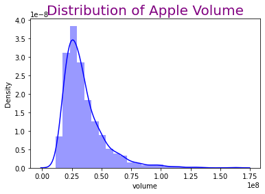
The distribution chart of volume.
sns.distplot(df.volume, bins=25, color="b")
plt.title("Distribution of Apple Volume", fontsize=20, color = 'Purple')
plt.show()
/shared-libs/python3.7/py/lib/python3.7/site-packages/seaborn/distributions.py:2619: FutureWarning: `distplot` is a deprecated function and will be removed in a future version. Please adapt your code to use either `displot` (a figure-level function with similar flexibility) or `histplot` (an axes-level function for histograms).
  warnings.warn(msg, FutureWarning)
Section 3: Linear Regression
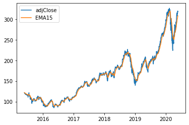
There are some commonly used indicators such as moving averages (SMA, EMA, MACD), relative Strength index (RSI), or bollinger bands (BBANDS). For our data, we will use exponetial moving average (EMA). First we need to calculate the 15-day Exponential Moving Averages (EMA15) and add EMA15 column to our DataFrame.
df["EMA15"] = df["adjClose"].ewm(span=15, min_periods=0, ignore_na = False, adjust=False).mean()
df_sub = df[["date","adjClose","EMA15"]]
df_sub.info()
<class 'pandas.core.frame.DataFrame'>
Int64Index: 1258 entries, 0 to 1257
Data columns (total 3 columns):
 #   Column    Non-Null Count  Dtype
---  ------    --------------  -----
 0   date      1258 non-null   datetime64[ns, UTC]
 1   adjClose  1258 non-null   float64
 2   EMA15     1258 non-null   float64
dtypes: datetime64[ns, UTC](1), float64(2)
memory usage: 39.3 KB
plt.plot(df_sub["date"],df["adjClose"],label = "adjClose")
plt.plot(df_sub["date"],df["EMA15"], label = "EMA15")
plt.legend()
plt.show()
chartClose = alt.Chart(df_sub).mark_line(color = "orange").encode(
    x = "date",
    y="adjClose"
)

chartEMA = alt.Chart(df_sub).mark_line(color ="Blue").encode(
    x = "date",
    y = "EMA15"
)

chartClose + chartEMA
Both graphs above are the same; however, I prefer to use plt.plot. When we have multiple linear lines, plt.plot is easier to label different lines. There is a way to create a title for various linear lines, but it is more complicated.
from sklearn.preprocessing import StandardScaler
from sklearn.model_selection import train_test_split
from sklearn.linear_model import LinearRegression
from sklearn.metrics import log_loss, mean_squared_error, mean_absolute_error, r2_score
X_train, X_test, y_train, y_test = train_test_split(df[['adjClose']],df[['EMA15']], test_size=0.2)
reg = LinearRegression()
reg.fit(X_train, y_train)
y_pred = reg.predict(X_test)
print("Mean Absolute Error is", mean_absolute_error(y_test, y_pred))
print("Coefficient of Determination is", r2_score(y_test,y_pred))
Mean Absolute Error is 3.8818754599384966
Coefficient of Determination is 0.9899721051486294
The graph below represents the observed values and predicted values on day x. The red dots are observed values whereas the purple line represents the predicted values.
df["Pred"] = reg.predict(df[["adjClose"]])
def pred_chart(x):
    day(x)
    c = alt.Chart(day(x), title = f"Apple's Stock Predicted and Observed Values on Day {x}").mark_circle(color = "red").encode(
        x= alt.X("date", scale=alt.Scale(zero=False)),
        y= alt.Y("adjClose", scale=alt.Scale(zero=False)),
    )
    c1 = alt.Chart(day(x)).mark_line(color = "Purple"). encode(
        x = alt.X("date",scale=alt.Scale(zero=False)),
        y = alt.Y("Pred",scale=alt.Scale (zero=False))
    )
    return c + c1

pred_chart(5)
Section 4: K-Nearest Neighbors Regressor
from sklearn.neighbors import KNeighborsClassifier, KNeighborsRegressor
K-Nearest Neighbors R egressor is a non-parametric method to estimate the association between the independent and continuous outcomes by averaging observations from the same neighborhood. In this case, I’ll use ‘n neighbors = 10’, which will take the ten closest points to take the average.
X_train, X_test, y_train, y_test = train_test_split(df[['adjClose']],df[['EMA15']], test_size=0.2)
reg1 = KNeighborsRegressor(n_neighbors=10)
reg1.fit(X_train,y_train)
reg1.predict(X_test)
print("Mean Test Absolute Error is", mean_absolute_error(reg1.predict(X_test), y_test))
print("Mean Train Absolute Error is", mean_absolute_error(reg1.predict(X_train), y_train))
Mean Test Absolute Error is 3.6018819215316356
Mean Train Absolute Error is 3.3270751521487245
Function get_scores(k) will take an input k to calculate the mean absolute train error and mean absolute test error and from there I can create a DataFrame of train error and test error for range k from 1 to 150.
def get_scores(k):
    reg = KNeighborsRegressor(n_neighbors=k)
    reg.fit(X_train, y_train)
    train_error = mean_absolute_error(reg.predict(X_train), y_train)
    test_error = mean_absolute_error(reg.predict(X_test), y_test)
    return (test_error, train_error)

get_scores(10)
(3.6018819215316356, 3.3270751521487245)
df_scores = pd.DataFrame({"k":range(1,150),"train_error":np.nan,"test_error":np.nan})
for i in df_scores.index:
    df_scores.loc[i,["train_error","test_error"]] = get_scores(df_scores.loc[i,"k"])

df_scores
| k | train_error | test_error | |
|---|---|---|---|
| 0 | 1 | 4.934897 | 0.043639 |
| 1 | 2 | 4.469894 | 2.293783 |
| 2 | 3 | 4.152767 | 2.824419 |
| 3 | 4 | 3.871697 | 3.106926 |
| 4 | 5 | 3.831669 | 3.206610 |
| ... | ... | ... | ... |
| 144 | 145 | 5.274543 | 5.751847 |
| 145 | 146 | 5.303177 | 5.779944 |
| 146 | 147 | 5.327647 | 5.816586 |
| 147 | 148 | 5.353606 | 5.850652 |
| 148 | 149 | 5.389431 | 5.880698 |
149 rows × 3 columns
The blue curve denotes training error, while the orange curve denotes test error. Furthermore, we can see that extremely high K values cause underfitting, whereas low K values cause overfitting to occur.
df_scores["kinv"] = 1/df_scores.k
ctrain = alt.Chart(df_scores).mark_line().encode(
    x = "kinv",
    y = "train_error"
)
ctest = alt.Chart(df_scores).mark_line(color="orange").encode(
    x = "kinv",
    y = "test_error"
)
ctest+ctrain
Section 5: Candlestick Chart
Instead of using the Scatter() plot, we will create fully interactive chart using plotly. By passing the Close or adjClose price to the y-axis, and we need to specify each of open, high, low, and close by using add_trace(go.Candlestick(...)). With make_subplots(), we also have another smaller chart at the bottom; this is called a “range slider”, and we can drag either side to zoom in/out on a certain chart area. We could hide this range slider by using figure.update_layout(xaxis_rangeslider_visible = False). In the chart below, different colors help distinguish between an up or down day – green for up days and red for down days.
import plotly.graph_objects as go
from plotly.subplots import make_subplots


stock = make_subplots(
            specs=[[{"secondary_y":True}]]
        ).add_trace(go.Candlestick(
                        x=df.date,
                        open= df["open"],
                        high=df["high"],
                        low=df["low"],
                        close= df["close"],
                        name = 'Price'),
        ).update_layout(title = {"text":"Apple Stock", "x":0.5})

stock
Summary
In this project, I started by cleaning and organizing the data set. Then I constructed a few charts to observe and compare the trend of Apple stock performance and displayed the volume distribution over the last few years. Then, I calculated the 15-day Exponential Moving Average using the collected data. Using linear regression with EMA15 and Adjust Close data to predict future stock prices. I observed a DataFrame of train error and test error with a range of k from 1 to 150 by using the K-Nearest Neighbors Regressor. Finally, I created a candlestick chart with open, high, low, and close values.
References
What is the source of your dataset(s)?
Kaggle Dataset
Were any portions of the code or ideas taken from another source? List those sources here and say how they were used.
Towards Data Science to make distribution graph.
Netflix Stock Price Prediction to calculate EMA.
Python In Office to create candlestick chart.
 Created in Deepnote