
Airline Satisfaction Analysis
Contents
Airline Satisfaction Analysis
Author: Mitra Rezvany
Course Project, UC Irvine, Math 10, S22
Introduction
In this project, I will be using the airline satisfaction dataset imported from Kaggle. The dataset displays customer satisfaction scores from 120,000+ airline passengers, including details about the passenger, their type of travel, and their evaluation of different factors like cleanliness, comfort, and overall experience. The accompanying data_dictionary dataset defines each of these additional variables.
We will start by cleaning the datset using pandas and exploring its factors/variables using plotly and seaborn charts. Then, we will explore if the passenger’s age and the distance their flight travels can predict their satisfaction by using scikit learn’s Logistic Regression. Furthermore, we will use K-Nearest Neighbors Classifier to predict the satisfaction of passengers using factors regarding flight delays from the dataset. We’ll display these findings using interactive altair charts.
Main portion of the project
import pandas as pd
import seaborn as sns
import numpy as np
import altair as alt
import matplotlib.pyplot as plt
from sklearn.linear_model import LogisticRegression
from sklearn.neighbors import KNeighborsClassifier
from sklearn.model_selection import train_test_split
from sklearn.metrics import log_loss
Import the Data
df = pd.read_csv("airline_satisfaction.csv")
data_dict = pd.read_csv("data_dictionary.csv")
df
| ID | Gender | Age | Customer Type | Type of Travel | Class | Flight Distance | Departure Delay | Arrival Delay | Departure and Arrival Time Convenience | ... | On-board Service | Seat Comfort | Leg Room Service | Cleanliness | Food and Drink | In-flight Service | In-flight Wifi Service | In-flight Entertainment | Baggage Handling | Satisfaction | |
|---|---|---|---|---|---|---|---|---|---|---|---|---|---|---|---|---|---|---|---|---|---|
| 0 | 1 | Male | 48 | First-time | Business | Business | 821 | 2 | 5.0 | 3 | ... | 3 | 5 | 2 | 5 | 5 | 5 | 3 | 5 | 5 | Neutral or Dissatisfied |
| 1 | 2 | Female | 35 | Returning | Business | Business | 821 | 26 | 39.0 | 2 | ... | 5 | 4 | 5 | 5 | 3 | 5 | 2 | 5 | 5 | Satisfied |
| 2 | 3 | Male | 41 | Returning | Business | Business | 853 | 0 | 0.0 | 4 | ... | 3 | 5 | 3 | 5 | 5 | 3 | 4 | 3 | 3 | Satisfied |
| 3 | 4 | Male | 50 | Returning | Business | Business | 1905 | 0 | 0.0 | 2 | ... | 5 | 5 | 5 | 4 | 4 | 5 | 2 | 5 | 5 | Satisfied |
| 4 | 5 | Female | 49 | Returning | Business | Business | 3470 | 0 | 1.0 | 3 | ... | 3 | 4 | 4 | 5 | 4 | 3 | 3 | 3 | 3 | Satisfied |
| ... | ... | ... | ... | ... | ... | ... | ... | ... | ... | ... | ... | ... | ... | ... | ... | ... | ... | ... | ... | ... | ... |
| 129875 | 129876 | Male | 28 | Returning | Personal | Economy Plus | 447 | 2 | 3.0 | 4 | ... | 5 | 1 | 4 | 4 | 4 | 5 | 4 | 4 | 4 | Neutral or Dissatisfied |
| 129876 | 129877 | Male | 41 | Returning | Personal | Economy Plus | 308 | 0 | 0.0 | 5 | ... | 5 | 2 | 5 | 2 | 2 | 4 | 3 | 2 | 5 | Neutral or Dissatisfied |
| 129877 | 129878 | Male | 42 | Returning | Personal | Economy Plus | 337 | 6 | 14.0 | 5 | ... | 3 | 3 | 4 | 3 | 3 | 4 | 2 | 3 | 5 | Neutral or Dissatisfied |
| 129878 | 129879 | Male | 50 | Returning | Personal | Economy Plus | 337 | 31 | 22.0 | 4 | ... | 4 | 4 | 5 | 3 | 3 | 4 | 5 | 3 | 5 | Satisfied |
| 129879 | 129880 | Female | 20 | Returning | Personal | Economy Plus | 337 | 0 | 0.0 | 1 | ... | 4 | 2 | 4 | 2 | 2 | 2 | 3 | 2 | 1 | Neutral or Dissatisfied |
129880 rows × 24 columns
data_dict
| Field | Description | |
|---|---|---|
| 0 | ID | Unique passenger identifier |
| 1 | Gender | Gender of the passenger (Female/Male) |
| 2 | Age | Age of the passenger |
| 3 | Customer Type | Type of airline customer (First-time/Returning) |
| 4 | Type of Travel | Purpose of the flight (Business/Personal) |
| 5 | Class | Travel class in the airplane for the passenger... |
| 6 | Flight Distance | Flight distance in miles |
| 7 | Departure Delay | Flight departure delay in minutes |
| 8 | Arrival Delay | Flight arrival delay in minutes |
| 9 | Departure and Arrival Time Convenience | Satisfaction level with the convenience of the... |
| 10 | Ease of Online Booking | Satisfaction level with the online booking exp... |
| 11 | Check-in Service | Satisfaction level with the check-in service f... |
| 12 | Online Boarding | Satisfaction level with the online boarding ex... |
| 13 | Gate Location | Satisfaction level with the gate location in t... |
| 14 | On-board Service | Satisfaction level with the on-boarding servic... |
| 15 | Seat Comfort | Satisfaction level with the comfort of the air... |
| 16 | Leg Room Service | Satisfaction level with the leg room of the ai... |
| 17 | Cleanliness | Satisfaction level with the cleanliness of the... |
| 18 | Food and Drink | Satisfaction level with the food and drinks on... |
| 19 | In-flight Service | Satisfaction level with the in-flight service ... |
| 20 | In-flight Wifi Service | Satisfaction level with the in-flight Wifi ser... |
| 21 | In-flight Entertainment | Satisfaction level with the in-flight entertai... |
| 22 | Baggage Handling | Satisfaction level with the baggage handling f... |
| 23 | Satisfaction | Overall satisfaction level with the airline (S... |
# info on datatypes and null entries
df.info()
<class 'pandas.core.frame.DataFrame'>
RangeIndex: 129880 entries, 0 to 129879
Data columns (total 24 columns):
# Column Non-Null Count Dtype
--- ------ -------------- -----
0 ID 129880 non-null int64
1 Gender 129880 non-null object
2 Age 129880 non-null int64
3 Customer Type 129880 non-null object
4 Type of Travel 129880 non-null object
5 Class 129880 non-null object
6 Flight Distance 129880 non-null int64
7 Departure Delay 129880 non-null int64
8 Arrival Delay 129487 non-null float64
9 Departure and Arrival Time Convenience 129880 non-null int64
10 Ease of Online Booking 129880 non-null int64
11 Check-in Service 129880 non-null int64
12 Online Boarding 129880 non-null int64
13 Gate Location 129880 non-null int64
14 On-board Service 129880 non-null int64
15 Seat Comfort 129880 non-null int64
16 Leg Room Service 129880 non-null int64
17 Cleanliness 129880 non-null int64
18 Food and Drink 129880 non-null int64
19 In-flight Service 129880 non-null int64
20 In-flight Wifi Service 129880 non-null int64
21 In-flight Entertainment 129880 non-null int64
22 Baggage Handling 129880 non-null int64
23 Satisfaction 129880 non-null object
dtypes: float64(1), int64(18), object(5)
memory usage: 23.8+ MB
df.isna().any()
ID False
Gender False
Age False
Customer Type False
Type of Travel False
Class False
Flight Distance False
Departure Delay False
Arrival Delay True
Departure and Arrival Time Convenience False
Ease of Online Booking False
Check-in Service False
Online Boarding False
Gate Location False
On-board Service False
Seat Comfort False
Leg Room Service False
Cleanliness False
Food and Drink False
In-flight Service False
In-flight Wifi Service False
In-flight Entertainment False
Baggage Handling False
Satisfaction False
dtype: bool
Although this dataset is mostly clean, df.isna().any() points out that the “Arrival Delay” column contains missing values so we’ll have to drop those from df before exploring the dataset further. We use df.shape to confirm this change in the dataset.
df.shape
(129880, 24)
df.dropna(inplace=True)
print(f"The new number of rows in this dataset is {df.shape[0]}")
The new number of rows in this dataset is 129487
The “ID” column in df seems irrelevant and part of Kaggle data assignment rather than being a column significant to this dataset so we’ll remove it.
df = df.drop("ID", axis=1)
df.head()
| Gender | Age | Customer Type | Type of Travel | Class | Flight Distance | Departure Delay | Arrival Delay | Departure and Arrival Time Convenience | Ease of Online Booking | ... | On-board Service | Seat Comfort | Leg Room Service | Cleanliness | Food and Drink | In-flight Service | In-flight Wifi Service | In-flight Entertainment | Baggage Handling | Satisfaction | |
|---|---|---|---|---|---|---|---|---|---|---|---|---|---|---|---|---|---|---|---|---|---|
| 0 | Male | 48 | First-time | Business | Business | 821 | 2 | 5.0 | 3 | 3 | ... | 3 | 5 | 2 | 5 | 5 | 5 | 3 | 5 | 5 | Neutral or Dissatisfied |
| 1 | Female | 35 | Returning | Business | Business | 821 | 26 | 39.0 | 2 | 2 | ... | 5 | 4 | 5 | 5 | 3 | 5 | 2 | 5 | 5 | Satisfied |
| 2 | Male | 41 | Returning | Business | Business | 853 | 0 | 0.0 | 4 | 4 | ... | 3 | 5 | 3 | 5 | 5 | 3 | 4 | 3 | 3 | Satisfied |
| 3 | Male | 50 | Returning | Business | Business | 1905 | 0 | 0.0 | 2 | 2 | ... | 5 | 5 | 5 | 4 | 4 | 5 | 2 | 5 | 5 | Satisfied |
| 4 | Female | 49 | Returning | Business | Business | 3470 | 0 | 1.0 | 3 | 3 | ... | 3 | 4 | 4 | 5 | 4 | 3 | 3 | 3 | 3 | Satisfied |
5 rows × 23 columns
Visualization of Variables
Numerical Variables: Matplotlib and Seaborn Graphics
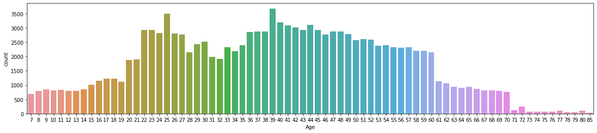
# When displaying the count of ages of passengers, the ticks on the x-axis overlap.
# To avoid this, we change the figure size to 20in wide by 4in high
plt.figure(figsize=(20,4))
sns.countplot(x="Age", data=df)
plt.show()
# Statistics of Numerical Variables
df.describe()
| Age | Flight Distance | Departure Delay | Arrival Delay | Departure and Arrival Time Convenience | Ease of Online Booking | Check-in Service | Online Boarding | Gate Location | On-board Service | Seat Comfort | Leg Room Service | Cleanliness | Food and Drink | In-flight Service | In-flight Wifi Service | In-flight Entertainment | Baggage Handling | |
|---|---|---|---|---|---|---|---|---|---|---|---|---|---|---|---|---|---|---|
| count | 129487.000000 | 129487.000000 | 129487.000000 | 129487.000000 | 129487.000000 | 129487.000000 | 129487.000000 | 129487.000000 | 129487.000000 | 129487.000000 | 129487.000000 | 129487.000000 | 129487.000000 | 129487.000000 | 129487.000000 | 129487.000000 | 129487.000000 | 129487.000000 |
| mean | 39.428761 | 1190.210662 | 14.643385 | 15.091129 | 3.057349 | 2.756786 | 3.306239 | 3.252720 | 2.976909 | 3.383204 | 3.441589 | 3.351078 | 3.286222 | 3.204685 | 3.642373 | 2.728544 | 3.358067 | 3.631886 |
| std | 15.117597 | 997.560954 | 37.932867 | 38.465650 | 1.526787 | 1.401662 | 1.266146 | 1.350651 | 1.278506 | 1.287032 | 1.319168 | 1.316132 | 1.313624 | 1.329905 | 1.176614 | 1.329235 | 1.334149 | 1.180082 |
| min | 7.000000 | 31.000000 | 0.000000 | 0.000000 | 0.000000 | 0.000000 | 0.000000 | 0.000000 | 0.000000 | 0.000000 | 0.000000 | 0.000000 | 0.000000 | 0.000000 | 0.000000 | 0.000000 | 0.000000 | 1.000000 |
| 25% | 27.000000 | 414.000000 | 0.000000 | 0.000000 | 2.000000 | 2.000000 | 3.000000 | 2.000000 | 2.000000 | 2.000000 | 2.000000 | 2.000000 | 2.000000 | 2.000000 | 3.000000 | 2.000000 | 2.000000 | 3.000000 |
| 50% | 40.000000 | 844.000000 | 0.000000 | 0.000000 | 3.000000 | 3.000000 | 3.000000 | 3.000000 | 3.000000 | 4.000000 | 4.000000 | 4.000000 | 3.000000 | 3.000000 | 4.000000 | 3.000000 | 4.000000 | 4.000000 |
| 75% | 51.000000 | 1744.000000 | 12.000000 | 13.000000 | 4.000000 | 4.000000 | 4.000000 | 4.000000 | 4.000000 | 4.000000 | 5.000000 | 4.000000 | 4.000000 | 4.000000 | 5.000000 | 4.000000 | 4.000000 | 5.000000 |
| max | 85.000000 | 4983.000000 | 1592.000000 | 1584.000000 | 5.000000 | 5.000000 | 5.000000 | 5.000000 | 5.000000 | 5.000000 | 5.000000 | 5.000000 | 5.000000 | 5.000000 | 5.000000 | 5.000000 | 5.000000 | 5.000000 |
The most common age of the passengers is 39, as shown by the peak of the graph above. df.desrcibe() confirms this by informing us that the mean of the “Age” column is 39.4.
Categorical Variables
chart = sns.countplot(x="Gender", data=df)
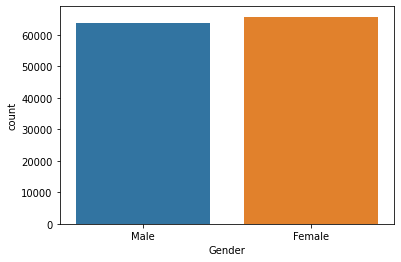
The genders of the passengers are pretty evenly distributed.
chart = sns.countplot(x="Satisfaction", data=df)
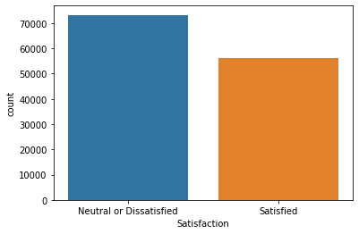
More people report being generally Neutral or Dissatsified on flights, however, there is not too large of a discrepancy.
sns.set(rc={'figure.figsize':(13, 8)})
fig, ax = plt.subplots(1,3)
sns.histplot(x="Customer Type", data=df, stat="percent", color="cornflowerblue", ax=ax[0])
sns.histplot(x="Type of Travel", data=df, stat="percent", color="navy", ax=ax[1])
sns.histplot(x="Class", data=df, stat="percent", color="indigo", ax=ax[2])
fig.show()
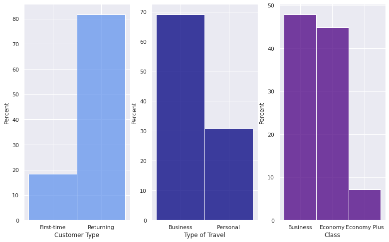
These histograms shows that the majority of passengers are returning members of this specific airline’s flights, traveling for business purposes, and are mostly split between the Business and Economy classes.
Logistic Regression
Use scikit learn’s Logistic Regression to attempt to predict Satisfaction using Age and Flight Distance.
As altair cannot chart data with more than 5000 rows, we will take a sample of 5000 rows from the available 129487 rows in df and make it into a new dataframe called df1. We will then use this sample data while performing machine learning techniques.
df1 = df.sample(5000)
df1
| Gender | Age | Customer Type | Type of Travel | Class | Flight Distance | Departure Delay | Arrival Delay | Departure and Arrival Time Convenience | Ease of Online Booking | ... | On-board Service | Seat Comfort | Leg Room Service | Cleanliness | Food and Drink | In-flight Service | In-flight Wifi Service | In-flight Entertainment | Baggage Handling | Satisfaction | |
|---|---|---|---|---|---|---|---|---|---|---|---|---|---|---|---|---|---|---|---|---|---|
| 26841 | Female | 61 | Returning | Business | Economy | 224 | 0 | 4.0 | 3 | 3 | ... | 3 | 4 | 2 | 1 | 1 | 3 | 2 | 3 | 3 | Neutral or Dissatisfied |
| 126240 | Male | 23 | First-time | Business | Economy | 590 | 2 | 19.0 | 4 | 3 | ... | 1 | 3 | 1 | 3 | 3 | 4 | 3 | 3 | 4 | Neutral or Dissatisfied |
| 35492 | Female | 67 | Returning | Personal | Economy | 950 | 0 | 0.0 | 1 | 2 | ... | 3 | 4 | 2 | 3 | 1 | 3 | 2 | 3 | 3 | Neutral or Dissatisfied |
| 53512 | Female | 18 | Returning | Personal | Economy | 2358 | 9 | 0.0 | 5 | 3 | ... | 3 | 2 | 5 | 2 | 2 | 4 | 3 | 2 | 3 | Neutral or Dissatisfied |
| 95259 | Male | 41 | Returning | Personal | Economy | 239 | 14 | 41.0 | 5 | 0 | ... | 4 | 4 | 4 | 4 | 4 | 3 | 4 | 4 | 1 | Neutral or Dissatisfied |
| ... | ... | ... | ... | ... | ... | ... | ... | ... | ... | ... | ... | ... | ... | ... | ... | ... | ... | ... | ... | ... | ... |
| 10577 | Female | 40 | Returning | Business | Business | 458 | 0 | 5.0 | 5 | 5 | ... | 5 | 5 | 5 | 5 | 3 | 5 | 5 | 5 | 5 | Satisfied |
| 74543 | Female | 8 | Returning | Business | Business | 1188 | 6 | 0.0 | 2 | 2 | ... | 1 | 4 | 1 | 4 | 4 | 4 | 4 | 4 | 3 | Neutral or Dissatisfied |
| 12651 | Male | 45 | First-time | Business | Economy Plus | 844 | 4 | 0.0 | 3 | 3 | ... | 1 | 2 | 4 | 2 | 2 | 1 | 3 | 2 | 4 | Neutral or Dissatisfied |
| 9821 | Male | 21 | First-time | Business | Business | 451 | 22 | 38.0 | 5 | 4 | ... | 5 | 5 | 2 | 5 | 5 | 4 | 4 | 5 | 5 | Satisfied |
| 96877 | Female | 44 | Returning | Personal | Economy | 849 | 45 | 44.0 | 4 | 2 | ... | 1 | 4 | 2 | 5 | 5 | 1 | 2 | 1 | 1 | Neutral or Dissatisfied |
5000 rows × 23 columns
alt.Chart(df1).mark_circle().encode(
x = "Age",
y = "Flight Distance",
color = "Satisfaction",
tooltip = ["Age", "Flight Distance"]
)
no_corr = df[["Age", "Flight Distance"]]
no_corr.corr()
| Age | Flight Distance | |
|---|---|---|
| Age | 1.000000 | 0.099863 |
| Flight Distance | 0.099863 | 1.000000 |
The graph above shows that there is no correlation between Age and Flight Distance, implying that they are not good factors to predict passenger’s general satisfaction on the flight together. The table above also indicates this, as the correlation between Age and Flight Distance is extremley low (about 0.1). We will confirm this by checking how the accuracy of prediction using these factors by performing logistic regression and splitting the data is weak.
cols = ["Age", "Flight Distance"]
X_train, X_test, y_train, y_test = train_test_split(df1[cols], df1["Satisfaction"], test_size=0.2, random_state=0)
print(f"The shape of this dataset using Train is {X_train.shape}")
The shape of this dataset using Train is (4000, 2)
clf = LogisticRegression()
clf.fit(X_train, y_train)
LogisticRegression()
df1["pred"] = clf.predict(df1[cols])
clf.score(X_test, y_test)
0.678
clf.score(X_train, y_train)
0.67
We were correct 64% of the time. Since the accuracy is so low, this is a sign that these are not the best variables to use when predicting the general satifaction of passengers, as their lack of correlation hinted at, and that we should be looking into other factors from the datset instead.
KNeigborsClassifier
Use KNeighborClassifier to predict Satisfaction using Departure Delay and Arrival Delay.
check_corr = df[["Age", "Flight Distance", "Departure Delay", "Arrival Delay"]]
check_corr.corr()
| Age | Flight Distance | Departure Delay | Arrival Delay | |
|---|---|---|---|---|
| Age | 1.000000 | 0.099863 | -0.009263 | -0.011248 |
| Flight Distance | 0.099863 | 1.000000 | 0.001992 | -0.001935 |
| Departure Delay | -0.009263 | 0.001992 | 1.000000 | 0.965291 |
| Arrival Delay | -0.011248 | -0.001935 | 0.965291 | 1.000000 |
The table above confirms that “Departure Delay” and “Arrival Delay” are the two numerical columns with the strongest correlation (about 0.97). Therefore, we can proceed with using them to predict the general satisfaction of passengers.
k_clf = KNeighborsClassifier(n_neighbors=30)
delay = ["Departure Delay", "Arrival Delay"]
X_train2, X_test2, y_train2, y_test2 = train_test_split(df1[delay], df1["Satisfaction"], test_size=0.4, random_state=0)
k_clf.fit(X_train2,y_train2)
KNeighborsClassifier(n_neighbors=49)
df1["Prediction"] = k_clf.predict(df1[delay])
Altair
Use altair to display differences in graphics when predictions are made using KMeansClassifier.
c1 = alt.Chart(df1).mark_circle().encode(
x=alt.X("Departure Delay", scale=alt.Scale(zero=False)),
y=alt.Y("Arrival Delay", scale=alt.Scale(zero=False)),
color="Satisfaction",
tooltip=["Departure Delay", "Arrival Delay"]
)
c2 = alt.Chart(df1).mark_circle().encode(
x=alt.X("Departure Delay", scale=alt.Scale(zero=False)),
y=alt.Y("Arrival Delay", scale=alt.Scale(zero=False)),
color="Prediction",
tooltip=["Departure Delay", "Arrival Delay"]
)
c1|c2
The graph on the left shows the actual data for the two types of delays, while the graph of the right shows the predicted data. Both scatterplots shows the positive correlation between departure delay and arrival delay. The predicted data scatterplot is almost entirely made up of points signifying passengers being neutral or dissatisffied, with only a small portion of satisfied passengers being clustered where the x and y axes cross, essentially where there is the lowest arrival and departure delay. This makes sense as people are more pleased with the service of an airline if there are little to no delays for their flight.
Finally, we will use a for loop and log_loss to find the number of neighbors in KNeighborsClassifier that will give us the best fit graph.
for k in range(6,50):
k_clf = KNeighborsClassifier(n_neighbors=k)
k_clf.fit(X_train, y_train)
loss = log_loss(y_test, k_clf.predict_proba(X_test))
print(k, loss)
6 1.4111251863307583
7 0.899857480556819
8 0.8333009710295111
9 0.8082307400551902
10 0.7286232491501456
11 0.7390070110585765
12 0.8284365394849427
13 0.7237233569791663
14 0.730086975826891
15 0.7361681146213711
16 0.7197551478181212
17 0.7227131448999714
18 0.7085926216493472
19 0.7132651754887945
20 0.7206286495101923
21 0.725462268515407
22 0.7138777971257559
23 0.705742401354357
24 0.6983860085109066
25 0.692945073258819
26 0.6964982325491654
27 0.6913277554801867
28 0.6878890119506471
29 0.689062148796085
30 0.6870316735759631
31 0.6903532411680618
32 0.6869070903665746
33 0.6875744312757628
34 0.6891576502112906
35 0.6878724176558395
36 0.6844915334619025
37 0.6836763884426055
38 0.6851704868072505
39 0.6829297815214472
40 0.6818537677111327
41 0.6815409729458989
42 0.6804247640209738
43 0.6812981984794128
44 0.6827787650141771
45 0.6819311980858049
46 0.6807964717982479
47 0.6809733398618737
48 0.6812360389881454
49 0.6813934053853075
Log Loss is the negative average of the log of corrected predicted probabilities for each instance. The values above show that log_loss becomes smaller as k grows larger. Also, overfitting is more likely to occur with smaller values of n_neighbors. Thus, we will have the best fitted graph when we set k to 42, where log_loss is the smallest at 0.6804. (This may change if notebook is run again, but k should be between 34 and 49 for best fit graph)
Summary
After performing both logistic regression and KMeansNeighbor machine learning techniques, our results showed that the numerical variables we examined (specifically Age and Flight Distance) were not able to predict general “Satsifaction” with great accuracy. However, we can conclude that delays do have an impact on the satisfaction of passengers, as the predictions showed greater dissatisfied passengers when there were more delays.
If we want to continue working with this dataset, we can try to convert the relevant categorical factors, such as Type of Travel and Class, into Boolean values and then check to see if they can better predict the general satisfaction of passengers for this airline. Another interesting machine learning idea is to try using linear regression and the delay times to predict other numerical data like flight distance.
References
Where the dataset was found: Kaggle
The configuration of the side by side historgrams in the visualization of relevant variables section was adapted from Airline Kaggle Notebook
K-Nearest Neighbors Guide: Winter Quarter Course Notes
I decided to use log_loss instead of test error with KNeighborsClassifier through McDonald’s Menu Analysis
 Created in Deepnote