Fraudulent And Non-fraudulent Transactions in Credit Cards
Contents
Fraudulent And Non-fraudulent Transactions in Credit Cards
Author:Yadi Wu
Course Project, UC Irvine, Math 10, S2
Introduction
The data set used in this experiment is the data of credit card transactions in September 2013 in a certain place in Europe. This dataset contains two days of transaction data, there are only 492 fraudulent transactions out of all 284807 transactions, which first brings us a data imbalance problem, with positive examples (fraudulent transactions) accounting for 0.172% of the total transactions. Among them, there are 28 columns of desensitization features, named V1, V2, … V28, which are all obtained by PCA (principal component analysis), and the only two features that are not dimensionally reduced by PCA are “Time” and “Amount” “, the label is “Class”. The feature ‘Time’ represents the elapsed time of each card swipe relative to the first swipe of each card in the dataset, in seconds. The label is “Class”, a value of 1 represents a fraudulent transaction, and a value of 0 represents a normal transaction.
!pip install --upgrade pip
Collecting pip
  Downloading pip-22.1.2-py3-none-any.whl (2.1 MB)
     |████████████████████████████████| 2.1 MB 19.1 MB/s
?25hInstalling collected packages: pip
  Attempting uninstall: pip
    Found existing installation: pip 20.1.1
    Uninstalling pip-20.1.1:
      Successfully uninstalled pip-20.1.1
Successfully installed pip-22.1.2
!pip install imblearn==0.0
Collecting imblearn==0.0
  Downloading imblearn-0.0-py2.py3-none-any.whl (1.9 kB)
Collecting imbalanced-learn
  Downloading imbalanced_learn-0.9.1-py3-none-any.whl (199 kB)
     ━━━━━━━━━━━━━━━━━━━━━━━━━━━━━━━━━━━━━━ 199.3/199.3 kB 27.6 MB/s eta 0:00:00
?25hRequirement already satisfied: threadpoolctl>=2.0.0 in /shared-libs/python3.7/py/lib/python3.7/site-packages (from imbalanced-learn->imblearn==0.0) (3.1.0)
Requirement already satisfied: numpy>=1.17.3 in /shared-libs/python3.7/py/lib/python3.7/site-packages (from imbalanced-learn->imblearn==0.0) (1.21.6)
Requirement already satisfied: scipy>=1.3.2 in /shared-libs/python3.7/py/lib/python3.7/site-packages (from imbalanced-learn->imblearn==0.0) (1.7.3)
Requirement already satisfied: joblib>=1.0.0 in /shared-libs/python3.7/py/lib/python3.7/site-packages (from imbalanced-learn->imblearn==0.0) (1.1.0)
  Downloading imbalanced_learn-0.9.0-py3-none-any.whl (199 kB)
     ━━━━━━━━━━━━━━━━━━━━━━━━━━━━━━━━━━━━━━ 199.1/199.1 kB 37.0 MB/s eta 0:00:00
?25hRequirement already satisfied: scikit-learn>=1.0.1 in /shared-libs/python3.7/py/lib/python3.7/site-packages (from imbalanced-learn->imblearn==0.0) (1.0.2)
Installing collected packages: imbalanced-learn, imblearn
Successfully installed imbalanced-learn-0.9.0 imblearn-0.0
import numpy as np
import pandas as pd
import matplotlib.pyplot as plt
import altair as alt
import seaborn as sns
from sklearn.preprocessing import StandardScaler
from sklearn.linear_model import LogisticRegression, LinearRegression
from sklearn.metrics import recall_score, accuracy_score, confusion_matrix, classification_report,roc_auc_score
from sklearn import model_selection
from sklearn import metrics
import imblearn
from imblearn.over_sampling import SMOTE
import warnings
warnings.filterwarnings('ignore')
from sklearn.model_selection import train_test_split
#load data
df = pd.read_csv("creditcard.csv")
df.head()
| Time | V1 | V2 | V3 | V4 | V5 | V6 | V7 | V8 | V9 | ... | V21 | V22 | V23 | V24 | V25 | V26 | V27 | V28 | Amount | Class | |
|---|---|---|---|---|---|---|---|---|---|---|---|---|---|---|---|---|---|---|---|---|---|
| 0 | 0.0 | -1.359807 | -0.072781 | 2.536347 | 1.378155 | -0.338321 | 0.462388 | 0.239599 | 0.098698 | 0.363787 | ... | -0.018307 | 0.277838 | -0.110474 | 0.066928 | 0.128539 | -0.189115 | 0.133558 | -0.021053 | 149.62 | 0 |
| 1 | 0.0 | 1.191857 | 0.266151 | 0.166480 | 0.448154 | 0.060018 | -0.082361 | -0.078803 | 0.085102 | -0.255425 | ... | -0.225775 | -0.638672 | 0.101288 | -0.339846 | 0.167170 | 0.125895 | -0.008983 | 0.014724 | 2.69 | 0 |
| 2 | 1.0 | -1.358354 | -1.340163 | 1.773209 | 0.379780 | -0.503198 | 1.800499 | 0.791461 | 0.247676 | -1.514654 | ... | 0.247998 | 0.771679 | 0.909412 | -0.689281 | -0.327642 | -0.139097 | -0.055353 | -0.059752 | 378.66 | 0 |
| 3 | 1.0 | -0.966272 | -0.185226 | 1.792993 | -0.863291 | -0.010309 | 1.247203 | 0.237609 | 0.377436 | -1.387024 | ... | -0.108300 | 0.005274 | -0.190321 | -1.175575 | 0.647376 | -0.221929 | 0.062723 | 0.061458 | 123.50 | 0 |
| 4 | 2.0 | -1.158233 | 0.877737 | 1.548718 | 0.403034 | -0.407193 | 0.095921 | 0.592941 | -0.270533 | 0.817739 | ... | -0.009431 | 0.798278 | -0.137458 | 0.141267 | -0.206010 | 0.502292 | 0.219422 | 0.215153 | 69.99 | 0 |
5 rows × 31 columns
#shape of data
print(df.shape)
(284807, 31)
#Check if there are missing values
print(df.isna().sum())
Time      0
V1        0
V2        0
V3        0
V4        0
V5        0
V6        0
V7        0
V8        0
V9        0
V10       0
V11       0
V12       0
V13       0
V14       0
V15       0
V16       0
V17       0
V18       0
V19       0
V20       0
V21       0
V22       0
V23       0
V24       0
V25       0
V26       0
V27       0
V28       0
Amount    0
Class     0
dtype: int64
#重复值检测
any(df.duplicated())
True
#去除重复值
df.drop_duplicates(inplace=True)
#异常值检测
fig , ax = plt.subplots(figsize=(18,12))
plt.title('箱线图异常值检测',fontsize=15)
sns.boxplot(data=df.iloc[:,1:-2],ax=ax)
plt.show()
#Descriptive statistical analysis of data
df.describe().T
| count | mean | std | min | 25% | 50% | 75% | max | |
|---|---|---|---|---|---|---|---|---|
| Time | 283726.0 | 94811.077600 | 47481.047891 | 0.000000 | 54204.750000 | 84692.500000 | 139298.000000 | 172792.000000 |
| V1 | 283726.0 | 0.005917 | 1.948026 | -56.407510 | -0.915951 | 0.020384 | 1.316068 | 2.454930 |
| V2 | 283726.0 | -0.004135 | 1.646703 | -72.715728 | -0.600321 | 0.063949 | 0.800283 | 22.057729 |
| V3 | 283726.0 | 0.001613 | 1.508682 | -48.325589 | -0.889682 | 0.179963 | 1.026960 | 9.382558 |
| V4 | 283726.0 | -0.002966 | 1.414184 | -5.683171 | -0.850134 | -0.022248 | 0.739647 | 16.875344 |
| V5 | 283726.0 | 0.001828 | 1.377008 | -113.743307 | -0.689830 | -0.053468 | 0.612218 | 34.801666 |
| V6 | 283726.0 | -0.001139 | 1.331931 | -26.160506 | -0.769031 | -0.275168 | 0.396792 | 73.301626 |
| V7 | 283726.0 | 0.001801 | 1.227664 | -43.557242 | -0.552509 | 0.040859 | 0.570474 | 120.589494 |
| V8 | 283726.0 | -0.000854 | 1.179054 | -73.216718 | -0.208828 | 0.021898 | 0.325704 | 20.007208 |
| V9 | 283726.0 | -0.001596 | 1.095492 | -13.434066 | -0.644221 | -0.052596 | 0.595977 | 15.594995 |
| V10 | 283726.0 | -0.001441 | 1.076407 | -24.588262 | -0.535578 | -0.093237 | 0.453619 | 23.745136 |
| V11 | 283726.0 | 0.000202 | 1.018720 | -4.797473 | -0.761649 | -0.032306 | 0.739579 | 12.018913 |
| V12 | 283726.0 | -0.000715 | 0.994674 | -18.683715 | -0.406198 | 0.139072 | 0.616976 | 7.848392 |
| V13 | 283726.0 | 0.000603 | 0.995430 | -5.791881 | -0.647862 | -0.012927 | 0.663178 | 7.126883 |
| V14 | 283726.0 | 0.000252 | 0.952215 | -19.214325 | -0.425732 | 0.050209 | 0.492336 | 10.526766 |
| V15 | 283726.0 | 0.001043 | 0.914894 | -4.498945 | -0.581452 | 0.049299 | 0.650104 | 8.877742 |
| V16 | 283726.0 | 0.001162 | 0.873696 | -14.129855 | -0.466860 | 0.067119 | 0.523512 | 17.315112 |
| V17 | 283726.0 | 0.000170 | 0.842507 | -25.162799 | -0.483928 | -0.065867 | 0.398972 | 9.253526 |
| V18 | 283726.0 | 0.001515 | 0.837378 | -9.498746 | -0.498014 | -0.002142 | 0.501956 | 5.041069 |
| V19 | 283726.0 | -0.000264 | 0.813379 | -7.213527 | -0.456289 | 0.003367 | 0.458508 | 5.591971 |
| V20 | 283726.0 | 0.000187 | 0.769984 | -54.497720 | -0.211469 | -0.062353 | 0.133207 | 39.420904 |
| V21 | 283726.0 | -0.000371 | 0.723909 | -34.830382 | -0.228305 | -0.029441 | 0.186194 | 27.202839 |
| V22 | 283726.0 | -0.000015 | 0.724550 | -10.933144 | -0.542700 | 0.006675 | 0.528245 | 10.503090 |
| V23 | 283726.0 | 0.000198 | 0.623702 | -44.807735 | -0.161703 | -0.011159 | 0.147748 | 22.528412 |
| V24 | 283726.0 | 0.000214 | 0.605627 | -2.836627 | -0.354453 | 0.041016 | 0.439738 | 4.584549 |
| V25 | 283726.0 | -0.000232 | 0.521220 | -10.295397 | -0.317485 | 0.016278 | 0.350667 | 7.519589 |
| V26 | 283726.0 | 0.000149 | 0.482053 | -2.604551 | -0.326763 | -0.052172 | 0.240261 | 3.517346 |
| V27 | 283726.0 | 0.001763 | 0.395744 | -22.565679 | -0.070641 | 0.001479 | 0.091208 | 31.612198 |
| V28 | 283726.0 | 0.000547 | 0.328027 | -15.430084 | -0.052818 | 0.011288 | 0.078276 | 33.847808 |
| Amount | 283726.0 | 88.472687 | 250.399437 | 0.000000 | 5.600000 | 22.000000 | 77.510000 | 25691.160000 |
| Class | 283726.0 | 0.001667 | 0.040796 | 0.000000 | 0.000000 | 0.000000 | 0.000000 | 1.000000 |
Polynomial Regression
df['Class'].value_counts().plot.barh()
plt.title("Number of fraudulent and legitimate transactions")
df['Class'].value_counts()
0    283253
1       473
Name: Class, dtype: int64
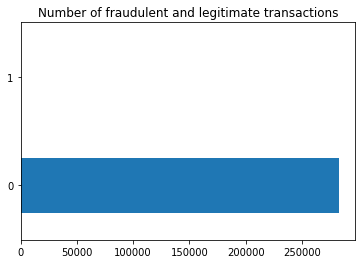
The above code is used to help me observe, understand and organize the data
KMeans Clustering
Through the classification of Class, we know that among the 280,000 data, there are only more than 400 fraudulent transactions. And first, I want to Kmeans Cluster them by applying the principal components of v1 to v28. See if I can find these frauds in the 280,000 data through the cluster.
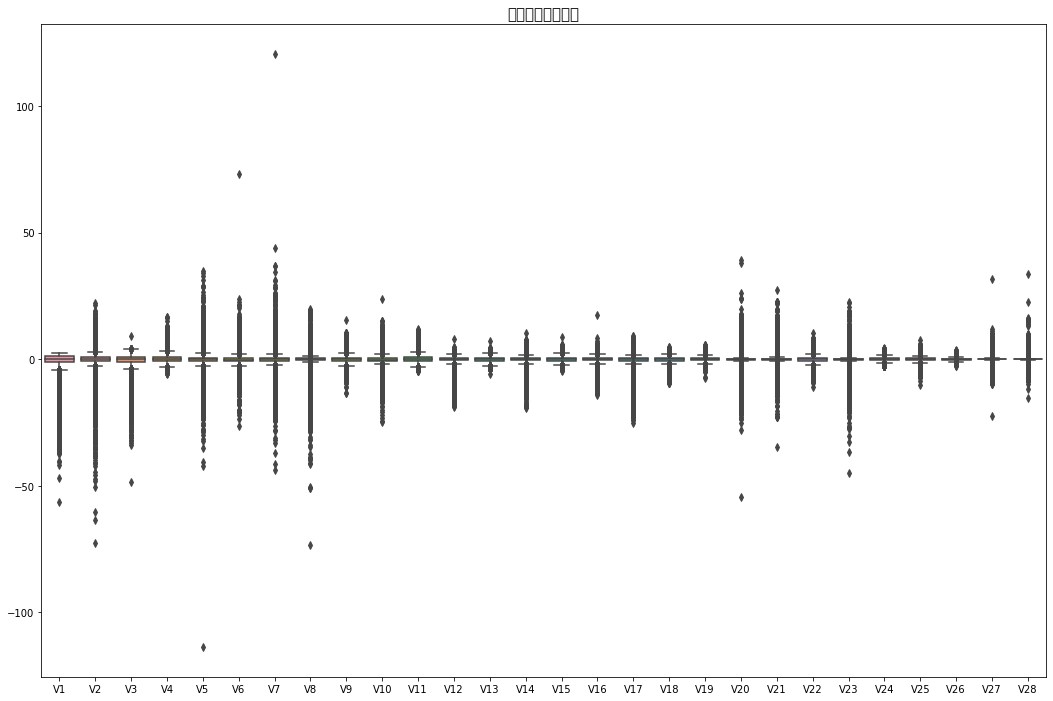
By observing the boxplot we created, we can find that there are many outliers in v1 to v28,, so in order to solve these outliers and not let it affect our clustering, I choose to use standardscaler to solve this problem. -
from sklearn.cluster import KMeans
max_deg = 28
cols = [f"V{i}" for i in range(1, max_deg+1)]
scaler = StandardScaler()
scaler.fit(df[cols])
df[cols] = scaler.transform(df[cols])
kmeans = KMeans(n_clusters = 2)
kmeans.fit(df[cols])
df["Cluster"] = kmeans.predict(df[cols])
df["Cluster"].value_counts()
1    244956
0     38770
Name: Cluster, dtype: int64
df
| Time | V1 | V2 | V3 | V4 | V5 | V6 | V7 | V8 | V9 | ... | V22 | V23 | V24 | V25 | V26 | V27 | V28 | Amount | Class | Cluster | |
|---|---|---|---|---|---|---|---|---|---|---|---|---|---|---|---|---|---|---|---|---|---|
| 0 | 0.0 | -0.701082 | -0.041687 | 1.680101 | 0.976623 | -0.247020 | 0.348012 | 0.193700 | 0.084434 | 0.333534 | ... | 0.383483 | -0.177444 | 0.110157 | 0.247059 | -0.392622 | 0.333033 | -0.065850 | 149.62 | 0 | 1 |
| 1 | 0.0 | 0.608792 | 0.164138 | 0.109279 | 0.318998 | 0.042258 | -0.060980 | -0.065656 | 0.072903 | -0.231703 | ... | -0.881454 | 0.162081 | -0.561503 | 0.321175 | 0.260854 | -0.027154 | 0.043219 | 2.69 | 0 | 1 |
| 2 | 1.0 | -0.700336 | -0.811337 | 1.174270 | 0.270648 | -0.366756 | 1.352655 | 0.643223 | 0.210788 | -1.381169 | ... | 1.065068 | 1.457772 | -1.138484 | -0.628161 | -0.288861 | -0.144325 | -0.183824 | 378.66 | 0 | 0 |
| 3 | 1.0 | -0.499064 | -0.109972 | 1.187383 | -0.608355 | -0.008814 | 0.937245 | 0.192079 | 0.320843 | -1.264664 | ... | 0.007299 | -0.305465 | -1.941446 | 1.242487 | -0.460694 | 0.154039 | 0.185687 | 123.50 | 0 | 0 |
| 4 | 2.0 | -0.597606 | 0.535539 | 1.025470 | 0.287092 | -0.297036 | 0.072873 | 0.481517 | -0.228725 | 0.747917 | ... | 1.101780 | -0.220709 | 0.232904 | -0.394800 | 1.041677 | 0.550001 | 0.654234 | 69.99 | 0 | 1 |
| ... | ... | ... | ... | ... | ... | ... | ... | ... | ... | ... | ... | ... | ... | ... | ... | ... | ... | ... | ... | ... | ... |
| 284802 | 172786.0 | -6.102103 | 6.118855 | -6.519873 | -1.459282 | -3.897079 | -1.956335 | -4.007632 | 6.196662 | 1.749010 | ... | 0.154412 | 1.626230 | -0.841382 | 2.757072 | 0.518377 | 2.380049 | 2.509507 | 0.77 | 0 | 1 |
| 284803 | 172787.0 | -0.379208 | -0.030938 | 1.347812 | -0.520175 | 0.629193 | 0.795504 | 0.018351 | 0.250814 | 0.535282 | ... | 1.275826 | 0.019665 | -1.678330 | -1.163409 | -0.820253 | 0.168567 | -0.164849 | 24.79 | 0 | 1 |
| 284804 | 172788.0 | 0.982354 | -0.180433 | -2.155033 | -0.392355 | 1.908988 | 2.276699 | -0.243249 | 0.601561 | 0.396215 | ... | 0.798074 | -0.060444 | 1.056626 | 0.510299 | -0.181557 | 0.006802 | -0.082640 | 67.88 | 0 | 1 |
| 284805 | 172788.0 | -0.126465 | 0.324660 | 0.464577 | 0.489870 | -0.275808 | 0.469130 | -0.560399 | 0.576734 | 0.359367 | ... | 1.104223 | -0.262138 | 0.203081 | -1.091530 | 1.133734 | 0.270523 | 0.317004 | 10.00 | 0 | 1 |
| 284806 | 172792.0 | -0.276860 | -0.112709 | 0.465125 | -0.355898 | -0.010438 | -0.486871 | 1.283094 | -0.350956 | 0.445258 | ... | 0.887577 | 0.603781 | 0.014172 | -0.908286 | -1.697776 | -0.010558 | 0.039941 | 217.00 | 0 | 1 |
283726 rows × 32 columns
After clustering, I need to check that when Class is 1, Cluster is also equal to 1. This can help me determine whether using cluster to identify fraud is an effective method.
df_fraud = df[df["Class"]==1]
df_result = df_fraud[df_fraud["Class"] !=df_fraud["Cluster"]]
df_result.shape
(102, 32)
Through the data, it can be known that when Class is equal to 1, only 4 rows in the cluster are also equal to 1, that is to say, through the cluster, it cannot help us find fraudulent behaviors through data features..
Polynomial Regression
Because the database I have chosen is too large. So I selected the fraction trade part for polynomial regression. I will analyze the linear regression of Time and amount in the Fraudent trade.
df_fraud
| Time | V1 | V2 | V3 | V4 | V5 | V6 | V7 | V8 | V9 | ... | V22 | V23 | V24 | V25 | V26 | V27 | V28 | Amount | Class | Cluster | |
|---|---|---|---|---|---|---|---|---|---|---|---|---|---|---|---|---|---|---|---|---|---|
| 541 | 406.0 | -1.189998 | 1.187907 | -1.068129 | 2.829108 | -0.380547 | -1.070182 | -2.068312 | 1.181043 | -2.527172 | ... | -0.048353 | -0.746205 | 0.528353 | 0.085859 | 0.368612 | 0.655430 | -0.438451 | 0.00 | 1 | 1 |
| 623 | 472.0 | -1.565412 | -1.914843 | 0.720398 | 1.620450 | 0.986181 | -0.798604 | 0.263732 | -0.056774 | -0.245878 | ... | 0.601053 | 2.205812 | -0.485477 | 0.537260 | -0.301858 | -0.643185 | 0.107360 | 529.00 | 1 | 1 |
| 4920 | 4462.0 | -1.185441 | 1.070858 | -0.239519 | 1.649866 | -0.598005 | -0.056045 | 0.456575 | -0.337807 | -0.216028 | ... | -1.286836 | 0.276620 | -0.144551 | -0.299072 | -1.125972 | 0.095524 | -0.468183 | 239.93 | 1 | 1 |
| 6108 | 6986.0 | -2.260698 | 0.827413 | -1.719688 | 1.897036 | -0.820591 | -1.280397 | -2.849317 | -0.210273 | -0.224714 | ... | 0.244266 | -0.699702 | -0.088695 | 0.484705 | -1.364245 | -2.094537 | 2.588289 | 59.00 | 1 | 1 |
| 6329 | 7519.0 | 0.630546 | 1.836324 | -2.854291 | 3.348765 | 2.630616 | -1.018528 | 1.394231 | -0.420256 | -1.169578 | ... | -0.971868 | -1.053394 | -2.696166 | 2.857019 | 1.175491 | -0.029765 | 0.445835 | 1.00 | 1 | 1 |
| ... | ... | ... | ... | ... | ... | ... | ... | ... | ... | ... | ... | ... | ... | ... | ... | ... | ... | ... | ... | ... | ... |
| 279863 | 169142.0 | -0.992699 | 0.686092 | -2.995961 | 1.239062 | -1.138931 | -1.508606 | -0.720598 | 0.592056 | -1.883493 | ... | -0.440514 | 1.024883 | -0.487263 | 1.031686 | 1.635188 | 0.735115 | 0.449417 | 390.00 | 1 | 1 |
| 280143 | 169347.0 | 0.704633 | 0.785520 | -3.318041 | 1.000449 | 0.320081 | -0.995096 | -1.152574 | 0.211509 | -1.027667 | ... | 0.038989 | -0.233828 | -0.134181 | 1.001703 | 1.533689 | 0.978889 | 0.567300 | 0.76 | 1 | 1 |
| 280149 | 169351.0 | -0.350129 | 0.686525 | -1.468379 | 0.333249 | -0.815079 | -0.001657 | -1.821788 | 1.027107 | -0.593938 | ... | 1.151230 | 0.305829 | 0.052600 | -1.418716 | 0.976993 | 0.968670 | 0.590850 | 77.89 | 1 | 1 |
| 281144 | 169966.0 | -1.601495 | 0.358292 | -3.580180 | 1.287005 | -0.611796 | -2.209134 | -1.800009 | 0.898677 | -1.488591 | ... | -0.371533 | -0.731610 | -0.303609 | -0.629170 | 1.257056 | 2.231529 | -0.775084 | 245.00 | 1 | 1 |
| 281674 | 170348.0 | 1.019526 | 0.098749 | -1.713455 | 0.291077 | 0.834651 | -0.071742 | 0.180220 | -0.057274 | 0.528919 | ... | -0.407316 | -0.116034 | -0.743818 | 0.601472 | -0.601109 | 0.003094 | -0.048338 | 42.53 | 1 | 1 |
473 rows × 32 columns
scaler = StandardScaler()
sub = ["Time","Amount"]
scaler.fit(df_fraud[sub])
df_fraud[sub] = scaler.transform(df_fraud[sub])
df_fraud
| Time | V1 | V2 | V3 | V4 | V5 | V6 | V7 | V8 | V9 | ... | V22 | V23 | V24 | V25 | V26 | V27 | V28 | Amount | Class | Cluster | |
|---|---|---|---|---|---|---|---|---|---|---|---|---|---|---|---|---|---|---|---|---|---|
| 541 | -1.647524 | -1.189998 | 1.187907 | -1.068129 | 2.829108 | -0.380547 | -1.070182 | -2.068312 | 1.181043 | -2.527172 | ... | -0.048353 | -0.746205 | 0.528353 | 0.085859 | 0.368612 | 0.655430 | -0.438451 | -0.476548 | 1 | 1 |
| 623 | -1.646165 | -1.565412 | -1.914843 | 0.720398 | 1.620450 | 0.986181 | -0.798604 | 0.263732 | -0.056774 | -0.245878 | ... | 0.601053 | 2.205812 | -0.485477 | 0.537260 | -0.301858 | -0.643185 | 0.107360 | 1.558570 | 1 | 1 |
| 4920 | -1.564041 | -1.185441 | 1.070858 | -0.239519 | 1.649866 | -0.598005 | -0.056045 | 0.456575 | -0.337807 | -0.216028 | ... | -1.286836 | 0.276620 | -0.144551 | -0.299072 | -1.125972 | 0.095524 | -0.468183 | 0.446488 | 1 | 1 |
| 6108 | -1.512090 | -2.260698 | 0.827413 | -1.719688 | 1.897036 | -0.820591 | -1.280397 | -2.849317 | -0.210273 | -0.224714 | ... | 0.244266 | -0.699702 | -0.088695 | 0.484705 | -1.364245 | -2.094537 | 2.588289 | -0.249569 | 1 | 1 |
| 6329 | -1.501120 | 0.630546 | 1.836324 | -2.854291 | 3.348765 | 2.630616 | -1.018528 | 1.394231 | -0.420256 | -1.169578 | ... | -0.971868 | -1.053394 | -2.696166 | 2.857019 | 1.175491 | -0.029765 | 0.445835 | -0.472701 | 1 | 1 |
| ... | ... | ... | ... | ... | ... | ... | ... | ... | ... | ... | ... | ... | ... | ... | ... | ... | ... | ... | ... | ... | ... |
| 279863 | 1.825501 | -0.992699 | 0.686092 | -2.995961 | 1.239062 | -1.138931 | -1.508606 | -0.720598 | 0.592056 | -1.883493 | ... | -0.440514 | 1.024883 | -0.487263 | 1.031686 | 1.635188 | 0.735115 | 0.449417 | 1.023822 | 1 | 1 |
| 280143 | 1.829720 | 0.704633 | 0.785520 | -3.318041 | 1.000449 | 0.320081 | -0.995096 | -1.152574 | 0.211509 | -1.027667 | ... | 0.038989 | -0.233828 | -0.134181 | 1.001703 | 1.533689 | 0.978889 | 0.567300 | -0.473624 | 1 | 1 |
| 280149 | 1.829803 | -0.350129 | 0.686525 | -1.468379 | 0.333249 | -0.815079 | -0.001657 | -1.821788 | 1.027107 | -0.593938 | ... | 1.151230 | 0.305829 | 0.052600 | -1.418716 | 0.976993 | 0.968670 | 0.590850 | -0.176897 | 1 | 1 |
| 281144 | 1.842461 | -1.601495 | 0.358292 | -3.580180 | 1.287005 | -0.611796 | -2.209134 | -1.800009 | 0.898677 | -1.488591 | ... | -0.371533 | -0.731610 | -0.303609 | -0.629170 | 1.257056 | 2.231529 | -0.775084 | 0.465992 | 1 | 1 |
| 281674 | 1.850323 | 1.019526 | 0.098749 | -1.713455 | 0.291077 | 0.834651 | -0.071742 | 0.180220 | -0.057274 | 0.528919 | ... | -0.407316 | -0.116034 | -0.743818 | 0.601472 | -0.601109 | 0.003094 | -0.048338 | -0.312931 | 1 | 1 |
473 rows × 32 columns
First let’s look at the graph, we can see that the relationship between them doesn’t look linear. So, I choose to do a polynomial regression.
cols2 = []
for deg in range(1,10):
    cols2.append(f"t{deg}")
    df_fraud[f"t{deg}"] = df_fraud["Time"]**deg
reg = LinearRegression()
reg.fit(df_fraud[cols2], df_fraud["Amount"])
df_fraud["Pred"] = reg.predict(df_fraud[cols2])
c = alt.Chart(df_fraud).mark_circle().encode(
    x="Time",
    y="Amount"
)
c_poly = alt.Chart(df_fraud).mark_line(color="red", clip=True).encode(
    x="Time",
    y="Pred"
)

c+c_poly
We found that the number of fraudulent transactions is lower than the number of non-fraudulent transactions (492). Actually, this seems to be an imbalanced dataset.
What is an imbalanced dataset
If any dataset has a large difference between positive and negative values, it is called an imbalanced dataset. In other words, a dataset where the number of records per (any) target class varies widely is called an imbalanced dataset. For example, in our dataset, we have a total of 284,807 records, but only 492 belong to class 1, which clearly shows that our dataset is unbalanced.
What can it cause
It can be seen that the number of records for class 1 is very small compared to class 0, so we cannot correctly classify class 1, which is a problem caused by the imbalance of the dataset. In order to deal with imbalanced datasets or make our model work well on imbalanced datasets, we need to measure the performance of the model in a well descriptive way, we can’t just measure the accuracy of the model, Since we have 99% of our data from class 0, it doesn’t matter how well our model performs on the minore class, its accuracy is always very low. Therefore, in the case of imbalanced data, we should choose estimators wisely! Metrics like confusion measures and classification reports give us correct estimates even when the dataset is unbalanced.
Processing method
Random sampling: One of the most widely used techniques for dealing with imbalanced data (making it balanced) is random sampling. Random sampling There are two main ways to randomly downsample. This involves randomly selecting examples from the majority class and removing them from the training dataset. Random upsampling. Random oversampling involves randomly picking samples from the minority class, replacing them, and adding them to the training dataset.
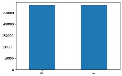
Synthetic Minority Supersampling Technique (SMOT): SMOTE first randomly selects a minority class instance a and finds its k nearest minority class neighbors. Synthetic instances are then created by randomly selecting one of the k nearest neighbors b and connecting a and b to form line segments in the feature space. The composite instance is generated as a convex combination of the two selected instances a and b. In addition to these methods, the emsemble method is also very useful in dealing with imbalanced datasets. We will use SMOTE for our dataset, as it is better to generate new data by sampling rather than just copying and deleting current data.
x = df.drop("Class",axis=1) #x will contain all data columns except class`
y = df['Class']
print(x.shape,y.shape)
(283726, 31) (283726,)
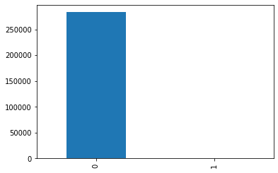
#Before #smote
y.value_counts().plot.bar()
<AxesSubplot:>
smote = SMOTE(random_state=42)
X,Y  = smote.fit_resample(x, y)
print("After SMOTE")
Y.value_counts().plot.bar()
After SMOTE
<AxesSubplot:>
sample=pd.concat([X,Y],axis=1).sample(10000,random_state=123)
sample
| Time | V1 | V2 | V3 | V4 | V5 | V6 | V7 | V8 | V9 | ... | V22 | V23 | V24 | V25 | V26 | V27 | V28 | Amount | Cluster | Class | |
|---|---|---|---|---|---|---|---|---|---|---|---|---|---|---|---|---|---|---|---|---|---|
| 442331 | 77172.237657 | 0.540937 | 0.790502 | -0.849117 | 1.508323 | 0.596676 | -0.842425 | 0.319839 | -0.083568 | -0.051690 | ... | -0.917181 | -0.174921 | -0.048331 | 1.219082 | -0.675134 | 0.264111 | 0.385684 | 1.000000 | 1 | 1 |
| 158471 | 112183.000000 | 0.995435 | -0.402174 | -0.191834 | 0.368670 | -0.735063 | -0.393922 | -0.638201 | 0.069545 | 1.441512 | ... | 0.724353 | 0.273253 | -0.133346 | -0.697353 | 1.204531 | -0.087840 | -0.151104 | 28.750000 | 1 | 0 |
| 93113 | 64421.000000 | 0.010810 | -2.128306 | -0.521554 | -0.390150 | -1.610271 | -0.594810 | 0.214228 | -0.374345 | -1.561731 | ... | -0.827589 | -1.212313 | 0.671466 | 0.672146 | -0.296187 | -0.355914 | 0.431251 | 792.000000 | 0 | 0 |
| 60869 | 49670.000000 | 0.464578 | 0.173652 | 0.296629 | 2.013869 | -0.064909 | 0.272325 | -0.084984 | 0.219016 | -0.426335 | ... | -0.010324 | -0.181532 | 0.221520 | 0.876706 | 0.148532 | 0.044308 | 0.135465 | 75.080000 | 1 | 0 |
| 60103 | 49287.000000 | -0.264812 | -1.895529 | 0.134618 | 0.616322 | -1.167512 | 0.897394 | 0.118770 | 0.258287 | 0.780149 | ... | -0.754793 | -0.942907 | -0.313470 | -0.685566 | 1.798187 | -0.410245 | 0.424572 | 828.550000 | 1 | 0 |
| ... | ... | ... | ... | ... | ... | ... | ... | ... | ... | ... | ... | ... | ... | ... | ... | ... | ... | ... | ... | ... | ... |
| 223306 | 143665.000000 | 0.841603 | -0.355296 | -2.650655 | 0.247401 | 2.292331 | 2.217603 | 0.625064 | 0.345962 | -0.423122 | ... | 1.150275 | -0.619937 | 1.260476 | 1.598715 | -0.412681 | -0.201462 | -0.140284 | 232.150000 | 1 | 0 |
| 550235 | 129386.841056 | 0.143811 | 0.902407 | -2.546283 | 2.530591 | -0.467587 | -0.353537 | -1.494261 | 0.791248 | -0.459440 | ... | 0.885070 | 0.112711 | 0.328755 | -0.519594 | -0.113653 | 0.907097 | 0.302719 | 111.690586 | 1 | 1 |
| 234211 | 148243.000000 | -0.305571 | 0.530397 | 0.049392 | -0.694545 | 0.599879 | 0.176063 | 0.931478 | -0.309567 | 0.831811 | ... | 0.746176 | -0.476628 | 0.545621 | 0.036709 | 1.030441 | -0.318004 | -0.650986 | 35.970000 | 1 | 0 |
| 294575 | 43245.220256 | -1.907073 | 1.322483 | -3.173414 | 1.258307 | -2.329949 | -0.990770 | -2.569501 | -0.569741 | -0.852165 | ... | -0.259052 | 0.370714 | -0.146394 | 0.377387 | -1.485624 | -0.163583 | -2.004174 | 269.933482 | 1 | 1 |
| 364614 | 154625.031140 | -0.347385 | 2.739970 | -4.371548 | 4.725430 | 0.680820 | -1.373242 | -1.769484 | 0.816217 | -4.321947 | ... | -0.394643 | -0.460494 | -1.724119 | -0.085912 | 1.161034 | 1.817458 | 1.122139 | 0.769328 | 1 | 1 |
10000 rows × 32 columns
# split training set and test set
X_train,X_test,y_train,y_test = train_test_split(sample.drop(['Time','Class'],axis=1),sample['Class'],random_state=42,test_size=.25)
plt.figure(figsize=(10,10))
sns.heatmap(df.corr(), cmap='tab20_r',linewidths=.5,annot=False)
<AxesSubplot:>
Heat map
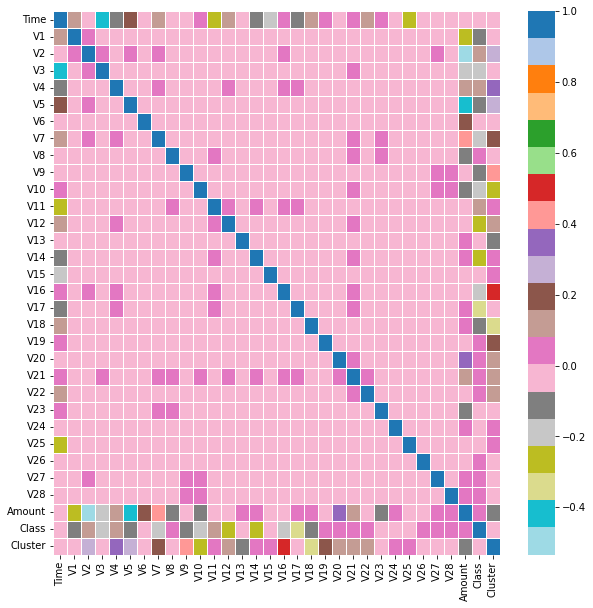
Using heat map, you can see the similarity of multiple features in the data table.The darker the color, the stronger the correlation
logistic regression model
#K-fold cross-validation
C= [1.0,3.0,6.0,8.0,10.0]
# Build an empty list to store the average accuracy
accuracy = []
per_accuracy=[]
for k in C:
    cv_result = model_selection.cross_val_score(LogisticRegression(C=k,class_weight=None,dual=False,fit_intercept=True,max_iter=100,penalty='l1',solver='liblinear'),
                                              X_train, y_train, cv = 10, scoring='recall')
    accuracy.append(cv_result.mean())
    per_accuracy.append(cv_result)
Building an empty list to store the average accuracy,and then using the 10-fold cross-validation method to compare the prediction accuracy of the model under each k value. Selecting the subscript corresponding to the maximum value from the k average accuracies, and then ploting a line graph between different K values and average prediction accuracy
accuracy
[0.9632642123922992,
 0.9645765483503045,
 0.9645765483503045,
 0.9645765483503045,
 0.9645765483503045]
df1 = pd.DataFrame({"C":[1.0,3.0,6.0,8.0,10.0],"accuracy":[0.963001745200698,0.9643140811587033,0.9648390155419054,0.9651007956466175,0.9651007956466175]})
d1 = alt.Chart(df1).mark_line().encode(
    x = "C",
    y = alt.X("accuracy", scale = alt.Scale(domain=(0.962,0.966))),
    tooltip = ["C","accuracy"]
)
d2 = alt.Chart(df1).mark_point().encode(
    x = "C",
    y = alt.X("accuracy", scale = alt.Scale(domain=(0.962,0.966))),
    tooltip = ["C","accuracy"]
)
d1+d2
According to this image, we can clearly see that the best value is 10, so next, I will use c=3 and the logistic knowledge I have learned as well as my own personal research to build a logistic regression model. I will apply confusion matrix, classification_report, accuracy_score and recall_score.
#build logistic regression model
clf = LogisticRegression(C=10,solver='liblinear')
clf.fit(X_train, y_train)
y_pred = clf.predict(X_test)
acc_lr = accuracy_score(y_test, y_pred)
recall_lr=recall_score(y_test, y_pred, average='macro')
# confusion matrix
conf = confusion_matrix(y_test, y_pred)
#model evaluation report
clf_report = classification_report(y_test, y_pred)
print(f'The accuracy of the logistic regression model is:{acc_lr}')
print(f'Recall of Logistic Regression Models:{recall_lr}')
#Result visualization
sns.heatmap(conf,annot = True, cmap = 'GnBu')
#After a few tries, I found that annot=true is very important.
#Because without this, the numbers we want to see on the confusion table won't appear.
plt.title('The confusion matrix for the logistic regression model is:')
plt.show()
print('Model Evaluation Report for Logistic Regression Models:')
print(clf_report)
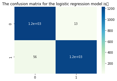
The accuracy of the logistic regression model is:0.9724
Recall of Logistic Regression Models:0.9725358422939068
Model Evaluation Report for Logistic Regression Models:
              precision    recall  f1-score   support

           0       0.96      0.99      0.97      1240
           1       0.99      0.96      0.97      1260

    accuracy                           0.97      2500
   macro avg       0.97      0.97      0.97      2500
weighted avg       0.97      0.97      0.97      2500
confusion matrix:
The sum of the main diagonals in the confusion matrix represents the number of correct predictions, and the sum of the negative diagonals represents the number of incorrect predictions
Accuracy:
It is the number of values that are accurately predicted by the model (positive or negative). Accuracy = (0,0)+(1,1)/ ((0,0)+(0,1)+(1,0)+(1,1). The accuracy of our model comes out to be 0.9716.
Recall:
It is the number of True Positives correctly predicted w.r.t. total number of positives. Also called TPR. recall = (1,1)/((0,1)+(1,1)) and (0,0)/((0,0)+(1,0)). .
Precision
That is how actual converted values are classified as converted. Precision = (0,0)/((0,1)+(0,0))and(1,1)/((1,1)+(1,0)).
Specificity:
It is the number of True Negatives correctly predicted w.r.t. total number of negatives. Also expressed as (1-FPR). (1,1) / ((1,1)+(0,1))and(0,0)/((0,0)+(1,0)).
micro avg:
Calculate the indicator values under all data, for example, 3 out of 5 samples of all data are correctly predicted, so the micro avg is 0.6
macro avg:
The unweighted average of each category evaluation index, such as the macro avg of the accuracy, (0.50+0.00+1.00)/3=0.5
weighted avg:
weighted average, such as the calculation method of the first value
fpr,tpr,threshold =metrics.roc_curve(y_test,clf.predict_proba(X_test)[:,1])
# Calculate true rate and false positive rate
roc_df = pd.DataFrame()
roc_df['fpr'] = fpr
roc_df['tpr'] = tpr
roc_df['threshold'] = threshold
roc_df
| fpr | tpr | threshold | |
|---|---|---|---|
| 0 | 0.000000 | 0.000000 | 2.000000e+00 |
| 1 | 0.000000 | 0.384921 | 1.000000e+00 |
| 2 | 0.000000 | 0.400000 | 1.000000e+00 |
| 3 | 0.000000 | 0.411111 | 1.000000e+00 |
| 4 | 0.000000 | 0.418254 | 1.000000e+00 |
| ... | ... | ... | ... |
| 133 | 0.662903 | 0.998413 | 6.264739e-03 |
| 134 | 0.662903 | 0.999206 | 6.262106e-03 |
| 135 | 0.679839 | 0.999206 | 5.616998e-03 |
| 136 | 0.679839 | 1.000000 | 5.602523e-03 |
| 137 | 1.000000 | 1.000000 | 1.408001e-24 |
138 rows × 3 columns
Create a new pd database and put the data we got into this pd dataframe. Then use df to build the roc graph.
roc_line = alt.Chart(roc_df).mark_line(color = 'red').encode(
    x=alt.X('fpr', title="false positive rate"),
    y=alt.Y('tpr', title="true positive rate")
)

roc_area = alt.Chart(roc_df).mark_area(fillOpacity = 0.5, fill = 'red').encode(
    x=alt.X('fpr', title="false positive rate"),
    y=alt.Y('tpr', title="true positive rate")
)

baseline = alt.Chart(roc_df).mark_line(strokeDash=[20,5], color = 'black').encode(
    x=alt.X('threshold', scale = alt.Scale(domain=[0, 1]), title=None),
    y=alt.Y('threshold', scale = alt.Scale(domain=[0, 1]), title=None)
)
roc_line + roc_area + baseline.properties(
    title='Titanic survivor data ROC curve').interactive()
Summary
This is all the code I did. First, I analyzed the 280,000 data to find if there are duplicate values, na values and outliers.According to the data, we know that there are only 400 fraudulent behaviors in the 280,000 data, so I learned imbalance to balance my data. Then use kmeans cluster and polynomial regression for data classification and linear regression. Finally, a logistic regression model is established and its validity and accuracy are tested.
reference:
Confusion Matrix: https://scikit-learn.org/stable/modules/generated/sklearn.metrics.plot_confusion_matrix.html
Roc Line: https://www.statology.org/plot-roc-curve-python/
