Plots from the Spotify dataset
Contents
Plots from the Spotify dataset
A chart with all the data
Import the attached Spotify dataset as
df. In this csv file, missing values are denoted by a blank space. Use thena_valueskeyword argument withpd.read_csvso that those blank spaces get converted tonp.nan.
import pandas as pd
import altair as alt
df = pd.read_csv("../data/spotify_dataset.csv", na_values=" ")
Check your work by evaluating
value_countsondf.dtypes. If everything worked correctly, there should be 11 float columns, 3 integer columns, and 9 object columns.
df.dtypes.value_counts()
float64    11
object      9
int64       3
dtype: int64
Plot the data from
dfusing Altair. Encode the “Acousticness” data as the x-coordinate, the “Energy” data as the y-coordinate, and encode the “Valence” data as the color.Use this method from the Altair documentation to adjust the color scheme used. This will be using the
dark2color scheme.
alt.Chart(df).mark_circle().encode(
    x="Acousticness",
    y="Energy",
    color=alt.Color('Valence', scale=alt.Scale(scheme='dark2'))
)
Change the color scheme from
dark2to a different one of these options (scroll down to find the options).Add a tooltip to the chart, indicating the Artist name and the song name.
alt.Chart(df).mark_circle().encode(
    x="Acousticness",
    y="Energy",
    color=alt.Color('Valence', scale=alt.Scale(scheme='turbo'))
)
A chart with the 50 most frequently occurring artists
Define a new variable
scontaining the pandas Series corresponding to the “Artist” column indf.
s = df["Artist"]
Call the
value_countsmethod ons.
s.value_counts()
Taylor Swift                     52
Lil Uzi Vert                     32
Justin Bieber                    32
Juice WRLD                       30
Pop Smoke                        29
                                 ..
Chris Brown, Young Thug           1
Rauw Alejandro, J Balvin          1
347aidan                          1
Migrantes, Alico                  1
Dadá Boladão, Tati Zaqui, OIK     1
Name: Artist, Length: 716, dtype: int64
Using the previous result, find the 50 most frequently occurring artists in this dataset. (Note: the
value_countsmethod automatically sorts the results from most frequent to least frequent.)Define a variable
top_artistswhich contains these top 50 artists. (Hint. You might want to use theindexattribute.)
top_artists = s.value_counts().index[:50]
(More difficult.) Use the
isinmethod (documentation) and Boolean indexing to define a new pandas DataFramedf2which is the sub-DataFrame ofdfcontaining only the 50 most frequently occurring artists.
df2 = df[df["Artist"].isin(top_artists)]
Check your answer: the shape of
df2should be 678 by 23.
df2.shape
(678, 23)
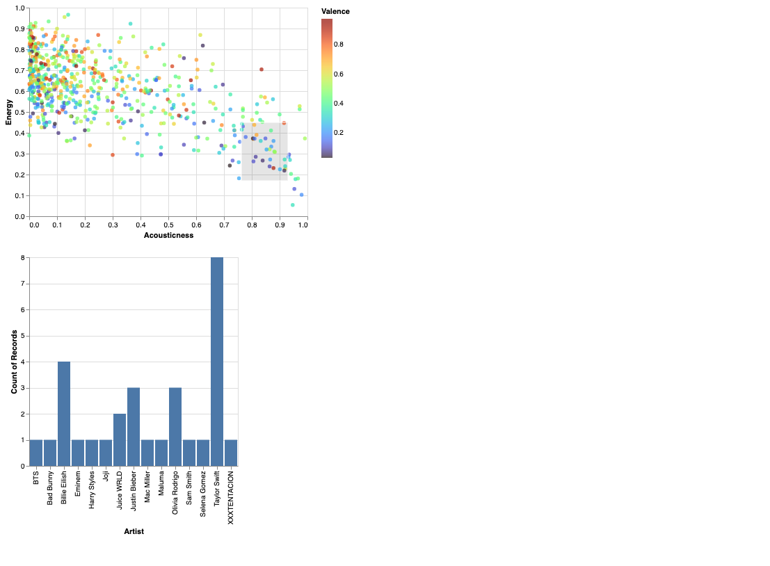
Interactive Altair chart
In this portion, we will make an interactive bar chart to accompany the chart we made above. This is based on the Interactive bar chart YouTube video:
Make the same chart as you made above, with the only difference being, that you now use
df2instead ofdffor the data.
alt.Chart(df2).mark_circle().encode(
    x="Acousticness",
    y="Energy",
    color=alt.Color('Valence', scale=alt.Scale(scheme='turbo'))
)
Add a
selection_intervalobject namedbrushto the chart.Assign this chart to the variable name
c1using the codec1 = alt.Chart....Display this chart by evaluating
c1.Check your work: if you click and drag on the chart, there should be a grey rectangle that appears. (Once you’ve displayed the grey rectangle, you can move it around.)
brush = alt.selection_interval()

c1 = alt.Chart(df2).mark_circle().encode(
    x="Acousticness",
    y="Energy",
    color=alt.Color('Valence', scale=alt.Scale(scheme='turbo'))
).add_selection(brush)
c1
Make a second chart
c2showing a bar chart for the selected data as on the most recent video. The x-axis should correspond to Artist names (only the top 50 since we’re usingdf2) and the y-axis should correspond to the number of times those artists appear in the selection. (Usetransform_filterwithbrush, as in the above video.)Display c1 and c2, one after the other, using
c1&c2. (If you instead want them to appear side-by-side, you can usec1|c2.)
c2 = alt.Chart(df2).mark_bar().encode(
    x="Artist",
    y="count()"
).transform_filter(brush)
c1&c2
Find an image you like (including the selection) and save it using the … “Save as PNG” from the top right of the Deepnote cell with the two charts.
Upload that file to this Deepnote project, and embed that png file in a markdown cell. The syntax is
.
 Created in Deepnote