Homework 2
Contents
Homework 2
Author: BLANK
Collaborators: BLANK
References: BLANK
Question 1
Load the “penguins” dataset using the load_dataset function from the Seaborn library. Save this dataset with the variable name
df. (Don’t forget to import Seaborn. Assign Seaborn the abbreviationsns.)How many rows are there in this dataset? How many columns? Answer this question using code, and then put the answer in a markdown cell. (So your notebook should include both the code cell to find the answer, as well as the markdown cell giving the answer.)
Question 2
Which of the columns in the penguins dataset include missing data? Make a list of them using list comprehension.
Same question for the rows.
Display the sub-DataFrame of
dfwhich contains all the columns but only the rows which are missing data.Check that your sub-DataFrame is correct: the median value in the
flipper_length_mmcolumn should be 193.0.
Question 3
Evaluate
df.corr()to view the correlations between the different numeric columns in the DataFrame.Which two columns are the most negatively correlated? Answer in a markdown cell.
Question 4
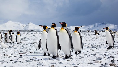
Find a picture illustrating negative correlation (nothing to do with penguins). Upload that picture into Deepnote (the same way you upload a csv file into Deepnote), and replace the below penguins picture with your negative correlation picture. Also update the link to indicate where the picture came from.
 (Source: flickr)
Question 5
For the two most negatively correlated columns in the penguins DataFrame, draw a scatter plot of those columns using Altair and
mark_circle.By default, Altair includes zero in the x and y-axes. Remove zero from both axes using this method. (This should have the effect of zooming in on the data.)
Can you see how the data is indeed negatively correlated?
Question 6
Add color to your chart encoding the species of the penguins.
Question 7
Do these columns seem negatively correlated for the Gentoo species? Answer in a markdown cell using the Altair chart.
Make a sub-DataFrame called
df_gentoowhich contains only the “Gentoo” species and which contains only the two columns of interest.Compute
df_gentoo.corr()for this new DataFrame.Does the result match what you thought visually? Answer in one sentence in a markdown cell.
Question 8
Using a for loop and f-strings, for each species in
df, print a sentence of the form “The correlation between colA and colB for the {???} species is {???}”. (Replace colA and colB with the names of the columns you have been using above. In the Gentoo line, you should see the same number that you calculated above.)
Question 9
Choose one example from the Altair example gallery and make a chart from the penguins data using that same technique. Give a link to the original example from the Altair gallery in a markdown cell.
Submission
To submit this homework, go to the Share option at the top right, and share the project to create a link, and then submit that link on Canvas.
