
The analysis of relations between the total covid-affected population and other datas
Contents
The analysis of relations between the total covid-affected population and other datas#
Author: Haoyang Wang
Course Project, UC Irvine, Math 10, F22
Introduction#
During the pandemic, millions of people get affected by covid-19. This project is for finding the relationship between how many people were affected in total (Total Cases) and other datas (Population, pcr-Test etc.). The project used pandas, altair, seaborn, and machine learning tools in finding the relation.
Explore the datas by using Pandas#
import pandas as pd
import numpy as np
import altair as alt
import seaborn as sns
First, let’s see what the dataset generally looks like.
df = pd.read_csv("Covid Live.csv")
df.head()
| # | Country,\nOther | Total\nCases | Total\nDeaths | New\nDeaths | Total\nRecovered | Active\nCases | Serious,\nCritical | Tot Cases/\n1M pop | Deaths/\n1M pop | Total\nTests | Tests/\n1M pop | Population | |
|---|---|---|---|---|---|---|---|---|---|---|---|---|---|
| 0 | 1 | USA | 98,166,904 | 1,084,282 | NaN | 94,962,112 | 2,120,510 | 2,970 | 293,206 | 3,239 | 1,118,158,870 | 3,339,729 | 334,805,269 |
| 1 | 2 | India | 44,587,307 | 528,629 | NaN | 44,019,095 | 39,583 | 698 | 31,698 | 376 | 894,416,853 | 635,857 | 1,406,631,776 |
| 2 | 3 | France | 35,342,950 | 155,078 | NaN | 34,527,115 | 660,757 | 869 | 538,892 | 2,365 | 271,490,188 | 4,139,547 | 65,584,518 |
| 3 | 4 | Brazil | 34,706,757 | 686,027 | NaN | 33,838,636 | 182,094 | 8,318 | 161,162 | 3,186 | 63,776,166 | 296,146 | 215,353,593 |
| 4 | 5 | Germany | 33,312,373 | 149,948 | NaN | 32,315,200 | 847,225 | 1,406 | 397,126 | 1,788 | 122,332,384 | 1,458,359 | 83,883,596 |
I noticed that there are something wrong with the columns‘ names for the dataframe. Therefore, for calling the columns easily, I rename the dataframe.
# Call columns to make sure store their true name in the dictionary later
df.columns
Index(['#', 'Country,\nOther', 'Total\nCases', 'Total\nDeaths', 'New\nDeaths',
       'Total\nRecovered', 'Active\nCases', 'Serious,\nCritical',
       'Tot Cases/\n1M pop', 'Deaths/\n1M pop', 'Total\nTests',
       'Tests/\n1M pop', 'Population'],
      dtype='object')
# Use the dictionary help me with renaming
col_name = {'Country,\nOther':"Country", 'Total\nCases':"Total Cases", 'Total\nDeaths':"Total Deaths", 'New\nDeaths':"New Deaths",
       'Total\nRecovered':"Total Recovered", 'Active\nCases':"Active Cases", 'Serious,\nCritical':"Serious Criticals",
       'Tot Cases/\n1M pop':"Total Cases/m", 'Deaths/\n1M pop':"Deaths/m", 'Total\nTests':"Total Test",
       'Tests/\n1M pop':"Tests/m"}
df.rename(col_name, axis=1, inplace=True)
df.head()
| # | Country | Total Cases | Total Deaths | New Deaths | Total Recovered | Active Cases | Serious Criticals | Total Cases/m | Deaths/m | Total Test | Tests/m | Population | |
|---|---|---|---|---|---|---|---|---|---|---|---|---|---|
| 0 | 1 | USA | 98,166,904 | 1,084,282 | NaN | 94,962,112 | 2,120,510 | 2,970 | 293,206 | 3,239 | 1,118,158,870 | 3,339,729 | 334,805,269 |
| 1 | 2 | India | 44,587,307 | 528,629 | NaN | 44,019,095 | 39,583 | 698 | 31,698 | 376 | 894,416,853 | 635,857 | 1,406,631,776 |
| 2 | 3 | France | 35,342,950 | 155,078 | NaN | 34,527,115 | 660,757 | 869 | 538,892 | 2,365 | 271,490,188 | 4,139,547 | 65,584,518 |
| 3 | 4 | Brazil | 34,706,757 | 686,027 | NaN | 33,838,636 | 182,094 | 8,318 | 161,162 | 3,186 | 63,776,166 | 296,146 | 215,353,593 |
| 4 | 5 | Germany | 33,312,373 | 149,948 | NaN | 32,315,200 | 847,225 | 1,406 | 397,126 | 1,788 | 122,332,384 | 1,458,359 | 83,883,596 |
Drop missing values and the whole “New Deaths” column because it almost have no data.
del df["New Deaths"] #"del" reference: https://www.educative.io/answers/how-to-delete-a-column-in-pandas
df = df.dropna(axis=0).copy()
df.head()
| # | Country | Total Cases | Total Deaths | Total Recovered | Active Cases | Serious Criticals | Total Cases/m | Deaths/m | Total Test | Tests/m | Population | |
|---|---|---|---|---|---|---|---|---|---|---|---|---|
| 0 | 1 | USA | 98,166,904 | 1,084,282 | 94,962,112 | 2,120,510 | 2,970 | 293,206 | 3,239 | 1,118,158,870 | 3,339,729 | 334,805,269 |
| 1 | 2 | India | 44,587,307 | 528,629 | 44,019,095 | 39,583 | 698 | 31,698 | 376 | 894,416,853 | 635,857 | 1,406,631,776 |
| 2 | 3 | France | 35,342,950 | 155,078 | 34,527,115 | 660,757 | 869 | 538,892 | 2,365 | 271,490,188 | 4,139,547 | 65,584,518 |
| 3 | 4 | Brazil | 34,706,757 | 686,027 | 33,838,636 | 182,094 | 8,318 | 161,162 | 3,186 | 63,776,166 | 296,146 | 215,353,593 |
| 4 | 5 | Germany | 33,312,373 | 149,948 | 32,315,200 | 847,225 | 1,406 | 397,126 | 1,788 | 122,332,384 | 1,458,359 | 83,883,596 |
I noticed that the data in the columns are strings with comma. I need to convert them into numeric type for manipulating easier.
# first, find the columns who are string
from pandas.api.types import is_string_dtype
str_col = [i for i in df.columns if is_string_dtype(df[i])]

# the first string column is "Country", drop it
str_col = str_col[1:]
# Delete the commas, then convert the string columns into numberic
for i in str_col:
    df[i] = df[i].str.replace(",","")
    df[i] = pd.to_numeric(df[i])
Visualization by Altair and Seaborn#
First of all, I’d like to see whether the population and the density (total cases/million people) of affected patients have a strong relation. In other words, is the population affect the possibility of being affected.
alt.Chart(df).mark_circle().encode(
    x = alt.X("Population",sort="ascending"),
    y = alt.Y("Total Cases/m",sort="ascending"),
    tooltip = ("Country","Total Cases")
).interactive()
I use selection for showing the details.
sel = alt.selection_interval()

c1 = alt.Chart(df).mark_circle().encode(
    x =alt.X("Population", scale=alt.Scale(domain=[0,400000000])),
    y ="Total Cases/m",
    tooltip = ("Country","Total Cases"),
    color = alt.condition(sel, alt.value("Black"), "Population")
).add_selection(sel)

c2 = alt.Chart(df).mark_bar().encode(
    x ="Country",
    y ="Total Cases/m",
    color ="Country"
).transform_filter(sel)

alt.vconcat(c1,c2) # Can choose a rectangle by mouse to see the datas specifically
Without considering the outliars (China and India), we could say that it is hard to observe the strong relation between the density of affected patients and the population. Thus, I’d like check whether Test helps in preventing people from affected.
sns.scatterplot(
    data = df,
    x = "Tests/m",
    y = "Total Cases/m"
)
<AxesSubplot:xlabel='Tests/m', ylabel='Total Cases/m'>
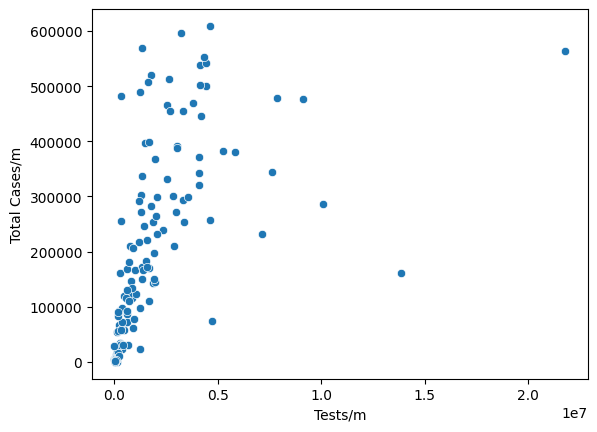
Surprisingly, a negative relation (which impies tests do prevent people from affected) is not observed here between Tests/m and Total Cases/m.
DecisionTreeRegressor#
Though the relations between other datas and “Total Tests” are hard to be observed, I’m going to use machine learning to try to predict the “Total Tests” by using other datas as input.
For avoiding repeat affection on the prediction result, I will delete some of the inputs which are repeated, for example, “Total Test”, and “Tests/m”.
cols = [i for i in str_col if i[-2:] != "/m"]
cols = cols[1:] #the first one is "Total Cases" (predict result), drop it
from sklearn.model_selection import train_test_split
X = df[cols]
y = df["Total Cases/m"]
X_train, X_test, y_train, y_test = train_test_split(X, y,train_size=.8,random_state=59547172)
from sklearn.tree import DecisionTreeRegressor
reg = DecisionTreeRegressor()
reg.fit(X_train, y_train)
DecisionTreeRegressor()
reg.score(X_test, y_test) #the predicted result not seems good, might be overfitting
0.33628386401402366
reg.score(X_train, y_train) # 1.0 implies there is overfitting
1.0
the feature importances seem not really make sense to me
pd.Series(reg.feature_importances_, index=reg.feature_names_in_)
Total Deaths         0.049213
Total Recovered      0.343638
Active Cases         0.035992
Serious Criticals    0.011876
Total Test           0.126348
Population           0.432932
dtype: float64
To make sure I use a proper max_leaf_nodes number, I will make a U-shape test error curve first.
from sklearn.metrics import mean_absolute_error
train_dic = {}
test_dic = {}

for i in range(2,100):
    reg = DecisionTreeRegressor(criterion = "absolute_error",
    max_leaf_nodes = i)
    reg.fit(X_train, y_train)
    train_dic[i] = mean_absolute_error(y_train, reg.predict(X_train))
    test_dic[i] = mean_absolute_error(y_test, reg.predict(X_test))
train_loss = pd.Series(train_dic)
test_loss = pd.Series(test_dic)
train_loss.name = "train"
test_loss.name = "test"
df_loss = pd.concat((train_loss, test_loss), axis=1)
df_loss.reset_index(inplace=True)
df_loss.rename({"index": "max_leaf_nodes"}, axis=1, inplace=True)
df_melted = df_loss.melt(id_vars="max_leaf_nodes", var_name="error_type", value_name="loss")
The curve is not typically U-shaped, and the best max_leaf_nodes here I can choose where is not overfitting is 17. (Actually, I also check 37, but the score of train data is .98 versus .70 test score, which implies overfitting, so I just discard 37.)
alt.Chart(df_melted).mark_line().encode(
    x = "max_leaf_nodes",
    y = "loss",
    color = "error_type",
    tooltip = "max_leaf_nodes"
)
Do the DicisionTreeRegressor again.
reg2 = DecisionTreeRegressor(max_leaf_nodes=17)
reg2.fit(X_train, y_train)
DecisionTreeRegressor(max_leaf_nodes=17)
reg2.score(X_test, y_test) # the score still not perform well
0.6106858707481919
RandomForestRegressor#
I will use randomforest to make the predict more accurate.
from sklearn.ensemble import RandomForestRegressor
forest_reg = RandomForestRegressor(n_estimators=100, max_leaf_nodes=17)
forest_reg.fit(X_train, y_train)
RandomForestRegressor(max_leaf_nodes=17)
forest_reg.score(X_test, y_test)
0.7140076019321402
df["pred"] = forest_reg.predict(df[cols])
c1 = alt.Chart(df).mark_circle(color="black").encode(
    x = alt.X("Population", scale=alt.Scale(domain=[0,400000000])),
    y = "Total Cases",
    tooltip = "Country"
)

c2  = alt.Chart(df).mark_circle(color="red").encode(
    x = alt.X("Population", scale=alt.Scale(domain=[0,400000000])),
    y = "pred"
)

c1+c2
The chart is not performing good, I think the outliars make a lot effects on the predicted result.
KNeighborsRegressir#
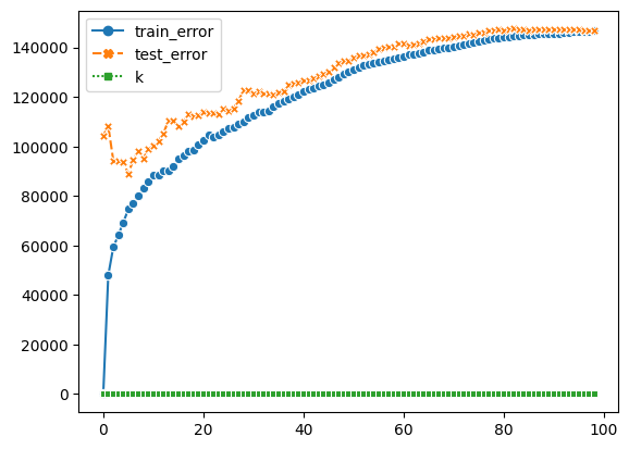
I will use KNeighborsRegressor to check the predict result again.
from sklearn.neighbors import KNeighborsRegressor
# Again, start with finding the best k
def get_scores(k):
    K_reg=KNeighborsRegressor(n_neighbors=k)
    K_reg.fit(X_train, y_train)
    train_error=mean_absolute_error(K_reg.predict(X_train), y_train)
    test_error=mean_absolute_error(K_reg.predict(X_test), y_test)
    return (train_error, test_error)
df_k = pd.DataFrame(columns=("train_error", "test_error"))
df_k["train_error"] = [get_scores(k)[0] for k in range(1,100)]
df_k["test_error"] = [get_scores(k)[1] for k in range(1,100)]
df_k["k"] = df_k.index
By the chart, we know higher the k, bigger the error. The best K I can get from it is 5
sns.lineplot(data=df_k, markers=True)
<AxesSubplot:>
K_reg = KNeighborsRegressor(n_neighbors=5)
K_reg.fit(X_train, y_train)
df["K_predict"] = K_reg.predict(df[cols])
Still, by using KNeighbors, the predict results do not vary from randomforest a lot. Therefore, I conclude that there is no much relations between the Total Cases and other datas.
c3 = alt.Chart(df).mark_circle(color="black").encode(
    x = alt.X("Population", scale=alt.Scale(domain=[0,400000000])),
    y = "Total Cases",
    tooltip = "Country"
)

c4  = alt.Chart(df).mark_circle(color="red").encode(
    x = alt.X("Population", scale=alt.Scale(domain=[0,400000000])),
    y = "K_predict"
)

c3+c4
Summary#
I use pandas in cleaning and analyzing datas, altair/seaborn for visualization, and Decision Tree/Random Forest/KNeighbors in machine learning. Though I used different techniques, the predicted results do not perform well. Therefore, I would say it is hardly to oberserve a relationship between the Total Cases with other datas based on this dataframe.
References#
del: “How to delete a column in pandas” by Neko Yan, https://www.educative.io/answers/how-to-delete-a-column-in-pandas
Seaborn Visualization: Seaborn.pydata https://seaborn.pydata.org/generated/seaborn.scatterplot.html https://seaborn.pydata.org/generated/seaborn.lineplot.html
What is the source of your dataset(s)? Kaggle
List any other references that you found helpful. KNeighborsRegressor: Chris’s previous lecture https://christopherdavisuci.github.io/UCI-Math-10-W22/Week6/Week6-Wednesday.html
Submission#
Using the Share button at the top right, enable Comment privileges for anyone with a link to the project. Then submit that link on Canvas.
 Created in Deepnote