Worksheet 8
Contents
Worksheet 8#
This worksheet is due Tuesday of Week 5, before discussion section. You are encouraged to work in groups of up to 3 total students, but each student should make their own submission on Canvas. (It’s fine for everyone in the group to have the same upload.)
Creating the DataFrame#
Import the Math2B_grades_clean.csv file.
Choose 30 random rows using the pandas DataFrame
samplemethod. Use the keyword argumentrandom_statewith your student id number, so that the results are always the same. (If you are in a group, use the student id number of any one of the group members.) Name this 30-row DataFramedf30.
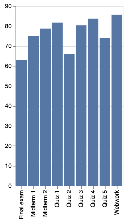
The following image shows the average score for each assignment. Why would it be difficult to produce the following chart using Altair and
df30? (Hint. What would you put for the x-axis encoding?)

To fix that, we will create a new longer DataFrame that contains the same data.
Use the pandas DataFrame method
melt(documentation) to create a new variable column named “Assignment” containing the assignment names and a new value column named “Score” containing the scores. (Do not put the student ids or the final course grades into these new columns.) Name the resulting DataFramedf.
Check your answer. The new DataFrame
dfshould have 270 rows and 4 columns. The columns should be named “Student_id”, “Total”, “Assignment”, “Score”.
Check your answer. If you evaluate the following code, you should see something very similar to the above image (but the particular scores will be different because of the randomness). (If you want to make the chart look even more similar, you can remove the axis titles by using the keyword argument
axis=alt.Axis(title=None)for both the x-axis and y-axis specifications.)
alt.Chart(df).mark_bar().encode(
    x="Assignment",
    y="mean(Score)"
)
Creating the base chart#
The Altair chart we make will be based on the following. (Notice it doesn’t have a mark defined yet, so it will raise an error if you try to plot it.)
base = alt.Chart(df).encode(
    x="Assignment",
    y="Score",
    tooltip=["Student_id", "Assignment", "Score"],
)
Evaluate
base.mark_circle()to get a sense for the contents.
It would be better if the assignments were in the chronological order, rather than alphabetical order. The following dictionary says what date each assignment occurred on.
assignment_dates = {'Final exam': '6/4/22',
 'Midterm 1': '4/20/22',
 'Midterm 2': '5/13/22',
 'Quiz 1': '4/7/22',
 'Quiz 2': '4/14/22',
 'Quiz 3': '4/28/22',
 'Quiz 4': '5/5/22',
 'Quiz 5': '5/26/22',
 'Webwork': '4/8/22'}
Using that dictionary, make a list
assignment_list = ['Quiz 1', 'Webwork', ...]which lists these assignments in chronological order. (Here is one approach: convert this dictionary to a pandas Series, then convert the dates usingpd.to_datetime, then usesort_values. In general in Math 10, it’s never correct to just write out all the entries one at a time.)
Update the x-channel in the
basedefinition to specifysort=assignment_list(you will also need to addalt.Xto input this keyword argument). Be sureassignment_listis really a list, not something like a pandas Index.If you evaluate
base.mark_circle(), it should look similar to above, but with the x-axis in chronological order.
Creating an interactive chart from the base chart#
Fill in appropriate values to the following template.
???idshould be Student id that you want to highlight. (This occurs in two places. Any of the 30 student ids is fine to choose, but choose one for which you think the scores are “interesting” in some way.)???paramshould be the variable name for the selection object. (This occurs in three places.)???sizeshould be the size you want for the highlighted student.???encodeshould be the encoding abbreviation that makes the most sense for student id numbers.Replace
???facetso that we see a different chart for each course grade.???descriptionshould be a brief description of something you find interesting about the student you highlighted.???rsshould be the random state you used at the beginning (insample).
highlight = alt.selection(type='single', on='mouseover',
                          fields=['Student_id'], nearest=True,
                          init={'Student_id': ???id})

lines = base.mark_line().encode(
    size=alt.condition(???param, alt.value(???size), alt.value(1)),
    color=alt.condition(???param, "Student_id:???encode", alt.value("lightgray"))
)

points = base.mark_circle(opacity=0).add_selection(
    ???param
)

chart = alt.layer(lines, points).facet(
    ???facet
).resolve_scale(
    color="independent"
).properties(
    title={
      "text": "Student ???id ???description",
      "subtitle": "The random_state we used was ???rs"
    }
)

chart
Reminder#
Every group member needs to submit this on Canvas (even if you all submit the same file).
Submission#
Save chart as a json file named “wkst8.json” using the following code, and upload that json file on Canvas.
with open("wkst8.json", "w") as f:
    f.write(chart.to_json())

