
Title
Contents
Title#
Name: Yihao Zhang
ID: 67069281
Introduction#
The World Happiness Report is a landmark survey of the state of global happiness . The report continues to gain global recognition as governments, organizations and civil society increasingly use happiness indicators to inform their policy-making decisions. Leading experts across fields – economics, psychology, survey analysis, national statistics, health, public policy and more – describe how measurements of well-being can be used effectively to assess the progress of nations. My project is to build a LinearRegression and predict Happiness score based on the variable of Economy, Familt, trust, health, and freedom,and find out which variabless might contribute the most to the model. At last I will try to use sklearn to determine whether a country’s happiness is beyond expectation.
import altair as alt
import pandas as pd
from sklearn.pipeline import Pipeline
from sklearn.preprocessing import StandardScaler
from sklearn.cluster import KMeans
import numpy as np
from pandas.api.types import is_numeric_dtype
from sklearn.linear_model import LinearRegression
Dataframe Outlook#
Import data:#
df = pd.read_csv("data happiness.csv", na_values=" ").dropna(axis=0).copy()
df=df.loc[:,["Country name","Regional indicator","Ladder score","Logged GDP per capita","Social support","Healthy life expectancy","Freedom to make life choices","Generosity","Perceptions of corruption"]].copy()
df
| Country name | Regional indicator | Ladder score | Logged GDP per capita | Social support | Healthy life expectancy | Freedom to make life choices | Generosity | Perceptions of corruption | |
|---|---|---|---|---|---|---|---|---|---|
| 0 | Finland | Western Europe | 7.842 | 10.775 | 0.954 | 72.000 | 0.949 | -0.098 | 0.186 |
| 1 | Denmark | Western Europe | 7.620 | 10.933 | 0.954 | 72.700 | 0.946 | 0.030 | 0.179 |
| 2 | Switzerland | Western Europe | 7.571 | 11.117 | 0.942 | 74.400 | 0.919 | 0.025 | 0.292 |
| 3 | Iceland | Western Europe | 7.554 | 10.878 | 0.983 | 73.000 | 0.955 | 0.160 | 0.673 |
| 4 | Netherlands | Western Europe | 7.464 | 10.932 | 0.942 | 72.400 | 0.913 | 0.175 | 0.338 |
| ... | ... | ... | ... | ... | ... | ... | ... | ... | ... |
| 144 | Lesotho | Sub-Saharan Africa | 3.512 | 7.926 | 0.787 | 48.700 | 0.715 | -0.131 | 0.915 |
| 145 | Botswana | Sub-Saharan Africa | 3.467 | 9.782 | 0.784 | 59.269 | 0.824 | -0.246 | 0.801 |
| 146 | Rwanda | Sub-Saharan Africa | 3.415 | 7.676 | 0.552 | 61.400 | 0.897 | 0.061 | 0.167 |
| 147 | Zimbabwe | Sub-Saharan Africa | 3.145 | 7.943 | 0.750 | 56.201 | 0.677 | -0.047 | 0.821 |
| 148 | Afghanistan | South Asia | 2.523 | 7.695 | 0.463 | 52.493 | 0.382 | -0.102 | 0.924 |
149 rows × 9 columns
df.shape
(149, 9)
Rank the Countries With Most Happiness Ladder Score
df["Ladder score"].sort_values(ascending= False)
0      7.842
1      7.620
2      7.571
3      7.554
4      7.464
       ...
144    3.512
145    3.467
146    3.415
147    3.145
148    2.523
Name: Ladder score, Length: 149, dtype: float64
df["Rank"]=pd.Series(range(1,150))
The Daraframe is already in descending sorting, therefore we can distribute ranks to the countries directly.
10 Countries With Most Happiness Ladder Score#
df[["Country name","Rank"]].head(10)
| Country name | Rank | |
|---|---|---|
| 0 | Finland | 1 |
| 1 | Denmark | 2 |
| 2 | Switzerland | 3 |
| 3 | Iceland | 4 |
| 4 | Netherlands | 5 |
| 5 | Norway | 6 |
| 6 | Sweden | 7 |
| 7 | Luxembourg | 8 |
| 8 | New Zealand | 9 |
| 9 | Austria | 10 |
10 Countries With Least Happiness Ladder Score#
df[["Country name","Rank"]].tail(10)
| Country name | Rank | |
|---|---|---|
| 139 | Burundi | 140 |
| 140 | Yemen | 141 |
| 141 | Tanzania | 142 |
| 142 | Haiti | 143 |
| 143 | Malawi | 144 |
| 144 | Lesotho | 145 |
| 145 | Botswana | 146 |
| 146 | Rwanda | 147 |
| 147 | Zimbabwe | 148 |
| 148 | Afghanistan | 149 |
Data visualization#
Distributing the Level of happiness regards to Quantiles of Ladder score#
Medianhp=df["Ladder score"].quantile(q=0.5)
firstq=df["Ladder score"].quantile(q=0.25)
thirdq=df["Ladder score"].quantile(q=0.75)
def quartile(data):
    if data >= thirdq:
        return("Very Happy")
    if data <= firstq:
        return("Not Happy")
    if Medianhp >= data >= firstq:
        return("Less Happy")
    if thirdq >= data >= Medianhp:
        return("Happy")
df["Happiness"]= df["Ladder score"].map(quartile)
df[["Country name","Regional indicator","Happiness"]]
| Country name | Regional indicator | Happiness | |
|---|---|---|---|
| 0 | Finland | Western Europe | Very Happy |
| 1 | Denmark | Western Europe | Very Happy |
| 2 | Switzerland | Western Europe | Very Happy |
| 3 | Iceland | Western Europe | Very Happy |
| 4 | Netherlands | Western Europe | Very Happy |
| ... | ... | ... | ... |
| 144 | Lesotho | Sub-Saharan Africa | Not Happy |
| 145 | Botswana | Sub-Saharan Africa | Not Happy |
| 146 | Rwanda | Sub-Saharan Africa | Not Happy |
| 147 | Zimbabwe | Sub-Saharan Africa | Not Happy |
| 148 | Afghanistan | South Asia | Not Happy |
149 rows × 3 columns
Distrubute countries to 4 happiness level by using the 1st and 3 rd quantiles, and the median of the ladder score.
Graph Regards to Level of Happiness#
c1 = alt.Chart(df).mark_point().encode(
    x=alt.X("Regional indicator", scale=alt.Scale(zero=False)),
    y=alt.Y("Ladder score", scale=alt.Scale(zero=False)),
    color="Happiness",
    tooltip=["Country name","Logged GDP per capita","Social support","Healthy life expectancy","Freedom to make life choices","Generosity","Perceptions of corruption"]
).properties(
    height=800,
    width=300,
    title="Country Region VS Happiness Ladder Score"
)
c1
Ladder Score Global distrubution#
Use plotly to draw graph with world map to see the rough ladder score distribution related to the country region
import plotly.express as px
fig = px.choropleth(
    df,
    locations="Country name",
    color="Ladder score",
    locationmode="country names",
    color_continuous_scale=px.colors.sequential.Plasma
)
fig.update_layout(title="Ladder Score worldwide distribution")
fig.show()
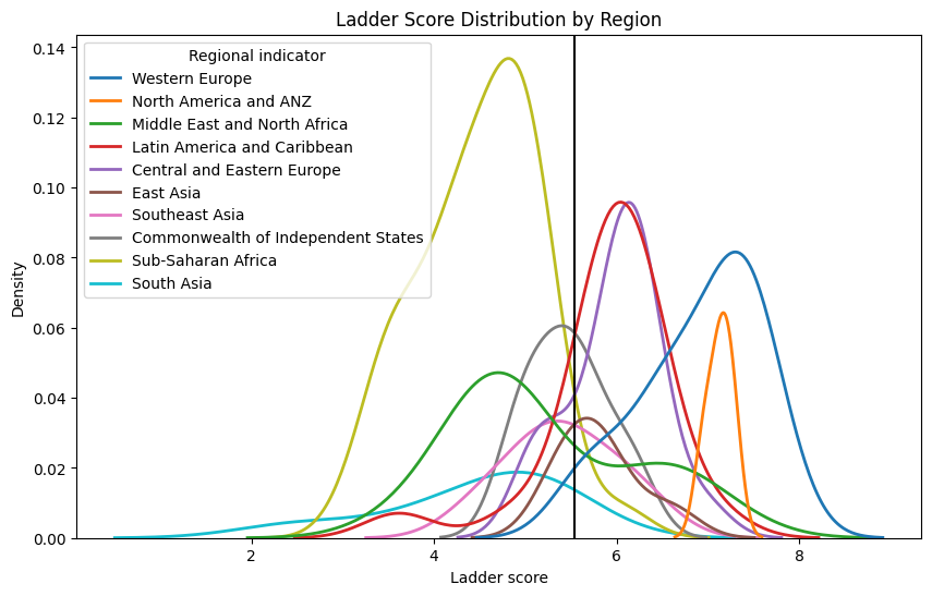
import seaborn as sns
import matplotlib.pyplot as plt
plt.figure(figsize=(10, 6))
sns.kdeplot(data=df, x=df["Ladder score"], hue=df["Regional indicator"],fill=False, linewidth=2)
plt.axvline(df["Ladder score"].mean(), c="black")
plt.title("Ladder Score Distribution by Region")
plt.show()
Scatterplot with Numerical variable as x axis, Ladder score as y axis, with Color Indicating its Region#
chart_list = []
for i in df.columns:
    c = alt.Chart(df).mark_circle().encode(
    x=alt.X(i, scale=alt.Scale(zero=False)),
    y = "Ladder score",
    color=alt.Color("Regional indicator", scale=alt.Scale(scheme='dark2')),
    tooltip=["Country name","Logged GDP per capita","Social support","Healthy life expectancy","Freedom to make life choices","Generosity","Perceptions of corruption"]
).properties(
    title=f"{i} VS Happiness Ladder Score"
)
    chart_list.append(c)
alt.hconcat(chart_list[3], chart_list[4], chart_list[5],chart_list[6],chart_list[7],chart_list[8])
Plotly Bar Chart with region as x axis and average ladder score as y axis
import plotly.express as px
avg = pd.DataFrame(df.groupby('Regional indicator')['Ladder score'].mean())

fig = px.bar(df, x=avg.index, y=avg["Ladder score"])
fig.show()
After drawing the diagram based on the Regional indicator, Happiness level and Ladder score. By looking at the chart above, we can say that Western Europe and Central and Eastern Europecountries tend to have happier perception of life, Sub-Saharan Africa and South Asia countries tend to have a less happier perception of current life. We can also see that economy, healthy life and social support form a clearer correlation with happiness ladder score compared to other variables. We see a clearly positive correlation between GDP and Happiness, and between social support and Happiness
Clustering the Countries use Standard Scaler and KMeans Clustering#
from sklearn.pipeline import Pipeline
from sklearn.preprocessing import StandardScaler
from sklearn.cluster import KMeans
pipe = Pipeline(
    [
        ("scaler", StandardScaler()),
        ("kmeans", KMeans(n_clusters=5))
    ]
)
cols0=["Ladder score","Logged GDP per capita","Social support","Healthy life expectancy","Freedom to make life choices","Generosity","Perceptions of corruption"]
pipe.fit(df[cols0])
Pipeline(steps=[('scaler', StandardScaler()), ('kmeans', KMeans(n_clusters=5))])In a Jupyter environment, please rerun this cell to show the HTML representation or trust the notebook. On GitHub, the HTML representation is unable to render, please try loading this page with nbviewer.org.
Pipeline(steps=[('scaler', StandardScaler()), ('kmeans', KMeans(n_clusters=5))])StandardScaler()
KMeans(n_clusters=5)
arr=pipe.predict(df[cols0])
df["cluster"] = arr
Scatterplot with Numerical variable as x axis, Ladder score as y axis, with Color Indicating its Cluster#
chart_list0 = []
for i in df.columns:
    e = alt.Chart(df).mark_circle().encode(
    x=alt.X(i, scale=alt.Scale(zero=False)),
    y = "Ladder score",
    color=alt.Color("cluster:N", scale=alt.Scale(scheme='blues')),
    tooltip=["Country name","Logged GDP per capita","Social support","Healthy life expectancy","Freedom to make life choices","Generosity","Perceptions of corruption"]
).properties(
    title=f"{i} VS Happiness Ladder Score with Cluster"
)
    chart_list0.append(e)
alt.hconcat(chart_list0[3], chart_list0[4], chart_list0[5],chart_list0[6],chart_list0[7],chart_list0[8])
Correlations and Feature Selection#
cols=["Logged GDP per capita","Social support","Healthy life expectancy","Freedom to make life choices","Generosity","Perceptions of corruption"]
import matplotlib.pyplot  as plt
import seaborn as sns
plt.figure(figsize=(4,3))
sns.heatmap(df[cols].corr(),annot=True,fmt=".2f",linewidth=0.7)
<AxesSubplot: >
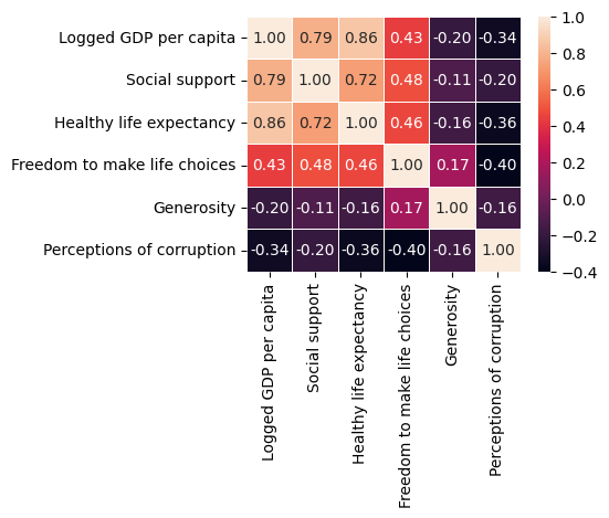
corr = df[df.columns].corr()
corr.sort_values(["Ladder score"], ascending = False, inplace = True)
print(corr["Ladder score"])
Ladder score                    1.000000
Logged GDP per capita           0.789760
Healthy life expectancy         0.768099
Social support                  0.756888
Freedom to make life choices    0.607753
Generosity                     -0.017799
cluster                        -0.075286
Perceptions of corruption      -0.421140
Rank                           -0.984265
Name: Ladder score, dtype: float64
We see the variable with most correlation with the ladder score is GDP, and the least correlated variable is Generosity.
Linear Regression and Prediction#
Sklearn Linear Regression Based on Numerical Variables Only#
from sklearn.linear_model import LinearRegression
reg = LinearRegression()
cols=["Logged GDP per capita","Social support","Healthy life expectancy","Freedom to make life choices","Generosity","Perceptions of corruption"]
reg.fit(df[cols],df["Ladder score"])
pd.Series(reg.coef_,index=cols)
Logged GDP per capita           0.279533
Social support                  2.476206
Healthy life expectancy         0.030314
Freedom to make life choices    2.010465
Generosity                      0.364382
Perceptions of corruption      -0.605092
dtype: float64
reg.coef_
array([ 0.2795329 ,  2.47620585,  0.03031381,  2.0104647 ,  0.36438194,
       -0.60509177])
print(f"The equation is: Pred Price = {cols[0]} x {reg.coef_[0]} + {cols[1]} x {reg.coef_[1]}+{cols[2]} x {reg.coef_[2]}+{cols[3]} x {reg.coef_[3]}+{cols[4]} x {reg.coef_[4]}+{cols[5]} x {reg.coef_[5]} + {reg.intercept_}")
The equation is: Pred Price = Logged GDP per capita x 0.2795328970903119 + Social support x 2.476205853915902+Healthy life expectancy x 0.030313812350904194+Freedom to make life choices x 2.01046470184026+Generosity x 0.3643819429244515+Perceptions of corruption x -0.6050917656434847 + -2.2372192944749907
df["Pred"] = reg.predict(df[cols])
Constructing graph to see the differences of true ladder score and predicted data.
import altair as alt
chartlist2=[]
for i in cols:
    c=alt.Chart(df).mark_circle().encode(
        x=alt.X(i, scale=alt.Scale(zero=False)),
        y="Ladder score",
        color=alt.Color("Regional indicator", scale=alt.Scale(scheme='dark2')),
    )
    c1=alt.Chart(df).mark_line().encode(
        x=alt.X(i, scale=alt.Scale(zero=False)),
        y="Pred",
    )
    c3=c+c1
    chartlist2.append(c3)
alt.hconcat(*chartlist2)
Build training and test set:#
from sklearn.model_selection import train_test_split
X_train,X_test,y_train,y_test = train_test_split(df[cols],df["Ladder score"],test_size = 0.3, random_state=1)
from sklearn.linear_model import LinearRegression
model = LinearRegression()
model.fit(X_train,y_train)
predtrain= model.predict(X_train)

predtest= model.predict(X_test)

print("Accuracy on Traing set: ",model.score(X_train,y_train))
print("Accuracy on Testing set: ",model.score(X_test,y_test))
Accuracy on Traing set:  0.7816778724066249
Accuracy on Testing set:  0.6683353869020149
from sklearn.metrics import mean_squared_error
from sklearn.metrics import r2_score
print("Mean Squared Error: ",mean_squared_error(y_test, predtest))
print("R^2 Score: ",r2_score(y_test,predtest))
Mean Squared Error:  0.3334530610483154
R^2 Score:  0.6683353869020149
Interpreting the R^2 score, The model is explaining almost 67% of variablity of the variance fo the training data, and we get a score of 0.78 on the accuracy of Training set, a score of 0.67 on the accuracy of Testing set,
As we can see the model does not have a really good model score and accuracy, to improve our model, we put variable of region indicator into consideration.
Improvements of Prediction Model#
Create Binary Variables Column to improve Model accuracy, taking consideration of country geographic location#
df2=pd.get_dummies(df["Regional indicator"])
df3=pd.concat([df, df2], axis=1).copy()
df3
| Country name | Regional indicator | Ladder score | Logged GDP per capita | Social support | Healthy life expectancy | Freedom to make life choices | Generosity | Perceptions of corruption | Rank | ... | Central and Eastern Europe | Commonwealth of Independent States | East Asia | Latin America and Caribbean | Middle East and North Africa | North America and ANZ | South Asia | Southeast Asia | Sub-Saharan Africa | Western Europe | |
|---|---|---|---|---|---|---|---|---|---|---|---|---|---|---|---|---|---|---|---|---|---|
| 0 | Finland | Western Europe | 7.842 | 10.775 | 0.954 | 72.000 | 0.949 | -0.098 | 0.186 | 1 | ... | 0 | 0 | 0 | 0 | 0 | 0 | 0 | 0 | 0 | 1 |
| 1 | Denmark | Western Europe | 7.620 | 10.933 | 0.954 | 72.700 | 0.946 | 0.030 | 0.179 | 2 | ... | 0 | 0 | 0 | 0 | 0 | 0 | 0 | 0 | 0 | 1 |
| 2 | Switzerland | Western Europe | 7.571 | 11.117 | 0.942 | 74.400 | 0.919 | 0.025 | 0.292 | 3 | ... | 0 | 0 | 0 | 0 | 0 | 0 | 0 | 0 | 0 | 1 |
| 3 | Iceland | Western Europe | 7.554 | 10.878 | 0.983 | 73.000 | 0.955 | 0.160 | 0.673 | 4 | ... | 0 | 0 | 0 | 0 | 0 | 0 | 0 | 0 | 0 | 1 |
| 4 | Netherlands | Western Europe | 7.464 | 10.932 | 0.942 | 72.400 | 0.913 | 0.175 | 0.338 | 5 | ... | 0 | 0 | 0 | 0 | 0 | 0 | 0 | 0 | 0 | 1 |
| ... | ... | ... | ... | ... | ... | ... | ... | ... | ... | ... | ... | ... | ... | ... | ... | ... | ... | ... | ... | ... | ... |
| 144 | Lesotho | Sub-Saharan Africa | 3.512 | 7.926 | 0.787 | 48.700 | 0.715 | -0.131 | 0.915 | 145 | ... | 0 | 0 | 0 | 0 | 0 | 0 | 0 | 0 | 1 | 0 |
| 145 | Botswana | Sub-Saharan Africa | 3.467 | 9.782 | 0.784 | 59.269 | 0.824 | -0.246 | 0.801 | 146 | ... | 0 | 0 | 0 | 0 | 0 | 0 | 0 | 0 | 1 | 0 |
| 146 | Rwanda | Sub-Saharan Africa | 3.415 | 7.676 | 0.552 | 61.400 | 0.897 | 0.061 | 0.167 | 147 | ... | 0 | 0 | 0 | 0 | 0 | 0 | 0 | 0 | 1 | 0 |
| 147 | Zimbabwe | Sub-Saharan Africa | 3.145 | 7.943 | 0.750 | 56.201 | 0.677 | -0.047 | 0.821 | 148 | ... | 0 | 0 | 0 | 0 | 0 | 0 | 0 | 0 | 1 | 0 |
| 148 | Afghanistan | South Asia | 2.523 | 7.695 | 0.463 | 52.493 | 0.382 | -0.102 | 0.924 | 149 | ... | 0 | 0 | 0 | 0 | 0 | 0 | 1 | 0 | 0 | 0 |
149 rows × 23 columns
cols4=[ 'Logged GDP per capita', 'Social support', 'Healthy life expectancy',
       'Freedom to make life choices', 'Generosity',
       'Perceptions of corruption',
       'Central and Eastern Europe', 'Commonwealth of Independent States',
       'East Asia', 'Latin America and Caribbean',
       'Middle East and North Africa', 'North America and ANZ', 'South Asia',
       'Southeast Asia', 'Sub-Saharan Africa', 'Western Europe']
Build Training and Testing set for the New Model#
from sklearn.model_selection import train_test_split
X_train,X_test,y_train,y_test = train_test_split(df3[cols4],df3["Ladder score"],test_size = 0.3, random_state=1)
from sklearn.linear_model import LinearRegression
model2 = LinearRegression()
model2.fit(X_train,y_train)
pred2= model2.predict(X_train)
predtest2=model2.predict(X_test)
print("Accuracy on Traing set: ",model2.score(X_train,y_train))
print("Accuracy on Testing set: ",model2.score(X_test,y_test))
Accuracy on Traing set:  0.8272728525667357
Accuracy on Testing set:  0.7353645962541258
from sklearn.metrics import mean_squared_error
from sklearn.metrics import r2_score
print("Mean Squared Error: ",mean_squared_error(y_test, predtest2))
print("R^2 Score: ",r2_score(y_test,predtest2))
Mean Squared Error:  0.2660624074921989
R^2 Score:  0.7353645962541258
Interpreting the R^2 score, The new model is explaining almost 74% of variablity of the variance fo the training data, and we get higher model accuracy score on both of the training set and testing set, and we also get less Mean Squared Error.
sklearn Linear Regression of the New Model#
from sklearn.linear_model import LinearRegression
reg2 = LinearRegression()
reg2.fit(df3[cols4],df3["Ladder score"])
pd.Series(reg2.coef_,index=cols4)
Logged GDP per capita                 0.267515
Social support                        1.949552
Healthy life expectancy               0.014086
Freedom to make life choices          2.266572
Generosity                            0.497026
Perceptions of corruption            -0.328476
Central and Eastern Europe            0.170953
Commonwealth of Independent States   -0.189213
East Asia                            -0.048350
Latin America and Caribbean           0.299890
Middle East and North Africa         -0.108041
North America and ANZ                 0.520121
South Asia                           -0.557216
Southeast Asia                       -0.460052
Sub-Saharan Africa                   -0.134426
Western Europe                        0.506334
dtype: float64
reg2.coef_
array([ 0.26751474,  1.94955181,  0.01408642,  2.26657235,  0.49702641,
       -0.32847612,  0.17095269, -0.18921326, -0.04834953,  0.29989009,
       -0.10804123,  0.52012137, -0.55721574, -0.46005188, -0.13442618,
        0.50633366])
print(f"The equation is: Pred Price = {cols4[0]} x {reg2.coef_[0]} + {cols4[1]} x {reg2.coef_[1]}+{cols4[2]} x {reg2.coef_[2]}+{cols4[3]} x {reg2.coef_[3]}+{cols4[4]} x {reg2.coef_[4]}+{cols4[5]} x {reg2.coef_[5]}+{cols4[6]} x {reg2.coef_[6]}+{cols4[7]} x {reg2.coef_[7]}+{cols4[8]} x {reg2.coef_[8]}+{cols4[9]} x {reg2.coef_[9]}+{cols4[10]} x {reg2.coef_[10]}+{cols4[11]} x {reg2.coef_[11]}+{cols4[12]} x {reg2.coef_[12]}+{cols4[13]} x {reg2.coef_[13]}+{cols4[14]} x {reg2.coef_[14]}+{cols4[15]} x {reg2.coef_[15]} + {reg2.intercept_}")
The equation is: Pred Price = Logged GDP per capita x 0.2675147422939184 + Social support x 1.9495518113713843+Healthy life expectancy x 0.014086415435709418+Freedom to make life choices x 2.2665723530069286+Generosity x 0.4970264092008061+Perceptions of corruption x -0.32847612358341893+Central and Eastern Europe x 0.17095269208625866+Commonwealth of Independent States x -0.1892132556381877+East Asia x -0.048349528121480884+Latin America and Caribbean x 0.29989008516075766+Middle East and North Africa x -0.10804122503952122+North America and ANZ x 0.5201213713676418+South Asia x -0.5572157356073879+Southeast Asia x -0.46005188026096594+Sub-Saharan Africa x -0.13442618032271927+Western Europe x 0.5063336563756091 + -1.0711857633458735
df3["Pred"] = reg2.predict(df3[cols4])
df3
| Country name | Regional indicator | Ladder score | Logged GDP per capita | Social support | Healthy life expectancy | Freedom to make life choices | Generosity | Perceptions of corruption | Rank | ... | Central and Eastern Europe | Commonwealth of Independent States | East Asia | Latin America and Caribbean | Middle East and North Africa | North America and ANZ | South Asia | Southeast Asia | Sub-Saharan Africa | Western Europe | |
|---|---|---|---|---|---|---|---|---|---|---|---|---|---|---|---|---|---|---|---|---|---|
| 0 | Finland | Western Europe | 7.842 | 10.775 | 0.954 | 72.000 | 0.949 | -0.098 | 0.186 | 1 | ... | 0 | 0 | 0 | 0 | 0 | 0 | 0 | 0 | 0 | 1 |
| 1 | Denmark | Western Europe | 7.620 | 10.933 | 0.954 | 72.700 | 0.946 | 0.030 | 0.179 | 2 | ... | 0 | 0 | 0 | 0 | 0 | 0 | 0 | 0 | 0 | 1 |
| 2 | Switzerland | Western Europe | 7.571 | 11.117 | 0.942 | 74.400 | 0.919 | 0.025 | 0.292 | 3 | ... | 0 | 0 | 0 | 0 | 0 | 0 | 0 | 0 | 0 | 1 |
| 3 | Iceland | Western Europe | 7.554 | 10.878 | 0.983 | 73.000 | 0.955 | 0.160 | 0.673 | 4 | ... | 0 | 0 | 0 | 0 | 0 | 0 | 0 | 0 | 0 | 1 |
| 4 | Netherlands | Western Europe | 7.464 | 10.932 | 0.942 | 72.400 | 0.913 | 0.175 | 0.338 | 5 | ... | 0 | 0 | 0 | 0 | 0 | 0 | 0 | 0 | 0 | 1 |
| ... | ... | ... | ... | ... | ... | ... | ... | ... | ... | ... | ... | ... | ... | ... | ... | ... | ... | ... | ... | ... | ... |
| 144 | Lesotho | Sub-Saharan Africa | 3.512 | 7.926 | 0.787 | 48.700 | 0.715 | -0.131 | 0.915 | 145 | ... | 0 | 0 | 0 | 0 | 0 | 0 | 0 | 0 | 1 | 0 |
| 145 | Botswana | Sub-Saharan Africa | 3.467 | 9.782 | 0.784 | 59.269 | 0.824 | -0.246 | 0.801 | 146 | ... | 0 | 0 | 0 | 0 | 0 | 0 | 0 | 0 | 1 | 0 |
| 146 | Rwanda | Sub-Saharan Africa | 3.415 | 7.676 | 0.552 | 61.400 | 0.897 | 0.061 | 0.167 | 147 | ... | 0 | 0 | 0 | 0 | 0 | 0 | 0 | 0 | 1 | 0 |
| 147 | Zimbabwe | Sub-Saharan Africa | 3.145 | 7.943 | 0.750 | 56.201 | 0.677 | -0.047 | 0.821 | 148 | ... | 0 | 0 | 0 | 0 | 0 | 0 | 0 | 0 | 1 | 0 |
| 148 | Afghanistan | South Asia | 2.523 | 7.695 | 0.463 | 52.493 | 0.382 | -0.102 | 0.924 | 149 | ... | 0 | 0 | 0 | 0 | 0 | 0 | 1 | 0 | 0 | 0 |
149 rows × 23 columns
Ture Ladder Score VS. Predicted Ladder Score with New Model#
import altair as alt
chartlist3=[]
for i in cols:
    d=alt.Chart(df3).mark_circle().encode(
        x=alt.X(i, scale=alt.Scale(zero=False)),
        y="Ladder score",
        color=alt.Color("Regional indicator", scale=alt.Scale(scheme='dark2')),
    )
    d1=alt.Chart(df3).mark_line().encode(
        x=alt.X(i, scale=alt.Scale(zero=False)),
        y="Pred",
        color=alt.value("#FFAA00")
    )
    d3=d+d1
    chartlist3.append(d3)
alt.hconcat(*chartlist3)
Use Sklearn Gradient Boosting Classifier to determine if a country’s people’s happiness is beyond expectation cosidering various variables.#
from sklearn.ensemble import GradientBoostingClassifier
import numpy as np
conditions = [df3['Pred'] > df['Ladder score'],df3['Pred'] < df['Ladder score']]
choices = ['Under Expectation','Beyond Expectation']
df3['Happiness Expectation'] = np.select(conditions, choices, default='Beyond Expectation')
df3
| Country name | Regional indicator | Ladder score | Logged GDP per capita | Social support | Healthy life expectancy | Freedom to make life choices | Generosity | Perceptions of corruption | Rank | ... | Commonwealth of Independent States | East Asia | Latin America and Caribbean | Middle East and North Africa | North America and ANZ | South Asia | Southeast Asia | Sub-Saharan Africa | Western Europe | Happiness Expectation | |
|---|---|---|---|---|---|---|---|---|---|---|---|---|---|---|---|---|---|---|---|---|---|
| 0 | Finland | Western Europe | 7.842 | 10.775 | 0.954 | 72.000 | 0.949 | -0.098 | 0.186 | 1 | ... | 0 | 0 | 0 | 0 | 0 | 0 | 0 | 0 | 1 | Beyond Expectation |
| 1 | Denmark | Western Europe | 7.620 | 10.933 | 0.954 | 72.700 | 0.946 | 0.030 | 0.179 | 2 | ... | 0 | 0 | 0 | 0 | 0 | 0 | 0 | 0 | 1 | Beyond Expectation |
| 2 | Switzerland | Western Europe | 7.571 | 11.117 | 0.942 | 74.400 | 0.919 | 0.025 | 0.292 | 3 | ... | 0 | 0 | 0 | 0 | 0 | 0 | 0 | 0 | 1 | Beyond Expectation |
| 3 | Iceland | Western Europe | 7.554 | 10.878 | 0.983 | 73.000 | 0.955 | 0.160 | 0.673 | 4 | ... | 0 | 0 | 0 | 0 | 0 | 0 | 0 | 0 | 1 | Beyond Expectation |
| 4 | Netherlands | Western Europe | 7.464 | 10.932 | 0.942 | 72.400 | 0.913 | 0.175 | 0.338 | 5 | ... | 0 | 0 | 0 | 0 | 0 | 0 | 0 | 0 | 1 | Beyond Expectation |
| ... | ... | ... | ... | ... | ... | ... | ... | ... | ... | ... | ... | ... | ... | ... | ... | ... | ... | ... | ... | ... | ... |
| 144 | Lesotho | Sub-Saharan Africa | 3.512 | 7.926 | 0.787 | 48.700 | 0.715 | -0.131 | 0.915 | 145 | ... | 0 | 0 | 0 | 0 | 0 | 0 | 0 | 1 | 0 | Under Expectation |
| 145 | Botswana | Sub-Saharan Africa | 3.467 | 9.782 | 0.784 | 59.269 | 0.824 | -0.246 | 0.801 | 146 | ... | 0 | 0 | 0 | 0 | 0 | 0 | 0 | 1 | 0 | Under Expectation |
| 146 | Rwanda | Sub-Saharan Africa | 3.415 | 7.676 | 0.552 | 61.400 | 0.897 | 0.061 | 0.167 | 147 | ... | 0 | 0 | 0 | 0 | 0 | 0 | 0 | 1 | 0 | Under Expectation |
| 147 | Zimbabwe | Sub-Saharan Africa | 3.145 | 7.943 | 0.750 | 56.201 | 0.677 | -0.047 | 0.821 | 148 | ... | 0 | 0 | 0 | 0 | 0 | 0 | 0 | 1 | 0 | Under Expectation |
| 148 | Afghanistan | South Asia | 2.523 | 7.695 | 0.463 | 52.493 | 0.382 | -0.102 | 0.924 | 149 | ... | 0 | 0 | 0 | 0 | 0 | 1 | 0 | 0 | 0 | Under Expectation |
149 rows × 24 columns
X_train,X_test,y_train,y_test = train_test_split(df3[cols4],df3['Happiness Expectation'],test_size = 0.3, random_state=1)
clf = GradientBoostingClassifier(n_estimators=200, learning_rate=1.0,max_depth=1, random_state=0).fit(X_train, y_train)
clf.score(X_test, y_test)
0.4666666666666667
The model score are too low, indicate that the model cannot be used to determine whether a happiness score of one country is beyond expectation.
Summary#
I have completed a linear regression model to predict the happiness index of country residence. The results show that if all features are included in the dataset, the R squared of the model is about 73.5%. I compared the importance of each variable to the final output and found that GDP and Social support are the two most important factors. Generosity is the least important factor. The model based on the most dominant features has an accuracy of about 82.7% on the training dataset and about 73.5% on the test dataset. Building regional factors into my model improved the accuracy of my model. In addition, we performed machine learning to predict whether the happiness index will exceed expectations, but found that the data and models were insufficient for us to draw conclusions.
References#
Dataframe reference link: https://www.kaggle.com/datasets/ajaypalsinghlo/world-happiness-report-2021/code
seaborn.kdeplot: https://seaborn.pydata.org/generated/seaborn.kdeplot.html
plotly: https://plotly.com/python/plotly-express/
Choropleth Maps in Python: https://plotly.com/python/choropleth-maps/
Seaborn Heatmap: https://machinelearningknowledge.ai/seaborn-heatmap-using-sns-heatmap-with-examples-for-beginners/
sklearn.ensemble.GradientBoostingClassifier: https://scikit-learn.org/stable/modules/generated/sklearn.ensemble.GradientBoostingClassifier.html
 Created in Deepnote