
Netflix Stock Price
Contents
Netflix Stock Price#
Author: Huangxiao Zhang
Course Project, UC Irvine, Math 10, F22
Introduction#
In this predicting project, I am going to make a prediction of Netflix Stock price since I am a big fan of this comany. The data is the price for netflix stock from 2002 to 2021. In the project, I am going to use linear regression and decision tree’s Predicted values compare with truth value.
Importing data#
import numpy as np
import pandas as pd
import altair as alt
from sklearn.model_selection import train_test_split
from sklearn.linear_model import LinearRegression
from sklearn.tree import DecisionTreeRegressor
from sklearn.metrics import mean_squared_error
import seaborn as sns
df = pd.read_csv('netflix.csv')
Sorting Data#
Original Dataset#
df
| Date | High | Low | Open | Close | Volume | Adj Close | |
|---|---|---|---|---|---|---|---|
| 0 | 2002-05-23 | 1.242857 | 1.145714 | 1.156429 | 1.196429 | 104790000.0 | 1.196429 |
| 1 | 2002-05-24 | 1.225000 | 1.197143 | 1.214286 | 1.210000 | 11104800.0 | 1.210000 |
| 2 | 2002-05-28 | 1.232143 | 1.157143 | 1.213571 | 1.157143 | 6609400.0 | 1.157143 |
| 3 | 2002-05-29 | 1.164286 | 1.085714 | 1.164286 | 1.103571 | 6757800.0 | 1.103571 |
| 4 | 2002-05-30 | 1.107857 | 1.071429 | 1.107857 | 1.071429 | 10154200.0 | 1.071429 |
| ... | ... | ... | ... | ... | ... | ... | ... |
| 4876 | 2021-10-05 | 640.390015 | 606.890015 | 606.940002 | 634.809998 | 9534300.0 | 634.809998 |
| 4877 | 2021-10-06 | 639.869995 | 626.359985 | 628.179993 | 639.099976 | 4580400.0 | 639.099976 |
| 4878 | 2021-10-07 | 646.840027 | 630.450012 | 642.229980 | 631.849976 | 3556900.0 | 631.849976 |
| 4879 | 2021-10-08 | 643.799988 | 630.859985 | 634.169983 | 632.659973 | 3271100.0 | 632.659973 |
| 4880 | 2021-10-11 | 639.419983 | 626.780029 | 633.200012 | 627.039978 | 2861200.0 | 627.039978 |
4881 rows × 7 columns
Rename Adj Close to Adjusted Closing Price.(Definition of adjusted closing price)
df = df.rename(columns={'Adj Close' : 'Adjusted Closing Price'})
Change type from object to datetime64[ns]
df["Date"] = pd.to_datetime(df["Date"])
Clean null value
df.dropna(inplace=True)
Clean Dataset#
df
| Date | High | Low | Open | Close | Volume | Adjusted Closing Price | |
|---|---|---|---|---|---|---|---|
| 0 | 2002-05-23 | 1.242857 | 1.145714 | 1.156429 | 1.196429 | 104790000.0 | 1.196429 |
| 1 | 2002-05-24 | 1.225000 | 1.197143 | 1.214286 | 1.210000 | 11104800.0 | 1.210000 |
| 2 | 2002-05-28 | 1.232143 | 1.157143 | 1.213571 | 1.157143 | 6609400.0 | 1.157143 |
| 3 | 2002-05-29 | 1.164286 | 1.085714 | 1.164286 | 1.103571 | 6757800.0 | 1.103571 |
| 4 | 2002-05-30 | 1.107857 | 1.071429 | 1.107857 | 1.071429 | 10154200.0 | 1.071429 |
| ... | ... | ... | ... | ... | ... | ... | ... |
| 4876 | 2021-10-05 | 640.390015 | 606.890015 | 606.940002 | 634.809998 | 9534300.0 | 634.809998 |
| 4877 | 2021-10-06 | 639.869995 | 626.359985 | 628.179993 | 639.099976 | 4580400.0 | 639.099976 |
| 4878 | 2021-10-07 | 646.840027 | 630.450012 | 642.229980 | 631.849976 | 3556900.0 | 631.849976 |
| 4879 | 2021-10-08 | 643.799988 | 630.859985 | 634.169983 | 632.659973 | 3271100.0 | 632.659973 |
| 4880 | 2021-10-11 | 639.419983 | 626.780029 | 633.200012 | 627.039978 | 2861200.0 | 627.039978 |
4881 rows × 7 columns
Seaborn and Altair Chart#
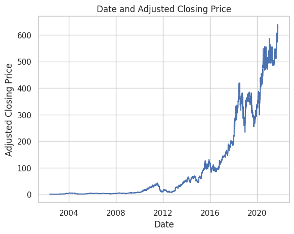
This is the line chart which shows the Adjusted Closing Price increase with time by sns.lineplot.
sns.set_theme(style="whitegrid")
sns.lineplot(x="Date", y="Adjusted Closing Price", data=df).set(title='Date and Adjusted Closing Price')
[Text(0.5, 1.0, 'Date and Adjusted Closing Price')]
This is a bar chart which indicates the changes of volume is cyclical
chart = alt.Chart(df).mark_bar().encode(
    x='Date',
    y='Open',
).properties(
    title='Date and Open Price'
)
chart
Build Training and Test Set#
Split the dataset into 2 parts: X includes Highest Price, Lowest Price, Openning Price, and Volume; y includes Adjusted Closing Price.
X = df.loc[:, ["High", "Low", "Open", "Volume"]]
y = df.iloc[:, -1]

X_train, X_test, y_train, y_test = train_test_split(X, y, test_size=0.2, random_state=100)
Linear Regression#
Train the data
reg = LinearRegression()
reg.fit(X_train, y_train)
LinearRegression()
predicting value for Linear Regression
linear_pred = reg.predict(X_test)
find the mean squared error for Linear Regression
linear_mse = mean_squared_error(y_test, linear_pred)
linear_mse
2.0652666805811815
Decision Tree Regressor#
Train the data
dt = DecisionTreeRegressor()
dt.fit(X_train, y_train)
DecisionTreeRegressor()
predicting value for DecisionTree
dt_pred = dt.predict(X_test)
find the mean squared error for DecisionTree
dt_mse = mean_squared_error(y_test, dt_pred)
dt_mse
8.674851664178735
Result#
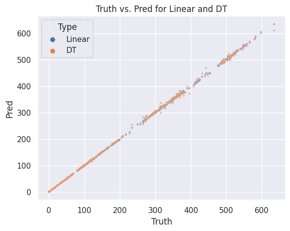
Comparing Truth value and Predicted value within one chart. sns.scatterplot
sns.set_theme()
results = pd.DataFrame({
    "Type": ["Linear"]*y_test.shape[0] + ["DT"]*y_test.shape[0],
    "Truth": y_test.tolist() * 2,
    "Pred": linear_pred.tolist() + dt_pred.tolist()
})

sns.scatterplot(x="Truth", y="Pred", hue="Type", data=results, alpha=0.5, s=9).set(title='Truth vs. Pred for Linear and DT')
[Text(0.5, 1.0, 'Truth vs. Pred for Linear and DT')]
Summary#
At the beginning, I plot two images to show the changes of Adjusted Closing Price and volume. The first image is a line chart which shows the Adjusted Closing Price increase with time while the second image is a bar chart which indicates the changes of volume is cyclical. Next I split the dataset into 2 parts, one with 80% random samples as train set and the remaine 20% random samples as test set. I fit a linear regression model and a decision model based on train set and evaluate the performances of them by these sets. The results shows that the mean squared error of the linear model is 2.0652666805811815 while the mean squared error of the decision tree is 8.75387563145938. Finally I plot a scatterplot which the x axis stands for the value of Adjusted Closing Price in the test set and the y axis represents the value of predictions of the two models. The scatterplot shows that both models has a relative wonderful performances.
References#
Your code above should include references. Here is some additional space for references. sns.lineplot sns.scatterplot
What is the source of your dataset(s)? Kaggle
List any other references that you found helpful. seaborn.set_theme
Submission#
Using the Share button at the top right, enable Comment privileges for anyone with a link to the project. Then submit that link on Canvas.
 Created in Deepnote